
Good to see you again. In the previous lesson, you developed a lighting concept statement: a concise argument connecting the project’s architectural idea, intended experience, and governing constraints. That statement now needs to become visible in space.
This lesson develops the visual hierarchy that makes a concept legible at night. You will learn to decide what should be noticed, what should support it, and what should deliberately recede. The principal tools are darkness, focal emphasis, vertical illumination, and an ambient layer. They are not separate effects to add mechanically; together, they establish a coherent order of attention.
By the end, you should be able to describe and sketch a hierarchy for a room or sequence of rooms without starting from a grid of luminaires.
Visual hierarchy is an allocation of attention
When someone enters a space, they do not perceive every surface with equal importance. Their eye is drawn toward brighter, more contrasting, more colourful, moving, or otherwise visually distinct elements. Lighting design can work with that tendency rather than surrendering to it.
A visual hierarchy is the intentional ordering of what the eye notices:
- Primary elements establish identity, destination, or orientation: an arrival desk, artwork, stair, display, shared table, façade entrance, or landscape view.
- Supporting elements reveal the architecture that makes those focal moments meaningful: walls, ceilings, circulation routes, structural rhythm, and material surfaces.
- Background elements provide enough visual information for comfort, safety, and spatial coherence without competing for attention.
- Dark or quiet zones allow the primary and supporting elements to have presence. Darkness is not simply unlit leftover space; it is an active part of the composition.
The concept statement from the preceding lesson should determine this order. If the concept is “a calm architectural background with precise focal light for a private collection,” then making every wall, shelf, ceiling, and artwork equally bright contradicts it. If the concept is “a luminous social spine through a deep workplace,” then the route and its vertical boundaries must read more clearly than peripheral storage or enclosed support spaces.
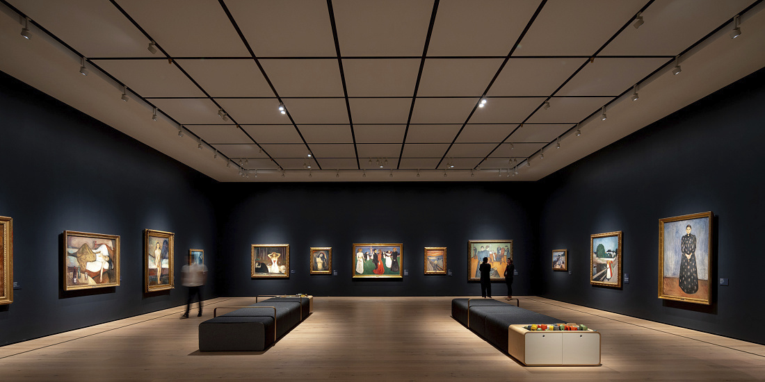
The museum gallery below shows a clear, restrained hierarchy. The paintings receive focal light; the dark walls suppress distraction and establish contrast; selected light on the floor supports circulation; and the general ambient condition is sufficient for orientation without becoming the subject itself.
A useful design question is therefore not, “Where do we need light?” but:
What must people notice first, what should they understand next, and what can remain visually quiet?
That question shifts the design from equipment coverage to architectural perception.
The four working tools of hierarchy
Richard Kelly’s influential “language of light” distinguishes ambient luminescence, focal glow, and play of brilliants. For architectural work, the first two provide a useful foundation for hierarchy. Vertical illumination and darkness make that foundation spatially convincing and visually comfortable.
LED luminaire manufacturer for architectural lighting | ERCO
Read this overview from ERCO as a perception-based framework rather than as a product guide. It introduces the relationship among ambient light, accent light, vertical illumination, glare control, and the three-part language of light.
In the section “Qualitative lighting design,” begin with the perception-based approach. Then read the full “Vertical illuminance” section, beginning with why vertical surfaces matter, including the paragraph on wallwashing and contrast. Finally, return to the later “Qualitative lighting design” section and read Kelly's three functions, followed by the short descriptions of ambient luminescence, focal glow, and play of brilliants. Focus on the distinction between a light level that supports orientation and a light pattern that directs attention.
1. Ambient layer: the visual baseline
The ambient layer is the stable field of light that lets people orient themselves, move safely, and understand the broad volume of a room. It may come from diffuse daylight, indirect light, a luminous ceiling plane, careful downlighting, wallwashing, or a combination.
Ambient light should not be interpreted as “make everything evenly bright.” A room can have a calm ambient condition and still retain substantial areas of shadow, especially on ceilings, secondary walls, or low-priority corners. The goal is visual reassurance, not visual sameness.
Ask these questions when establishing ambient light:
- Can people read the room’s dimensions, edges, and circulation paths?
- Can they identify thresholds, steps, furniture, and other occupants?
- Does the room feel gloomy because major surfaces disappear, or calm because only secondary elements recede?
- Are luminaires, bright apertures, or reflections more conspicuous than the architecture?
A uniform downlight grid often produces a technically adequate ambient field. But it can also flatten texture, erase spatial priorities, create repetitive bright spots on the floor, and make the ceiling into an unintended visual pattern. It is sometimes appropriate, especially where a genuinely even task field is needed, but it should be an intentional response to use and architecture rather than a default layout.
2. Vertical illumination: make the room feel bright, open, and legible
People spend much of their time looking forward, not directly downward. Walls, faces, shelving, façades, artwork, signage, and room boundaries therefore dominate everyday visual experience. A space can have a brightly illuminated floor and still feel cave-like if its vertical surfaces are dark.
Vertical illumination can perform several different roles:
| Vertical target | What it contributes to hierarchy |
|---|---|
| A broad wall | Makes the room’s boundary legible and can create an impression of spaciousness. |
| A material wall | Reveals colour, texture, rhythm, or depth; the lighting should suit the material rather than flatten it. |
| A circulation-end wall | Gives a route a visual destination and helps orientation. |
| Faces at a social setting | Supports communication and comfort. |
| Shelves, displays, or artwork | Provides a quiet field or an intentional focal moment, depending on the relative brightness. |
The same technique can have different visual consequences. A uniform wallwash produces a calm luminous plane and reduces severe contrast. A grazing treatment, placed close to a textured wall, exaggerates relief through shadow. A narrow accent can isolate one artwork or architectural detail. These are not interchangeable just because each puts light on a vertical surface.
The design decision is first about the role of the surface. Is it the room’s luminous background, a material subject, a destination, or an element that should recede?
3. Focal emphasis: use brightness to assign importance
Focal emphasis, or Kelly’s focal glow, is directed light that attracts attention to an object, area, or event. It may illuminate art, merchandise, a reception desk, a dining table, a stair landing, a display case, a doorway, or the face of a building.
Its strength lies in selectivity. If every object receives an accent, nothing is truly accented; the result becomes a field of competing signals.
A focal point must have a reason. It should generally do at least one of the following:
- establish a destination or aid orientation;
- reveal the project’s strongest architectural or material idea;
- support an important activity;
- signal identity or cultural meaning;
- create a considered pause within a sequence.
Focal lighting is also about contrast, not simply high output. A modestly lit sculpture against a subdued wall may read more powerfully than a much brighter sculpture surrounded by equally bright walls, floor, ceiling, and fittings.
For artwork and three-dimensional objects, direction matters as much as quantity. A frontal, diffuse treatment may show colour and outline but reduce relief. A controlled angled beam can model texture and depth, while an excessively steep or low direction can create distracting shadows, glare, or distortions. Later lessons will examine distributions and source placement in greater technical detail; for now, identify the visual task before selecting the optical solution.
4. Darkness: protect the design’s silence
A productive darkness is not a failure to meet a requirement. It is an area that has enough residual light, reflected light, or local guidance to remain safe and spatially intelligible, while not demanding attention.
Darkness can:
- frame a focal object;
- conceal secondary service elements;
- make room depth perceptible;
- slow the visual sequence before a destination;
- preserve intimacy in a residence or hospitality setting;
- prevent an overlit façade from dominating its context;
- reduce visual fatigue by avoiding a field of uniformly high brightness.
However, darkness must be checked from the user’s actual viewpoint. A deliberately dark ceiling may be appropriate; an unmarked change in level or an unlit exit route is not. The distinction is especially important in public circulation, stairs, bathrooms, workplaces, and exterior paths.
A good hierarchy is therefore not “bright versus dark.” It is a controlled distribution of brightness, shadow, and visual information.
Learn to see the layers before choosing fixtures
The image below separates three lighting qualities that can coexist in one setting. The upper row shows actual museum-like scenes; the lower row abstracts their visual effect. From left to right, the compositions move from a broadly luminous environment, to a distinct focal object against a darker field, to a more theatrical decorative effect.
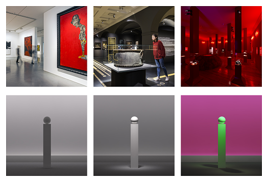
The lesson outcome does not require every project to use decorative sparkle or coloured effects. Play of brilliants may be appropriate for a celebratory retail setting, hospitality venue, or feature chandelier, but it can be unnecessary or even counterproductive in a contemplative gallery, focused workplace, or conservation-sensitive display.
What matters is that you can identify whether a proposed luminous element is:
- a background field that supports orientation;
- a vertical plane that defines space and perceived brightness;
- a focal event that directs attention;
- a decorative luminous object that is itself intended to be seen;
- or simply an accidental bright distraction.
This distinction is a strong critique tool. A glowing linear slot, for example, may look elegant in a rendering but be wrong if it becomes the brightest visual event in a room intended to privilege art, people, or a view.
Bright Ideas: Mastering Architectural Lighting
Watch this short sequence from “Bright Ideas: Mastering Architectural Lighting” by John Cullen Lighting. It contrasts a uniform downlight approach with layered lighting and makes the role of darkness unusually clear.
Watch layered lighting for the critique of uniform ceiling grids and the introduction of ambient, task, and focal layers. Continue with darkness and focus, noting the claim that the brightest area will pull attention and that overlighting creates a washed-out result. Finish with concealed sources to see why an exposed lamp can displace the intended focal point and cause glare.
The video’s residential examples generalize well. In a workplace, a bright exposed linear fitting over circulation can distract from a reception desk or collaborative setting. In a gallery, an unshielded track-head lens can compete with the painting it is intended to illuminate. In a residence, an overlit ceiling can make a room feel more exposed than relaxed.
Build hierarchy from the concept outward
The following process helps convert last lesson’s concept statement into a preliminary lighting composition. It can be done over a plan, a section, and a set of eye-level views. A reflected ceiling plan alone is not enough, because hierarchy is principally experienced from human viewpoints.
Step 1: Mark attention, not luminaires
Take a plan or section and label elements according to their intended visual status:
- P for primary;
- S for supporting;
- B for background;
- Q for quiet or dark.
For example, imagine a small gallery lobby whose concept is:
“Use a restrained gradient of brightness to draw visitors from a compressed entrance toward the collection and social heart of the atrium.”
A first hierarchy might be:
| Spatial element | Intended status | Lighting implication |
|---|---|---|
| Arrival threshold | S | Enough light to enter confidently; avoid making it visually louder than the atrium. |
| Reception or host point | P | A distinct focal field, with faces and the counter legible. |
| Atrium wall or structural rhythm | S | Vertical light reveals scale and leads the eye inward. |
| Featured artwork | P | Precise accent and controlled contrast with its background. |
| Secondary corridor | Q or B | Sufficient orientation and safety, but lower visual competition. |
| Ceiling service zones | Q | Recede unless the ceiling itself is central to the architectural idea. |
Notice that this is already a lighting design decision, but it contains no fixture names. It provides a test for later fixture choices.
Step 2: Establish the ambient condition
Next, ask what the least amount of broad light is that still supports orientation, use, and visual comfort. This is not a target illuminance calculation at this stage. It is a spatial judgment supported later by technical criteria.
Consider:
- the room’s scale and ceiling height;
- reflectance of walls, ceiling, and floor;
- daylight available at different times;
- likely occupancy and activities;
- changes between day and night;
- the importance of face-to-face interaction;
- safety requirements at routes, steps, and thresholds.
In a dark-finished gallery, a low ambient condition can be effective because careful accent lighting establishes the reading of the space. In a deep workplace, more vertical brightness may be needed so that walls and faces do not disappear. In a residence, the ambient layer may be low and distributed among coves, table lamps, floor lamps, and limited architectural light rather than a dominant ceiling system.
Step 3: Give important vertical surfaces a role
Choose the walls or vertical planes that will define volume, orientation, and material character. Avoid washing every wall by default. A uniformly illuminated perimeter may be appropriate in a circulation space or office, but it can undermine a more intimate or dramatic concept.
For each selected vertical plane, decide whether the desired reading is:
- even and spacious, using uniform wallwashing;
- textured and tactile, using controlled grazing;
- quietly present, using reflected or low-level spill light;
- destination-like, using greater brightness or contrast;
- subordinate, allowing it to recede.
At this stage, work in section as well as plan. The section reveals the relationship among mounting position, beam direction, ceiling height, eye level, and the visible brightness of the source.
Step 4: Place focal moments selectively
Now identify the few elements that deserve greatest emphasis. These may be permanent, such as a stair or artwork, or changeable, such as retail merchandise or a flexible display wall.
For each focal point, record:
- why it is primary;
- from where it should be seen;
- what visual quality matters: colour, texture, depth, face visibility, graphic legibility, or sparkle;
- what must not interfere: glare, reflected images, shadows, conservation limits, or views.
A focal point should usually have a visible relationship to its background. The background may be darker, lighter, more matte, more textured, or differently coloured. Light alone does not create all contrast; architecture and finishes are part of the composition.
Step 5: Decide where darkness is valuable
Finally, draw the quiet zones consciously. These might include:
- the upper ceiling plane around a focal pendant;
- a wall between separately accented artworks;
- the outer edges of a lounge;
- service doors and storage recesses;
- landscape beyond a terrace, except for gentle path cues;
- a façade’s blank areas, leaving entries and architectural depth to define identity.
Then carry out a safety and comfort check. Any quiet zone at a level change, route, door, or task area may need a subtle supporting light even if it remains visually secondary.
From hierarchy to preliminary arrangement
A hierarchy first tells you where light should be perceived. The next question is how luminaires can deliver that light without undermining it.
Arranging luminaires & luminaire spacing | ERCO Lighting knowledge
Use this ERCO technical overview to connect your hierarchy diagram to early luminaire geometry. The rules of thumb are useful starting points for sketches, but final layouts must be checked against the selected luminaire’s photometry, room geometry, reflectances, and glare performance.
In “What is the ideal arrangement of spotlights?”, read the role of spotlights, then continue through the art-lighting geometry. In “How do you position wallwashers?”, read from the perceptual value of lit walls. Continue through the diagrams and the wallwasher arrangement guidance, paying attention to the stated relationships between wall distance, room height, and spacing rather than treating any one number as universal.
Three early layout principles follow.
Ambient geometry must match the intended field
If the ambient layer is intended to be uniform general illumination, fixture spacing needs to provide overlap rather than isolated pools. The ERCO guide gives a rough starting relationship in which downlight spacing may be up to about times the mounting height above the working plane, with wall distance roughly half that spacing.
Treat this only as preliminary geometry. Beam distribution, output, ceiling reflectance, mounting depth, furniture, daylight, and the desired pattern all alter the result. A narrow-beam luminaire at the same spacing as a wide-beam luminaire will not create the same field.
More importantly, do not let a spacing formula decide the concept. If a uniform array conflicts with the intended hierarchy, consider whether the ambient requirement could be met through a different combination of vertical light, indirect light, localized task light, or more selective downlighting.
Accent geometry must respect the observer
For paintings and other vertical objects, the resource presents a angle of incidence as a starting arrangement. Its aim is practical: reduce the chance that a visitor’s body casts a shadow on the artwork while avoiding very steep grazing that creates long shadows.
This is a useful reminder that a focal light is not designed only from the object outward. It must be checked from the observer’s location. Review:
- whether the source is visible at typical viewing angles;
- whether glossy artwork produces a reflected image of the luminaire;
- whether a viewer blocks the beam;
- whether the beam frames the object without spilling onto adjacent surfaces;
- whether the direction supports the material’s texture and intended appearance.
Wallwash geometry must support the entire plane
A wallwasher is not simply a downlight placed nearer to a wall. It has a distribution designed to illuminate the vertical surface more evenly. The guide’s starting relationship places wallwashers at roughly one-third of room height from the wall and gives an upper limit for longitudinal spacing relative to that wall distance.
Again, use the relationship to make a first sketch, not a final specification. Tall walls, unusually dark finishes, recessed niches, obstructions, and special grazing effects require separate evaluation. The core idea is more important than the rule: if the wall is meant to be a luminous field, the arrangement must avoid a bright top edge, dark lower zone, scalloping, or patchiness that turns the wall into a distraction.
Critique a hierarchy through viewpoints, not just plans
A promising plan can fail when viewed at eye level. Before committing to a scheme, test it through representative perspectives or a physical/digital study from the places where users actually stand, sit, arrive, work, and circulate.
Use these five critique lenses.
Identity
Does the brightest or most memorable visual event express the concept? A hospitality lobby may want a feature stair, art wall, or social bar to act as its identity. A museum may want the collection to dominate, not the ceiling fixtures.
Orientation
Can people tell where they are, where they should go, and where important destinations are? Vertical planes and controlled brightness gradients are especially useful here. A bright floor with dark walls often gives less orientation than a more balanced scheme with readable vertical boundaries.
Comfort
Are sources shielded and set back sufficiently, especially in direct sightlines? Are there extreme transitions between bright focal points and surrounding darkness? Is reflected glare likely on polished stone, glazing, framed art, screens, or display cases?
Comfort does not require removing contrast. It requires making contrast purposeful and avoiding uncontrolled high-brightness sources.
Architectural coherence
Does the light reveal the architecture’s form, material, rhythm, and scale? Or has the ceiling layout imposed a separate pattern that ignores the space below it? A well-integrated hierarchy can make a modest architectural feature feel significant; an indifferent grid can make a carefully composed room appear generic.
Operational resilience
Can the hierarchy survive ordinary use? Consider furniture movement, replacement of displays, dimming scenes, cleaning, lamp or driver failure, and changing daylight. A focal composition dependent on one poorly accessible source may be visually strong on opening day but fragile in operation.
A compact hierarchy notation for concept design
For a schematic presentation, you can communicate hierarchy without rendering every luminaire. Create one plan and one key section using four tones or labels:
| Notation | Meaning | Example |
|---|---|---|
| P: Primary | Highest visual priority | Artwork, reception, dining table, stair landing |
| V: Vertical support | Surface defining space or orientation | Atrium wall, shelving wall, façade bay |
| A: Ambient | Low-contrast baseline for use and safety | General room volume, circulation floor |
| Q: Quiet | Deliberately subordinate or dark | Ceiling perimeter, service wall, unused corner |
Beside the drawing, write only the intended visual effect: “soft vertical wash,” “narrow focal beam,” “subdued ambient pool,” “retain shadow,” or “low-level route cue.” This is enough to review whether the design supports the concept before technical schedules and fixture selections begin.
A hierarchy diagram is successful when someone can understand the intended experience even if every product symbol is removed.
Key takeaways
Visual hierarchy turns a lighting concept into an ordered experience of space.
- Begin with attention, not luminaires: identify what is primary, supporting, background, and deliberately quiet.
- Ambient light establishes a usable visual baseline; it does not require uniform brightness everywhere.
- Vertical illumination makes room boundaries, materials, faces, and orientation legible. It often contributes more to perceived spaciousness than additional light on the floor.
- Focal emphasis directs the eye toward meaningful objects, destinations, activities, or architectural moments. It only works when it is selective.
- Darkness is a compositional tool that provides contrast, depth, rest, and focus, provided safety and navigation remain intact.
- Test every hierarchy from eye level and against glare, reflections, maintenance, and changing use.
In the next lesson, you will translate these visual intentions into appropriate lighting distributions and integration methods, selecting how light is delivered based on architectural purpose rather than the appearance of a fixture.
Can't find a good explanation? Sign up and we'll make it for you
Sign up