
Hello. In the previous lesson, you selected distributions and integration methods from architectural intent: grazing when texture should be revealed, wallwashing when a boundary should read as continuous, and concealed or visible equipment according to the desired architectural expression. That logic has one essential qualification: the same lighting distribution can produce very different results on different materials.
This lesson develops a practical way to predict those results. You will examine how a material’s reflectance, texture, gloss, and spectral response affect brightness, shadow, highlights, colour, and atmosphere. The goal is not to memorize material “rules,” but to make defensible predictions before specifying a luminaire or approving a sample.
Materials do not merely receive light
A lighting calculation can tell you how much light arrives at a surface. It cannot, by itself, tell you whether that surface will feel calm, heavy, silky, tactile, reflective, warm, or visually uncomfortable. Those outcomes emerge from the interaction of three things:
- The incident light: its direction, intensity, size, spectrum, and degree of diffusion.
- The material: its colour value, texture, gloss, opacity, and spectral reflectance.
- The viewer’s position: especially important for reflective materials, where a small change in viewpoint can turn a dark surface into a bright glare source.
Start with reflectance: the proportion of visible light a surface sends back rather than absorbs. In practice, paint and finish schedules often state this as Light Reflectance Value (LRV), on a scale from 0 to 100. A higher-value surface generally returns more light to the room; a lower-value surface absorbs more and contributes less to ambient brightness.
This does not mean high-LRV finishes are automatically better. A dark charcoal wall may be exactly right for a theatre lobby, luxury retail display, or intimate lounge. But it makes a real lighting demand: indirect light and ceiling bounce will be less effective, and the wall will need intentional treatment if it must remain legible.
How Colours Affect Lighting Design | ARTiculations
Watch How Colours Affect Lighting Design by ARTiculations for a concise introduction to Light Reflectance Value and its implications for spatial brightness and lighting performance.
Watch the LRV introduction to establish what the metric measures. Continue with value and scale, distinguishing value from hue and saturation. Then watch design consequences, focusing on why dark ceilings reduce reflected ambient light and why tonal contrast affects wayfinding.
LRV is a useful early-design indicator, particularly for ceilings and broad walls, but it is only one descriptor. It does not tell you whether a surface is polished, ribbed, translucent, metallic, or strongly coloured. Nor does it predict exactly how the finish will look under a particular LED spectrum.
A simple distinction will keep your material decisions clear:
- Hue is the family of colour: red, blue, green, ochre.
- Saturation is how vivid or muted that hue appears.
- Value, closely related to LRV, concerns lightness and the amount of light likely to be reflected.
A pale, muted blue may reflect considerably more light than a saturated navy blue. Therefore, do not infer brightness from colour family alone.
Texture and gloss decide where the reflected light goes
A matte plaster wall and a polished stone panel may have similar overall colour value, yet they behave very differently. The key is the geometry of reflection.
A relatively matte surface scatters light broadly. This is called diffuse reflection. Since its brightness changes less dramatically with viewpoint, the material itself remains visually available: one can read its colour and broad texture from many positions.
A glossy surface directs a substantial part of the light in a concentrated direction, like a mirror. This is specular reflection. It may show an image of a window, pendant, downlight aperture, or bright façade across the room. The material can therefore appear almost black from one viewpoint and intensely bright from another.
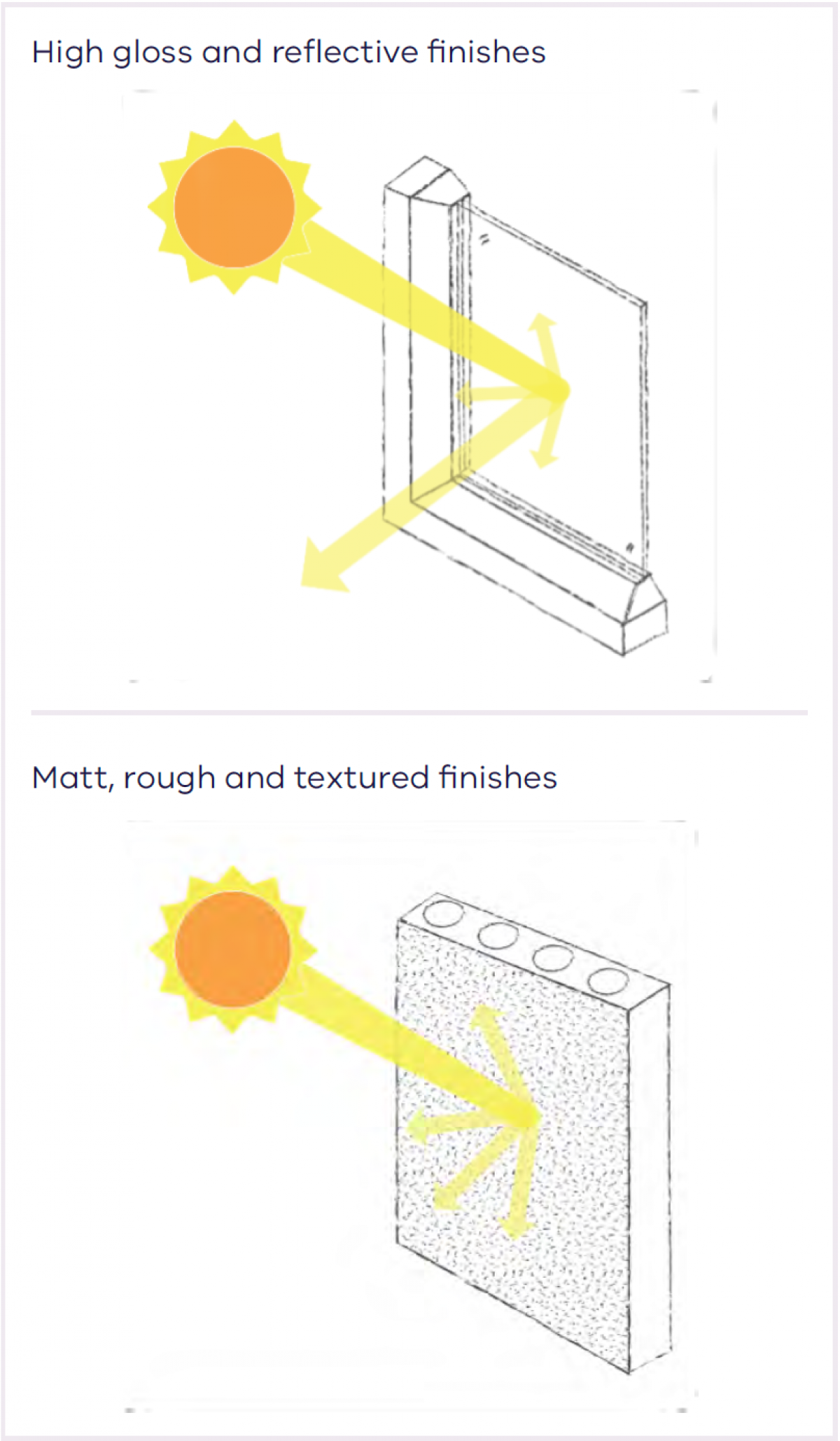
This leads to an important correction to a common assumption: a glossy material is not simply “brighter.” It is more directional. Its perceived brightness depends on whether the reflected source is aligned with the observer’s eye.
For a polished stone floor, glazed artwork, black lacquered joinery, or stainless-steel lift door, ask:
- What bright objects will this surface reflect?
- From normal approach, standing, and seated viewpoints, will the reflection enter the eye?
- Does the reflection contribute sparkle and depth, or does it conceal the material and create discomfort?
- Can the reflected image of a downlight be replaced with a larger, softer, more controlled luminous surface?
Gloss is usually controlled at the microscopic scale; texture operates at a larger, visible scale. Texture contains relief: joints in stone, grain in timber, ridges in concrete, weave in fabric, or folds in a curtain. It becomes legible when directional light creates a pattern of tiny highlights and shadows.
This is why the grazing strategy from the previous lesson is powerful. Light placed close to a textured wall travels almost parallel to it, revealing each projection and recess. More frontal light reduces those shadows and makes the same wall appear flatter.
Light and materials – Daylight and Architecture
Read Light and materials from Daylight and Architecture. It connects surface finish, colour value, directional light, and material expression through architectural examples.
In the opening section, read the discussion of reflection and value. Note the distinction between glossy, specular reflection and the diffuse reflection associated with matte materials. Then read Section “Light emphasizing materials,” beginning with the summary of highlights texture and transmission. Relate “grazing light” directly to the wall-grazing distribution discussed previously. Finally, in the Henry’s Church example later in the article, read the change in the screen material. Focus on the fact that a material can appear transparent in one lighting condition and reflective in another.
Predicting texture under different lighting directions
Consider a hand-finished limestone wall at an entry.
- Under frontal wallwashing, the wall can appear calm, continuous, and relatively pale. Its broad colour and mass are visible, but its joints and relief are subdued.
- Under close grazing, the same wall can appear deeply tactile, with strong shadows, variable brightness, and a more dramatic character.
- Under low-level lateral light, texture may become especially pronounced from an approach direction, but unevenness, stains, installation tolerances, and chipped edges can also become conspicuous.
- Under soft indirect light, the wall may recede almost entirely, contributing atmosphere without strongly declaring its texture.
The right result depends on the concept. A refined, quiet gallery entry might use restrained wallwashing on stone. A restaurant whose identity depends on crafted masonry might use grazing. Neither approach is inherently superior.
Source spectrum determines what colours the material has available to reflect
A source’s spectral power distribution (SPD) describes how much energy it emits at each visible wavelength. The visible “white” appearance of two sources can be similar while their SPDs differ substantially.
A material does not possess a fixed colour independent of light. Its surface selectively reflects parts of the incoming spectrum. Conceptually, the light reaching the eye is shaped by the product of the source spectrum and the material’s spectral reflectance :
If a source provides little energy in wavelengths a material would normally reflect, that aspect of the material may look dull, shifted, or insufficiently distinct. This is particularly relevant to saturated reds, warm timber tones, green planting, cosmetics, food, textiles, art, and branded merchandise.
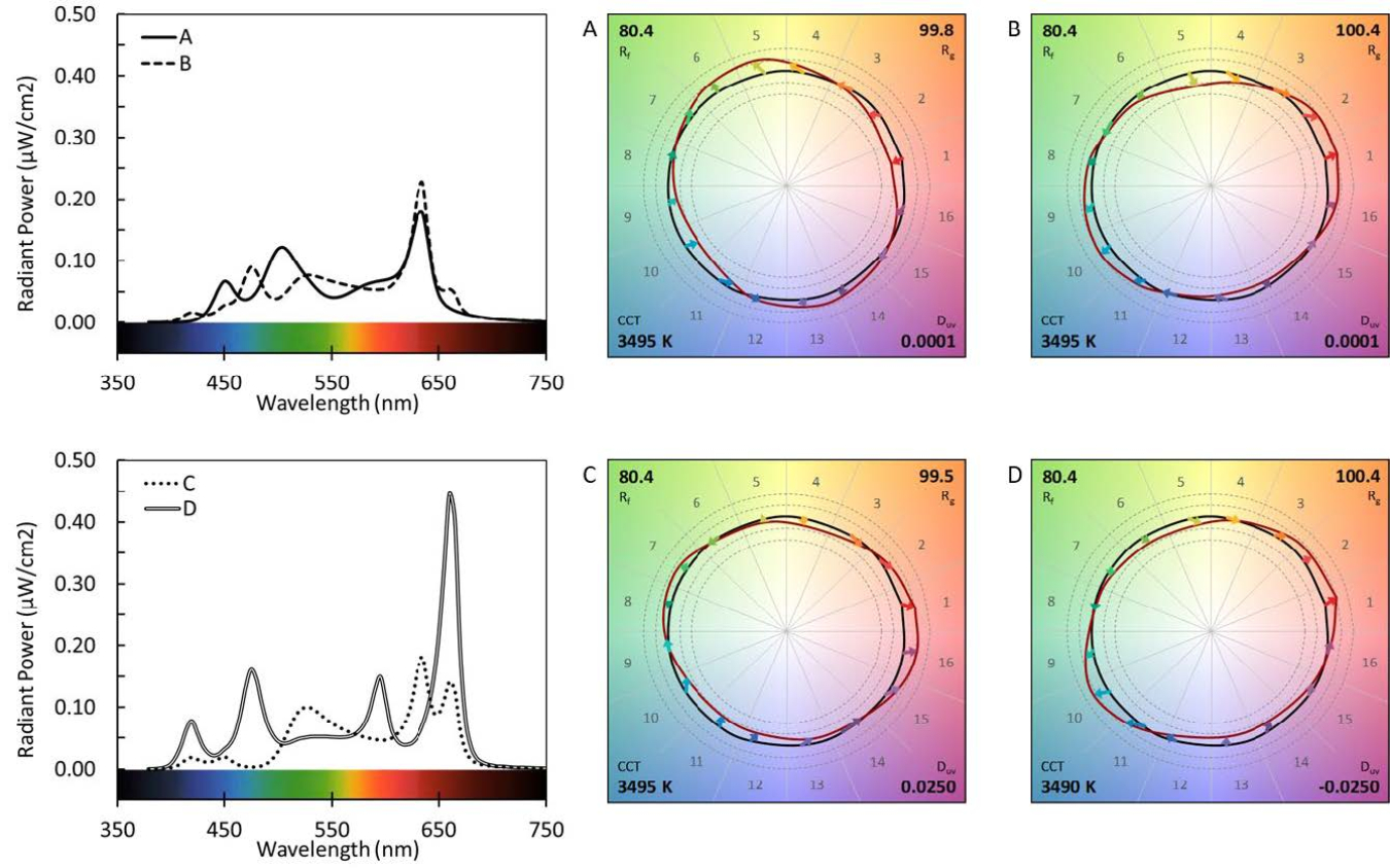
A useful practical distinction is:
- Correlated colour temperature (CCT) describes whether the overall white light appears relatively warm or cool.
- SPD describes the wavelength-by-wavelength composition of that light.
- Colour rendition describes the resulting interaction between a source’s SPD and the reflected spectrum of objects.
Therefore, specifying only “3000 K” is not enough when material appearance is important. Two 3000 K luminaires can produce noticeably different reds, timber tones, greens, skin tones, and coloured finishes.
[PDF] LED Color Characteristics
Read the U.S. Department of Energy fact sheet LED Color Characteristics for a rigorous explanation of spectral power distribution and colour rendition.
Begin with the SPD explanation. The important point is that visually similar white sources can have different spectral compositions. In the “Color Rendition” section, read the explanation beginning with different rendering outcomes. This explains why the same apparent light colour does not guarantee the same material appearance. Then read the three colour-rendition priorities. Focus on the difference between fidelity, preference, and discrimination rather than treating colour quality as a single score.
Use colour metrics as evidence, not a substitute for seeing materials
CRI, usually given as , is an average measure of colour fidelity relative to a reference source. It remains common in schedules, but it is not a complete predictor of material appearance. Two luminaires with the same CRI may differ in the specific hues they shift or desaturate.
For concept-stage material decisions, use this hierarchy of evidence:
- CCT and chromaticity consistency establish the intended family of white light and reduce visible mismatch between fittings.
- CRI provides a basic screening measure, but should not be the sole criterion for colour-critical materials.
- TM-30 information, where available, gives richer evidence. Its value indicates average fidelity, while indicates average gamut, or relative saturation. Its colour-vector graphic helps reveal which hue families shift.
- A physical mock-up remains decisive. Place the actual material sample under the proposed source, at the intended mounting geometry and dimming level, alongside adjacent materials.
A warm CCT may support a residential timber palette, but it does not guarantee that every timber stain will look rich or natural. A high CRI value may support a good preliminary choice, but it does not guarantee that a deep red textile, green stone, or skin tone will appear as intended. The material sample, source spectrum, beam direction, and surrounding finishes must be assessed together.
A material-by-material prediction method
For every visually important finish, write a short prediction before selecting the final lighting treatment. The point is to expose assumptions early enough to test them.
| Material condition | Likely visual response | Suitable lighting intention | Risk to check |
|---|---|---|---|
| Pale matte plaster | Broad diffuse reflection; increases perceived brightness; supports soft ambient bounce | Calm volume, luminous ceiling or wall, quiet background | Over-lighting can flatten the architecture and make the space feel visually blank |
| Dark rough stone or brick | Absorbs substantial light; relief becomes dramatic under grazing | Weight, tactility, threshold, crafted identity | Excessive grazing can create harsh contrast and reveal undesirable construction variation |
| Polished stone or lacquer | Reflects discrete bright sources and views; character changes strongly with viewpoint | Controlled sparkle, visual depth, precise emphasis | Reflected glare, bright downlight images, loss of visual clarity |
| Timber with visible grain | Grain and stain respond to spectrum and directional light; a darker timber limits bounce | Warmth, scale, craft, acoustic or spatial rhythm | Uniform frontal light can make grain appear flat; poor spectrum can make stains look dull or shifted |
| Brushed or perforated metal | Directional highlights reveal orientation, pattern, and fabrication | Rhythm, precision, luminous contrast | Uncontrolled highlights can fragment the visual field or cause glare |
| Translucent stone, fabric, resin, or screen | Transmission and internal scattering may create a glow; thickness changes the effect | Identity feature, soft separation, luminous object | Hot spots, visible source images, colour inconsistency, insufficient access for maintenance |
| Glass and mirrors | Primarily show reflected scene and source positions rather than their own surface colour | Depth, visual extension, controlled reflection | Bright reflected apertures, poor night views, unwanted visibility across glazing |
For each material, make four statements:
- Target character: What should the material feel like: quiet, tactile, weighty, polished, soft, luminous, or recessive?
- Lighting direction: Should light reveal texture, suppress texture, create a highlight, or produce a diffuse field?
- Spectral requirement: Is ordinary colour rendering sufficient, or is colour-critical evaluation needed?
- Failure condition: What would make the outcome unsuccessful: glare, flatness, dullness, excessive contrast, visual clutter, or a mismatch with adjacent finishes?
For example:
Material: honed green stone at a reception counter.
Target character: deep and refined, with limited sparkle rather than mirror-like reflections.
Lighting direction: soft directional light that reveals the plane without producing bright reflected images in the visitor’s approach view.
Spectral requirement: review the actual stone under the proposed source because green appearance can vary with spectrum.
Failure condition: a visible reflection of a downlight aperture makes the counter appear glossy, fragmented, and uncomfortable to look toward.
Notice how this statement connects material behaviour to the hierarchy work already completed. The counter is not lit because stone “needs light”; it is lit to have a controlled role in the arrival experience.
Make material sampling part of concept development
Before finalizing a material-and-light relationship, conduct a focused mock-up review. It need not begin as a full-scale room installation. Even a well-controlled sample review can identify the principal risks.
Review the actual sample under the intended source while changing:
- Viewing angle: approach, standing, seated, and oblique views.
- Lighting angle: frontal, oblique, grazing, and indirect conditions where relevant.
- Light level: full output and likely scene levels after dimming.
- Adjacent materials: especially the finishes that may create unwanted reflected images or colour contrast.
- Daylight condition: if the material sits near glazing, compare day and night conditions rather than approving it solely under artificial light.
Record observations in perceptual language as well as technical language. “The wall has 150 lux” is a measurement; “the stone reads flat from the arrival route and becomes visually noisy at close range” is a design finding. Both are useful, but only the second directly tests the concept.
Key takeaways
Material character is not an afterthought applied once luminaires have been selected. It is a central part of lighting concept development.
- Reflectance and LRV help predict how much light a surface returns to the room. High-value ceilings and walls support ambient bounce; dark finishes absorb light and require more deliberate hierarchy.
- Gloss creates directional specular reflections. A glossy material may reflect a bright source into the eye even when its own colour appears dark.
- Texture becomes visible through directional light and shadow. Grazing reveals relief; frontal light generally subdues it.
- Source spectrum and material reflectance work together to determine apparent colour. Similar CCTs do not guarantee similar rendering.
- CRI is only a starting point. Where material colour matters, use fuller colour-rendition information where available and verify the actual palette in a mock-up.
- For every critical material, define its intended character, lighting direction, spectral sensitivity, and likely failure condition.
In the next lesson, you will use these material predictions alongside hierarchy, comfort, adaptability, energy, and maintenance criteria to critique and refine a lighting concept before it becomes a fixed design decision.
Can't find a good explanation? Sign up and we'll make it for you
Sign up