
Hello! Welcome to the fourth lesson in our module on Applying Choice Architecture Ethically.
In our last lesson, we focused on designing ethical feedback mechanisms, exploring the line between helpful guidance and manipulation. We discussed how feedback can empower users by helping them understand the immediate and long-term consequences of their actions.
Today, we will deliberately cross that line to examine its dark side. Our learning outcome is to identify and deconstruct common 'dark patterns' that exploit decision-making biases unethically. As a product designer, understanding these manipulative practices is crucial—not to use them, but to recognize them, avoid them, and advocate for more transparent and user-respecting design within your teams and organizations.
1. What are Dark Patterns?
The term "dark patterns" was coined by UX specialist Harry Brignull to describe interfaces intentionally crafted to trick users into doing things they didn't mean to do. These aren't just mistakes or bad design; they are built on a sophisticated understanding of human psychology, deployed for business benefit at the user's expense.
To see this in action, let's start with a video that gives a powerful and memorable introduction to the concept.
How Dark Patterns Trick You Online
The video 'How Dark Patterns Trick You Online' by Nerdwriter1 offers an excellent introduction to this topic. It provides a clear definition and uses the powerful example of trying to delete an Amazon account to illustrate one of the most infamous dark patterns.
Please watch the video from the beginning until the timestamp 03:17. Pay close attention to how the Amazon user flow makes a simple task incredibly difficult (a 'Roach Motel') and how the other examples use visual tricks like color and contrast to mislead the user.
As the video demonstrates, dark patterns often work by creating excessive cognitive load (the Amazon example) or by exploiting our automatic, System 1 thinking processes. The email unsubscribe link that's hard to see and the game that switches its button colors are designed to bypass your deliberate, analytical thought and rely on you making a quick, reflexive error.
2. A Typology of Deception
Designers and researchers have identified and categorized many common dark patterns. Having a mental library of these patterns makes them easier to spot.
Here are two visual summaries that categorize some of the most frequent offenders. Your experience in UX will likely make many of these feel uncomfortably familiar.
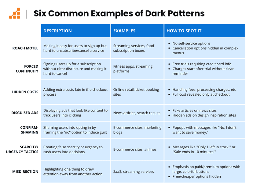
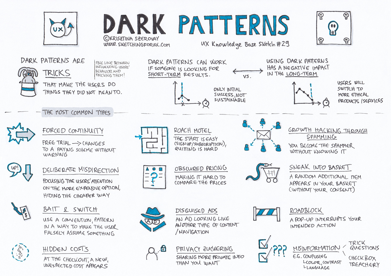
The second image makes a point that directly connects to our previous lesson: these tactics may boost a metric in the short term (e.g., higher conversion, lower churn), but they erode user trust and damage brand reputation in the long term. A successful "trick" today often leads to a lost customer tomorrow.
3. Deconstructing a Dark Pattern: A Case Study
Identifying a single dark pattern is one thing; deconstructing how multiple patterns are woven together into a manipulative user flow is another. This requires a designer's eye for detail.
The following article is a meticulous, screen-by-screen breakdown of how the author, a UX designer, was tricked into a paid subscription for Evernote. It’s a masterclass in the kind of deconstruction we're aiming for.
The elegant deception of UX. How the subtle use of dark patterns…
In 'The elegant deception of UX,' designer Josh Andrus documents his own experience with Evernote's onboarding. He calls this 'Elegant Deception' because it's not just one trick, but a series of subtle, carefully designed steps.
Please read the full article. As you read, focus on how the author identifies and names specific dark patterns (like Misdirection, Confirmshaming, and Roach Motel) at each step of the user flow. Notice how visual design choices (color, font size, button placement) and copywriting are used to create confusion and fatigue, ultimately leading the user to make an unintended purchase.
This case study is powerful because it shows how a company can adhere to the letter of platform rules (e.g., Apple's confirmation screen) while violating their spirit. The designer's intent was clearly not to help the user make an informed choice, but to guide them into a conversion through a path of maximum confusion.
4. The Psychology Behind the Deception
To truly deconstruct these patterns, we must connect them to the cognitive biases they exploit. A dark pattern is the "what"; the cognitive bias is the "why" it works. Throughout this course, we've covered many of these biases. Now let's see them weaponized.
The article below provides an excellent summary of the specific psychological principles that manipulative designs prey on.
About Cognitive Biases, Dark Patterns (Deceptive Design) and UX ...
The article 'About Cognitive Biases, Dark Patterns...' by Luiza Jarovsky explicitly connects the dots between specific biases and their application in deceptive design.
You don't need to read this entire article right now, but I want you to review the list of biases from '1. Anchoring bias' through '7. Optimism bias'. For each one, think about how it might have been used in the Evernote case study or the Nerdwriter video. For example: Confirmshaming in the Evernote flow leverages Loss Aversion by framing the free option as a loss. The urgency notifications on Booking.com (from the Nerdwriter video) exploit Scarcity. Clicking 'I accept' to get immediate access to a service is a classic example of Hyperbolic Discounting.
As the article concludes, this gives immense power to designers. You are in a position to either exploit these predictable "bugs" in human cognition for corporate gain or to design systems that account for them and protect the user's autonomy and best interests.
5. Education vs. Manipulation
This brings us to the fundamental ethical question: where is the line? All design influences behavior. A well-designed call-to-action persuades a user to click. When does persuasion become unethical manipulation?
The answer often comes down to intent and consent.
How Brands Use Design & Marketing to Control Your Mind
The video 'How Brands Use Design & Marketing to Control Your Mind' explores a wide range of persuasive techniques. Its conclusion offers a remarkably clear and practical framework for distinguishing between ethical education and unethical manipulation.
Please watch the final main section of the video, from 34:00 to 36:42. The speaker provides a simple, powerful definition to help you check your own behavior as a designer.
The distinction offered in the video is a vital one for any designer:
- Educating: Influencing someone for their benefit with their consent.
- Manipulating: Influencing someone for your benefit without their consent.
When you look back at the Evernote example, it's clear the user did not give informed consent to a process designed to confuse them into a purchase. The design was for the company's benefit, not the user's. This simple framework can serve as a powerful ethical compass.
Conclusion
In this lesson, we moved from theory to the often-uncomfortable reality of unethical design. We've seen that dark patterns are not accidents but deliberate choices that leverage a deep understanding of psychology to mislead users.
Key Takeaways:
- Dark Patterns are interfaces intentionally designed to trick users, exploiting cognitive biases for business gain.
- Common patterns include Roach Motel, Confirmshaming, Forced Continuity, and Misdirection. Recognizing and naming them is the first step to combating them.
- Deconstruction involves analyzing a user flow screen-by-screen to see how visual design, copy, and interaction patterns work together to manipulate the user.
- These patterns are effective because they exploit predictable biases like loss aversion, scarcity, and hyperbolic discounting.
- The ethical line often lies between education (influencing for the user's benefit, with consent) and manipulation (influencing for your benefit, without consent).
Next Up
We have now explored how to build helpful feedback loops and how to deconstruct harmful dark patterns. You have seen both the positive and negative potential of choice architecture. In our final lesson, we will synthesize everything we've learned. The goal will be for you to develop a personal ethical framework for applying psychological principles in your design practice, giving you a proactive tool to guide your work and lead your teams toward more ethical, user-centered outcomes.
Can't find a good explanation? Sign up and we'll make it for you
Sign up