
Hello! Welcome to the third module of our course.
In the previous two modules, we built a strong foundation in Excel. We learned how to import, clean, and structure financial data, and then we used that data to create a variety of essential financial charts, from line charts for trends to waterfall charts for P&L analysis.
Now, we're going to take a significant step forward by transitioning from Excel to Power BI. While Excel is a versatile spreadsheet tool, Power BI is a dedicated Business Intelligence (BI) tool designed specifically for data analysis and interactive visualization. It will allow us to create the kind of dynamic, professional-looking financial dashboards you're aiming for.
In this first lesson, our goal is to navigate the Power BI Desktop interface, including the Canvas, Fields, and Visualizations panes. Think of this as an orientation session. Before we start building, we need to get familiar with our new workshop and learn where all the tools are kept.
1. What is Power BI?
Power BI is a collection of software services, apps, and connectors that work together to turn your unrelated sources of data into coherent, visually immersive, and interactive insights. For your goal of creating financial market visualizations, it offers a much more powerful and flexible platform than Excel.
To start, let's get a clear definition of Power BI's main components.
Power BI Tutorial for Beginners
This brief introduction from DataCamp explains the three main elements of the Power BI ecosystem. We will be focusing on the first one: Power BI Desktop.
Please read the section titled 'What is Power BI?' to understand the roles of Power BI Desktop, the Power BI Service, and the mobile apps.
Now, let's watch a short video that provides a high-level overview of what Power BI is used for.
Your first 10 minutes of Power BI - A no-nonsense getting started tutorial for beginners
This clip from the channel 'Chandoo' gives a quick, no-nonsense summary of what Power BI is and the kinds of analysis it enables.
Watch the video from 00:49 to 01:31. Notice how it emphasizes connecting to various data sources to perform analysis and create visualizations.
2. Installing Power BI Desktop
Our journey begins with Power BI Desktop. This is the free application you'll use to connect to data, transform it, and design your reports. Once a report is built, you can then publish it to the Power BI Service to share it.
You can install the application on your computer now.
Get started with Power BI Desktop
This official guide from Microsoft explains the installation process. It's recommended to install from the Microsoft Store, as this ensures you receive automatic monthly updates.
Read the section 'Install Power BI Desktop' and follow the steps to install the application on your machine. Once installed, open it. You may see a welcome screen, which you can close to get to the main interface.
3. A Guided Tour of the Interface
With Power BI Desktop open, you'll see a blank report. It might look a bit intimidating at first, but the layout is quite logical. We can break it down into a few key areas.
The image below provides a map of the main components we will be discussing.
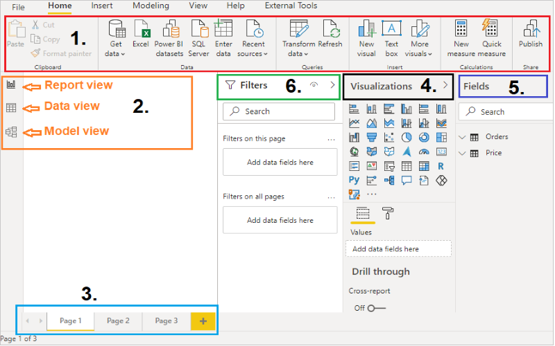
Let's go through each of these areas one by one.
Key Components of Power BI Desktop
-
1. The Ribbon: Similar to Microsoft Excel, the ribbon at the top gives you access to a wide range of tools and options. These are grouped into tabs like
Home,Insert,Modeling, andView. We'll use theHometab frequently to get data and theInserttab to add elements like text boxes or shapes. -
2. The Views: On the left-hand side, you'll see three icons that let you switch between different views:
- Report View (default): This is where you'll spend most of your time. It's the design surface, or Canvas, where you build your visualizations.
- Data View: This view lets you see the data in your tables, much like looking at a sheet in Excel. It's useful for inspecting your data after it has been imported.
- Model View: This view shows you all the tables in your data model and the relationships between them. This becomes crucial when you start working with multiple data sources (e.g., a table of stock prices and a separate table of company information).
-
3. The Canvas: This is the large, blank, dotted area in the center. It's where you will add, arrange, and design the charts, tables, and other visuals that make up your report.
-
4, 5, & 6. The Panes: The panels on the right-hand side are where most of the report-building action happens. By default, you'll see three main panes:
- Fields Pane (5): Once we load data, this pane will list all the available tables and their columns (or "fields"). To build a chart, you'll drag fields from this pane onto the canvas or into the Visualizations pane. It's currently empty because we haven't loaded any data yet.
- Visualizations Pane (4): This is your palette of chart types. You can select an icon (e.g., bar chart, line chart, pie chart) to add a visual to the canvas. Below the icons, there are "wells" (like
X-axis,Y-axis,Legend) where you place your data fields to configure the selected visual. - Filters Pane (6): This pane allows you to add filters to your report. You can filter data for a single visual, for an entire page, or for all pages in the report.
To solidify this, let's quickly review these components in a short text and then see them in a video walkthrough.
Power BI Tutorial for Beginners
This summary from DataCamp provides a concise description of each component we've just discussed.
Read the bulleted list under the diagram that describes the Ribbon, Views, Canvas, and Panes. This will help reinforce the terminology.
Now, let's see these areas in a live demonstration.
Your first 10 minutes of Power BI - A no-nonsense getting started tutorial for beginners
Watching someone navigate the interface is the best way to see how these parts work together. This video provides a clear walkthrough.
Watch from 02:12 to 03:29. The presenter does an excellent job of breaking the screen down into the ribbon, the canvas, and the right-hand side panels (which we know as the Panes).
Test your understanding!
Imagine you have just imported financial data into Power BI. You want to create a line chart showing a stock's price over time. Based on what you've just learned, match the action to the correct interface component.
Actions:
- Find the column containing the stock prices.
- Select the 'line chart' type.
- See the final, rendered chart.
Components:
A. The Canvas
B. The Fields Pane
C. The Visualizations Pane
Show answer
- Find the column containing the stock prices: You would do this in the (B) Fields Pane.
- Select the 'line chart' type: You would do this in the (C) Visualizations Pane.
- See the final, rendered chart: This would appear on (A) The Canvas.
Conclusion
In this lesson, we made the pivotal move from Excel to Power BI and took a thorough tour of our new environment. You should now be able to identify and understand the purpose of the key areas in the Power BI Desktop interface.
Key Takeaways:
- Power BI Desktop is the primary tool for designing and building interactive reports.
- The interface is structured into three main areas: the top Ribbon for tools, the left-side Views for switching context (Report, Data, Model), and the right-side Panes for building visuals.
- The core report-building workflow involves the Fields pane (to access your data), the Visualizations pane (to choose and configure a chart), and the Canvas (where the report comes to life).
We now have our bearings. In the next lesson, we'll put this knowledge into practice. We will learn how to connect to and import financial data from an Excel file into Power BI. This will populate the Fields pane and allow us to build our very first visual.
Can't find a good explanation? Sign up and we'll make it for you
Sign up