Hello! Welcome back.
In our last two lessons, we covered Flexbox and CSS Grid, which are the primary tools for managing the overall layout and flow of content on a page. You learned how to arrange items in one dimension (Flexbox) and two dimensions (Grid), much like using Auto Layout and Layout Grids in Figma.
Today, we're going to explore a different aspect of layout: the CSS position property. While Flexbox and Grid are about arranging elements within the normal flow of the document, the position property allows you to take elements out of that flow to place them in very specific locations. This is how you achieve effects that are common in UI design, like modal overlays, dropdown menus, and headers that stay fixed at the top of the screen.
The learning outcome for this lesson is to position elements using static, relative, absolute, and fixed positioning for specific use cases like overlays or fixed headers.
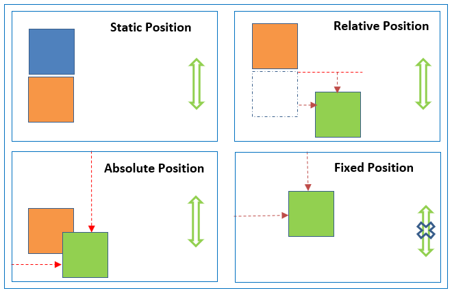
Let's start with a quick visual overview of the main positioning types we'll discuss.
1. The Starting Point: position: static
Every HTML element, by default, has position: static. This simply means it follows the normal document flow—block elements take up their own line, inline elements sit next to each other, and everything is arranged by the rules of Flexbox or Grid if they are inside such a container.
With static positioning, the offset properties top, bottom, left, right, and the layering property z-index have no effect.
Let's watch a quick explanation of this default behavior.
In his video "CSS position deep dive," Kevin Powell starts by explaining the default static position. This short segment will confirm your understanding of the normal document flow.
Watch from 01:43 to 02:54. Note that position: static is the default and that offset properties do not apply to it.
2. position: relative - Nudging and Anchoring
The first step away from the default is position: relative. This property is interesting because it does two very important things.
-
Nudging an Element: It allows you to use
top,left,bottom, andrightto move an element relative to its original position in the normal flow. Crucially, the space the element would have occupied is still reserved. Other elements are not affected and don't reflow to fill the gap. This is useful for small visual tweaks. -
Creating a Positioning Context: This is its most common and important use. An element with
position: relativebecomes an "anchor" or a "containing block" for any descendant elements that haveposition: absolute. We'll see exactly why this is so important in the next section.
Let's continue with Kevin Powell's video to see how position: relative works. He demonstrates how it offsets an element while preserving its original space.
Watch from 02:54 to 05:37. Pay close attention to how the element moves, but the space it came from remains empty. Also, notice the introduction of z-index, which controls the stacking order of positioned elements.
3. position: absolute - Breaking Out of the Flow
This is where things get powerful. When you give an element position: absolute, it is completely removed from the normal document flow. The space it occupied vanishes, and other elements reflow to fill it.
An absolutely positioned element is then positioned relative to its nearest positioned ancestor. A "positioned ancestor" is any parent element whose position is set to relative, absolute, fixed, or sticky. If no positioned ancestor is found, it defaults to being positioned relative to the initial containing block (essentially, the <html> element).
This is why position: relative is so critical. The most common pattern in CSS is to have:
- A parent element with
position: relative(often with no offset properties). This element stays in the normal flow and acts as an anchor. - A child element with
position: absolute. This child can now be precisely placed anywhere inside its parent usingtop,left, etc.
This pattern is fundamental for creating UI elements like:
- An icon positioned in the corner of an input field.
- A "New!" badge on a product card.
- A custom dropdown menu that appears below a button.
- A modal overlay that covers the page.
Kevin Powell's deep dive on position: absolute is excellent. It clearly explains how the element is removed from the flow and how the position: relative parent acts as its containing block.
Watch from 05:37 to 13:42. This is a longer segment, but it's crucial. Focus on: How the content reflows when an element becomes absolute. The difference between being positioned relative to the viewport vs. a parent with position: relative. How an absolutely positioned element's size changes to fit its content.
4. position: fixed - Sticking to the Viewport
position: fixed is very similar to absolute in that the element is removed from the normal document flow.
The key difference is that a fixed element is always positioned relative to the browser viewport. It does not move when the user scrolls the page.
This is perfect for UI elements that need to be persistently visible, such as:
- A site-wide header or navigation bar.
- A "cookie consent" banner at the bottom of the screen.
- A "Scroll to Top" button.
Now let's look at position: fixed. This segment explains its behavior and common use cases, like a fixed header.
Watch from 13:42 to 18:41. Note how the element stays in place during scrolling. Also, observe the common issue where content gets hidden underneath the fixed element because it's been removed from the document flow.
5. A Modern Hybrid: position: sticky (Bonus)
While not in the learning outcome's title, position: sticky is a modern and extremely useful value that you will encounter. It's a hybrid of relative and fixed.
An element with position: sticky behaves like a relative element until it scrolls to a certain point in the viewport (defined by top, bottom, etc.). Once it hits that threshold, it "sticks" and behaves like a fixed element.
This is the modern way to create a fixed header. It allows the header to be part of the initial page flow (solving the problem of content hiding underneath it) but then stick to the top once you scroll past it.
To round out your knowledge, let's look at position: sticky. It's the best of both worlds and solves many common layout challenges.
Watch from 18:41 to 24:35. See how sticky elegantly solves the fixed header problem without needing to add extra margin or padding to the content below it.
6. Tying It All Together: A Practical Example
Watching the concepts is one thing; seeing them used to build a real component is another. The following reading material walks through building a dropdown navigation menu, a perfect practical application of position: relative and position: absolute.
The "Advanced Positioning Tutorial" from Interneting Is Hard provides a fantastic, step-by-step guide to building a common UI component. This will solidify your understanding of how these properties work together.
Read the sections on (Relatively) Absolute Positioning, (Relatively) Absolute Submenus, and the Summary. Focus on how position: relative is applied to the parent list item (.dropdown) to act as an anchor for the absolutely positioned submenu (.features-menu).
Conclusion
Excellent work! You've now learned how to step outside the normal document flow to precisely control element placement. This is a critical skill for translating complex UI designs into code. While Flexbox and Grid form the skeleton of your layout, the position property adds the fine-tuned control needed for dynamic and interactive components.
Key Takeaways:
static: The default. Stays in the normal document flow.relative: Can be nudged from its original position, but keeps its space. Its main job is to act as a positioning "anchor" for absolute children.absolute: Removed from the flow and positioned relative to the nearest positioned ancestor. This is the key to creating overlays and layered components.fixed: Removed from the flow and positioned relative to the viewport. It stays in place when the user scrolls.sticky: A modern hybrid that scrolls normally until it hits a threshold, then becomes fixed.
In our next lesson, we will dive into relative units. We've been using pixels (px) for our offsets, but to create truly fluid and responsive designs, we'll need more flexible units like em, rem, percentages, and viewport units. These will allow our positioned elements to scale gracefully with different screen sizes and user font preferences.