
Hello! Welcome back to our course on analyzing user flows.
In our last lesson, we established a systematic way to deconstruct any user flow into its core components: entry points, steps, decision points, and exits. This gives us the "anatomy" of a user journey.
Today, we'll build on that by learning how to evaluate the quality of that journey. Our learning outcome is to differentiate between high-friction and low-friction user flows using real-world product examples. We'll explore what "friction" means in a UX context, learn that not all friction is bad, and see how to spot it in digital products.
This is a crucial step in moving from simply mapping a flow to diagnosing its weaknesses and strengths.
1. What is Friction?
In physics, friction is a force that resists motion. In user experience, the concept is analogous: friction is anything that prevents a user from smoothly accomplishing their goal. It's the resistance they feel, the moments that make them pause, think, or struggle.
A "low-friction" flow feels effortless, while a "high-friction" flow feels difficult or cumbersome. However, the goal isn't always to eliminate friction entirely. Sometimes, it's a necessary and even helpful part of the design.
To understand this distinction, let's start with a great physical analogy.
Designing for Friction and Flow in Customer Journeys
This video from the Nielsen Norman Group uses a simple, non-digital example—a pill bottle versus a blister pack—to introduce the core concepts of low-friction flow and high-friction design. It clearly illustrates why friction isn't inherently negative.
Please watch the entire video (it's short, under 3 minutes). Pay close attention to the distinction it makes between friction that helps the user (positive friction) and friction that serves only business goals (negative friction).
2. Positive vs. Negative Friction
As the video demonstrated, we can categorize friction into two broad types:
-
Positive Friction (or "Good Friction"): This is friction that is intentionally designed into a flow to help the user. It slows them down for a good reason, such as preventing errors, ensuring safety, or encouraging thoughtful decisions.
- Example from video: The blister pack makes it harder to take many pills at once, reducing the risk of overdose.
- Example from video: The "Do you want to save your changes?" dialog prevents you from losing work. This is a classic example of protective friction.
-
Negative Friction (or "Bad Friction"): This is the friction that gets in the user's way without providing any value to them. It's the result of poor design, confusing interfaces, or business goals that conflict with user goals. It leads to frustration, abandonment, and a poor overall experience.
- Example from video: A budget airline inserting multiple upsell screens for seat selection and insurance before you can complete your booking.
The Shopify Partners blog has a great article that further clarifies this distinction and provides a list of common causes of negative friction.
Frictionless Experience: How to Create Smooth User Flows
This article, 'Frictionless Experience: How to Create Smooth User Flows,' provides a solid definition of positive and negative friction with more digital examples.
Please read the section 'What is friction?' and the subsection 'Negative and positive friction'. This will reinforce the concepts from the video with examples like the macOS delete confirmation and Gmail's attachment reminder.
3. A Deeper Framework: The Hierarchy of Friction
Now that we can distinguish between "good" and "bad" friction, we can add more nuance. Not all friction is created equal. Some friction is about the interface clicks, some is about mental effort, and some is about emotions.
This framework is incredibly useful for analysis because it helps you pinpoint the type of problem you're seeing.
The Hierarchy of User Friction
The article 'The Hierarchy of User Friction' by Sachin Rekhi proposes a powerful model that categorizes friction into three levels. This will give you a more sophisticated lens for analyzing user flows.
Please read the article from the beginning down to the end of the 'Emotional Friction' section. As you read, focus on understanding the definitions and examples for each of the three levels: Interaction, Cognitive, and Emotional friction.
Let's summarize that hierarchy:
- Interaction Friction: Friction from the UI itself. This is the most tangible level and relates to the effort of physically interacting with the product.
- Examples: Too many clicks, slow page loads, hard-to-find buttons, long forms.
- Cognitive Friction: The mental effort required to use the product. This is about how much a user has to think.
- Examples: Unclear labels, inconsistent design patterns, complex information architecture, having to remember information from a previous screen.
- Emotional Friction: The feelings that prevent a user from completing a goal. This is the most subtle but often most powerful type of friction.
- Examples: Fear of making an irreversible mistake, anxiety about cost, feeling of being judged, pressure to perform.
Thinking about a problem like "high sign-up abandonment" through this lens allows for a more precise diagnosis. Is it because the form is too long (Interaction), the value proposition is unclear (Cognitive), or because users are afraid to commit their personal data (Emotional)?
4. Identifying Friction in Digital Products
With this framework, let's look at how to spot friction—and the lack of it—in real user flows.
Creating Low-Friction Flows
Your work as a UI/UX designer is often focused on proactively designing low-friction experiences. The following video frames this as "thinking like a product designer" by considering the entire flow, not just individual, polished screens.
Stop Making Pretty UIs. Think Like a Product Designer
This video, 'Stop Making Pretty UIs. Think Like a Product Designer,' offers concrete examples of design decisions that lead to low-friction experiences.
Please watch from 01:01 to 04:34. Notice how the presenter connects concepts like handling all user states (empty, loading), building for sequences, and using design systems directly to creating an effortless, low-friction experience.
As the video shows, low-friction design is about:
- Anticipating user needs: Providing clear feedback for loading, success, and error states reduces cognitive load.
- Thinking in sequences: Chaining steps logically, like Notion prompting for team members after creating a team space, makes the flow feel natural.
- Ensuring consistency: A strong design system makes the UI predictable, which reduces the mental effort needed to navigate it.
Spotting High-Friction Points
Now, let's practice identifying friction.
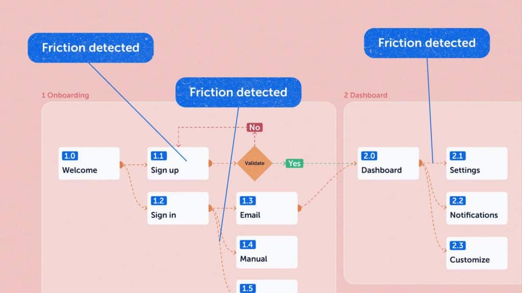
Look at the three points labeled "Friction detected":
- Sign up: What kind of friction might exist here? It could be interaction friction (too many fields) or emotional friction (asking for credit card details too early).
- Validate: This could be a source of cognitive friction. Perhaps the validation instructions are unclear, or the email takes too long to arrive, causing uncertainty.
- Dashboard → Settings: This suggests interaction friction. The path to Settings might be hidden or require too many clicks.
Now consider this flow for user registration.
-CnO6d7lLv6o-1080p-1654225304596+2.webp)
Can you identify a point of positive friction in this diagram?
The "Is password strong?" decision point is a perfect example. It adds a step and a potential loop (interaction friction) if the password is weak. However, this friction is positive because it serves the user's need for security. The friction is a trade-off for a clear benefit.
Conclusion
Today we moved from deconstructing flows to evaluating them. You now have a robust framework for identifying and categorizing friction, which is the first step toward diagnosing and solving usability problems.
Key Takeaways:
- Friction is any resistance a user encounters while trying to achieve a goal.
- Flows can be low-friction (effortless) or high-friction (difficult).
- Friction can be positive (intentional and helpful, like a confirmation dialog) or negative (unnecessary and frustrating, like a cluttered interface).
- We can analyze friction on three levels: Interaction (the UI), Cognitive (mental effort), and Emotional (user's feelings).
Next Lesson Preview:
Now that we can identify friction, we'll begin our deep dive into common flow pathologies. In the next lesson, we will focus on one of the most frequent sources of negative friction: data entry and form design. We'll look at specific ways to diagnose and fix problems in forms to create a smoother experience for users.
Can't find a good explanation? Sign up and we'll make it for you
Sign up