
Hello! Welcome to the final lesson of your course on creating financial data visualizations. It's been an incredible journey, from importing your first dataset in Excel to building a fully interactive dashboard in Power BI.
In our last lesson, you learned how to find and develop a compelling narrative from your data. You now have a story. Today, we'll focus on the final, crucial step: telling that story.
Our learning outcome is to present the financial data story using the dashboard, annotations, and commentary. This is where all your work comes together. You'll combine your technical Power BI skills with your knowledge of financial markets and your experience in communication to deliver a presentation that informs, persuades, and drives action.
Let's begin.
1. Answering the "So What?" Question
The single biggest reason data presentations fail is that they present a wall of data but never answer the audience's fundamental question: "So what?" Your audience, especially in a financial context, consists of busy decision-makers. They don't need more data; they need clarity and direction.
A successful presentation anticipates and answers three critical questions that every leader has in mind.
Creating Actionable Financial Dashboards for Impact
To understand why this is so critical, let's start with an article from the Corporate Finance Institute (CFI) that frames this challenge perfectly.
Read the first two sections: 'The “So What?” Problem in Financial Dashboard Design' and 'Three Critical Questions Your Financial Dashboards Must Answer'. As you read, think about your capstone project dashboard. How would you answer these three questions for your intended audience?
As the article highlights, your commentary and the design of your presentation should be laser-focused on answering:
- What are the key takeaways? (The main message)
- What should I focus on? (The priorities)
- Why is this happening and what can we do? (The cause and the action)
Your dashboard provides the evidence, but your commentary delivers these answers.
2. Weaving Your Narrative with Annotations and Commentary
To guide your audience to the answers, you need to transform your dashboard from a passive analytical tool into an active presentation device. The two primary tools for this are annotations and commentary.
- Annotations: These are visual cues—text boxes, dynamic titles, callouts, or strategic use of color—that you add directly to your dashboard. They highlight key findings and provide context, essentially starting the story before you even speak.
- Commentary: This is your spoken narrative. It’s the story you tell that connects the visuals, explains the "why" behind the numbers, and guides the audience to a conclusion.
Let's see a powerful "before and after" example of how simple annotations can completely change the nature of a report.
Telling a Story with Data | Dashboard Build Demo
This video from Maven Analytics demonstrates the entire data storytelling framework, but the final step is the most relevant for us today. Watch how they transform a standard report into a clear narrative.
Watch from 08:47 to 13:03. Pay close attention to the final step (starting at 11:48). Notice how replacing default chart titles like 'Revenue by Month' with descriptive headers like 'How did the region perform in September?' and adding summary text makes the story instantly understandable. This is a powerful form of annotation.
The video shows that a well-placed sentence is often more powerful than the chart itself. Your goal is to make your insights impossible to miss.
To formalize this, let's look at a quick guide on using annotations effectively.
How to Master Data Storytelling in Power BI
The Zebra BI blog has a great summary of best practices for using these elements.
In the 'Optimizing your Power BI dashboards for better storytelling' section, read the subsection titled 'Use annotations and commentary'. It reinforces the idea of adding comments to explain anomalies and provide meaningful context.
3. The Live Presentation: Leveraging Interactivity
Presenting with Power BI has a major advantage over static slides: interactivity. Your experience with organizing events will be useful here; think of a data presentation not as a one-way lecture, but as a guided, interactive session.
Instead of just showing a chart, you can use slicers, filters, and drill-throughs to:
- Answer audience questions on the fly ("What did performance look like for just the tech sector?").
- Deepen your analysis live ("We see an overall drop here. Let's drill through to see which specific assets are responsible.").
- Create a more engaging experience for your audience.
The key is to build these interactive storytelling aids into your dashboard beforehand.
DATA STORYTELLING TIPS for Interactive Power BI Reports // Beginners Guide to Power BI in 2023
This video from Fernan | Power BI demonstrates several techniques for building a dashboard that's ready for an interactive presentation.
Watch from 01:49 to 07:22. You've seen some of these features before, but watch again through the lens of a presenter. Consider how you can use dynamic titles, custom tooltips, and highlighting features to guide your audience's attention and add layers to your commentary during a live presentation.
By embedding these features, your commentary becomes more powerful. You can say, "As you can see, the title updates to show we are now looking only at 2022 data," or "If I hover here, the tooltip gives us a more detailed breakdown." This makes your presentation both a story and a demonstration of a powerful analytical tool.
Test your understanding!
You are presenting a dashboard on portfolio performance. An audience member asks, "You showed that the energy sector underperformed, but was that true for all stocks in that sector?" How could you use Power BI's interactive features to answer this question live, rather than saying "I'll get back to you"?
Show answer
There are a few excellent ways to handle this:
- Use a Slicer: If you have a slicer for 'Sector' on your page, you could simply select 'Energy'. All the visuals on the page, including a table showing individual stock performance, would then filter to show only the energy stocks, revealing if the underperformance was broad-based or driven by one or two bad performers.
- Use Drill-down: If your 'Performance by Sector' chart has a hierarchy (Sector > Stock), you could right-click on the 'Energy' bar and select 'Drill Down'. This would change the chart to show the performance of each individual stock within that sector.
- Use Drill-through: You could have a separate, more detailed page focused on individual stock performance. By right-clicking the 'Energy' bar on your main chart and selecting 'Drill through', you could navigate the audience to this detailed page, pre-filtered for the Energy sector.
4. Putting It All Together: Presenting a Financial Dashboard
Let's walk through a brief, hypothetical presentation using a financial dashboard. Imagine you are presenting this month-end report to a management team.
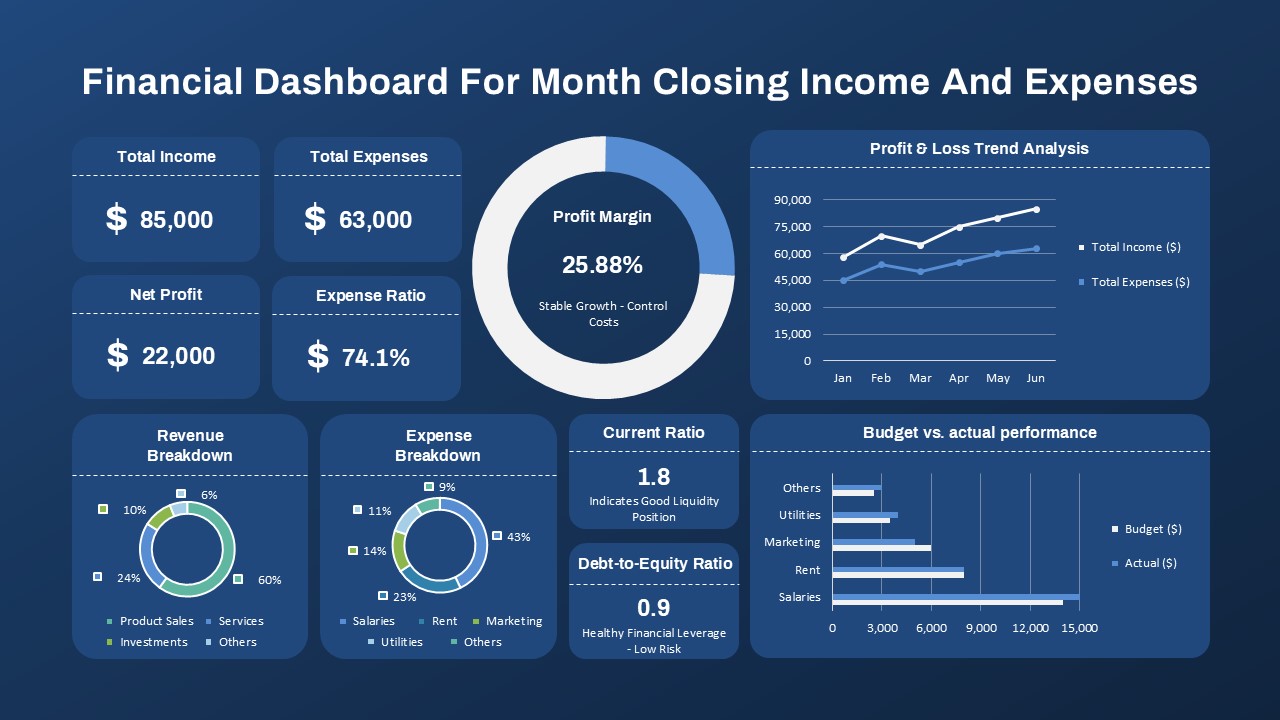
Your commentary might go something like this:
(Start with the key takeaways)
"Good morning. This month, our key takeaway is that while we achieved a healthy net profit of $1.5 million, our expense growth is tracking too closely with our income growth, putting pressure on our profit margin. Our priority needs to be cost control."
(Guide their focus using the visuals)
"As you can see from the KPIs at the top, our 25% profit margin is stable, which is good. However, if you look at the Profit & Loss trend line, you'll see the red expense line is rising almost as steeply as our blue income line. This is the trend we need to address."
(Explain the 'why' and propose the 'what to do')
"So, where are these costs coming from? The 'Expense Breakdown' chart shows that Marketing is our largest category. Now let's look at the 'Budget vs. Actual' performance. Here's the critical insight: we are over budget on Marketing by 15%. This is the primary driver of our rising costs. My recommendation for our next step is to conduct a detailed review of our marketing spend to identify immediate opportunities for optimization."
This short narrative uses the dashboard to tell a story that is clear, focused, and actionable.
Conclusion
Congratulations on completing the final lesson! You have not only learned how to build a dashboard but also how to bring it to life with a compelling story.
Key Takeaways from this Lesson:
- A great presentation answers the audience's three key questions: "What are the takeaways?", "What should I focus on?", and "Why is this happening and what can we do?".
- Use annotations like descriptive titles and text boxes to make your key messages clear directly on the dashboard.
- Use your commentary to connect the visuals, explain the context, and guide your audience to a conclusion.
- Leverage the interactivity of Power BI to create an engaging presentation and answer questions live.
Course Wrap-up
Over the past six modules, you have built a powerful and versatile skill set. You started with the fundamentals of cleaning and organizing data in Excel. You then mastered a wide range of core financial charts before moving into the powerful world of Power BI. You learned to build interactive reports, create advanced dashboards, and finally, to wrap it all in a compelling narrative.
You began this course with the goal "to be able to create nice data visualizations for financial markets." You are now equipped not just to create "nice" visualizations, but to create visualizations that are clear, insightful, and drive decisions.
This is a skill that is highly valued in the world of global financial markets. I encourage you to continue practicing, build your own capstone project based on a topic you're passionate about, and confidently apply what you've learned in your career. Well done
Can't find a good explanation? Sign up and we'll make it for you
Sign up