
Hello! Welcome to the final and most important module of this course: the Capstone Project.
In the last lesson, we wrapped up our tour of Power BI's features by learning how to publish and share a finished report. You now have all the technical skills needed to build a dashboard from start to finish. However, the most successful data visualization projects aren't defined by technical skill alone, but by the strategic thinking that happens before you even import a single row of data.
This lesson marks the beginning of your capstone project by focusing on that critical first step. Our learning outcome is to define the primary audience and key questions for a financial visualization project. We will explore why this planning phase is the foundation of any impactful dashboard and learn a structured process for getting it right. This is the secret to moving from simply creating charts to driving real-world decisions.
1. The Project Lifecycle: Starting with "Why"
Every data analysis project, whether in finance or any other field, follows a lifecycle. A well-designed visualization isn't just a collection of charts; it's the answer to a business need. Professionals often use frameworks to guide this process. One of the most common is the Cross-Industry Standard Process for Data Mining (CRISP-DM).
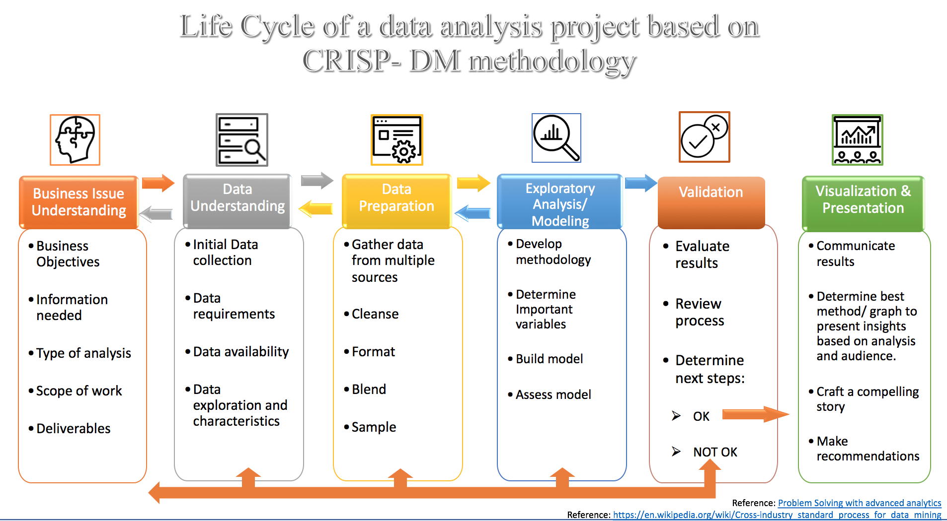
This initial phase is about asking "Why are we doing this?" and "Who is this for?" before you ever consider how you will do it. Getting this right ensures your final product is relevant, useful, and adopted by its intended users.
2. A Mindset Shift: Dashboards as Products
To succeed in this first phase, it's helpful to adopt a new mindset. Stop thinking of a dashboard as a technical report and start thinking of it as a product. This product has a market (your audience) and it must provide value to be successful.
The following video from Nicholas Kelly at Delivering Data Analytics introduces this powerful concept. It explains why so many dashboards fail and how shifting your focus from technology to people is the key to success.
Rapid Requirements Gathering for Business Intelligence and Analytics
Watch this segment from 'Rapid Requirements Gathering for Business Intelligence and Analytics' to understand the crucial mindset of treating dashboards as products for a market of stakeholders and users.
Watch from 05:11 to 09:57. Focus on the idea of a dashboard being a 'product' and the audience (stakeholders and users) being its 'market'. Consider how this changes your approach to building a visualization.
The key takeaway is this: to create a valuable product, you must first understand the needs of your market. This means deeply understanding your audience.
3. Identifying Your Audience and Their Needs
Who is your dashboard for? The answer dictates everything—the metrics you show, the level of detail, the vocabulary you use, and the comparisons you make. A dashboard for a CFO looks very different from one for a sales manager or a portfolio analyst.
Since your goal is to create visualizations for financial markets, let's look at some concrete examples.
Everything an FP&A leader should have on their finance ... dashboard
This article from Cube, 'Everything an FP&A leader should have on their finance ... dashboard', provides excellent, finance-specific examples of how the audience determines the content of a dashboard.
Read the sections '1. Determine the dashboard you need' and the best practice 'Consider your audience.' Pay close attention to the different KPIs listed for a CFO Dashboard, a Profit and Loss Dashboard, and a Cash Flow Dashboard. Notice how the metrics are tailored to the specific responsibilities of each audience.
As the article shows, a CFO is concerned with high-level strategic health (e.g., Working Capital, Cash Runway), while a Profit & Loss dashboard focuses on operational performance (e.g., Revenue streams, Operating Expenses).
We can categorize dashboards by their purpose, which is directly tied to the audience:
- Informational/Strategic (for Executives): High-level, summary metrics to monitor overall business health. (e.g., the CFO dashboard).
- Analytical (for Managers): More detailed data to understand trends and diagnose problems. (e.g., a dashboard for a regional sales manager).
- Exploratory (for Analysts): Granular data with high interactivity for deep-dive analysis.
Understanding which category your dashboard falls into is the first step in defining your project's scope.
4. Defining Key Questions: The "So What?" Test
Once you know your audience, you must define the specific questions your dashboard will answer for them. A common failure of dashboards is that they present data but don't lead to any conclusion or action. They fail the "So What?" test.
An effective dashboard doesn't just show what happened; it helps the user understand why it happened and what they should do about it.
This next resource from the Corporate Finance Institute (CFI) is excellent at framing this. It outlines the three fundamental questions that leaders ask when looking at a financial dashboard.
Creating Actionable Financial Dashboards for Impact | CFI
This article, 'Creating Actionable Financial Dashboards for Impact', explains the 'So What?' problem and outlines the critical questions your dashboard must answer to be truly effective.
Read the sections 'Three Critical Questions Your Financial Dashboards Must Answer' and '1. Define Your Focus Question.' Internalize the three questions leaders ask and think about how they guide the design of a dashboard.
To pass the "So What?" test, your dashboard must be built to answer questions like:
- How is revenue trending against our target?
- Which of our products are driving the most profit?
- Are there any regions or sectors that are underperforming?
- What is the primary cause of our increased operational expenses this quarter?
These questions are specific, measurable, and directly linked to business decisions.
Test your understanding!
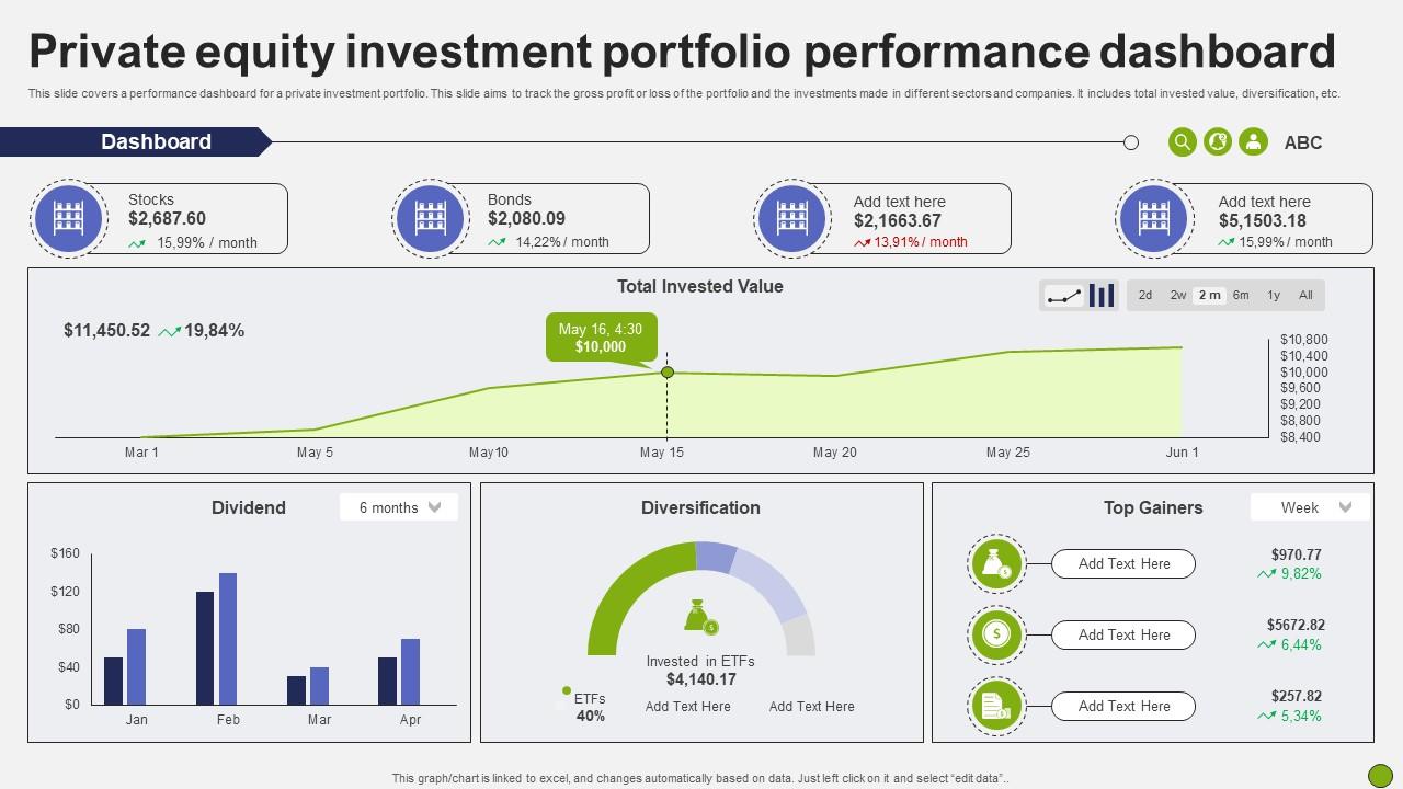
Take a look at the dashboard below. Based on the visuals, identify:
- The likely primary audience.
- At least three specific key questions it is designed to answer.
Show answer
-
Audience: The likely audience is a sophisticated individual investor, a portfolio manager, or a financial advisor who manages a client's private equity investments. The level of detail (asset classes, dividends, diversification) suggests a user who is actively managing their investments.
-
Key Questions:
- What is the total value of my portfolio and how has it changed over time? (Answered by the "Total Invested Value" line chart).
- How is my portfolio allocated across different asset classes like Stocks and Bonds? (Answered by the top-level summary cards).
- Which specific investments are performing best right now? (Answered by the "Top Gainers" table).
- How much income is my portfolio generating through dividends? (Answered by the "Dividend" bar chart).
- Is my portfolio sufficiently diversified? (Answered by the "Diversification" gauge).
5. A Practical Framework: From Goals to Actions
So, how do you put this all together in a structured way? The final video provides a simple but powerful, low-tech framework for connecting high-level business goals to the specific questions and actions your dashboard will support.
This method ensures that every single element you build has a clear purpose.
Rapid Requirements Gathering for Business Intelligence and Analytics
This final segment of the 'Rapid Requirements Gathering' video demonstrates a practical, step-by-step process for defining requirements. It connects a high-level goal to specific questions and actions.
Watch from 21:59 to 27:18. Pay close attention to the chain of logic he builds: Goal -> Question -> Visual -> Action. Although the example is from HR, this framework is universal. Try to imagine applying it to a financial goal, such as 'reduce portfolio risk'.
Let's translate that framework to a financial markets context:
- Goal: Increase portfolio return by 2% without taking on excessive risk.
- Question: Which assets in my portfolio have the highest volatility (risk) relative to their return?
- Visual: A scatter plot showing 'Return' on the Y-axis and 'Volatility' (Standard Deviation) on the X-axis for each asset.
- Action: If an asset shows high volatility but low returns, consider reallocating that capital to a more efficient asset.
By following this process, you create a direct line from a business objective to a data-driven action, with your visualization serving as the crucial bridge.
Conclusion
This lesson laid the strategic groundwork for your capstone project. Before you build, you must plan. The success of your final dashboard will depend heavily on the clarity you establish at this stage.
Key Takeaways:
- Start with Why: Every project begins with understanding the business issue. A dashboard is a tool to solve a problem or answer a question.
- Know Your Audience: The audience is your "market." Their goals, knowledge, and responsibilities dictate your dashboard's content, complexity, and design.
- Ask Actionable Questions: Your dashboard must pass the "So What?" test by providing insights that lead to decisions.
- Use a Structured Framework: Follow the Goal -> Question -> Visual -> Action chain to ensure every element in your dashboard has a clear purpose and contributes to a business objective.
In our next lesson, we will build directly on this foundation. Now that you know how to define the questions you need to answer, we will focus on the next logical step: Identify and source the necessary data for a chosen financial analysis scenario.
Can't find a good explanation? Sign up and we'll make it for you
Sign up