
Welcome back. You now have the core capstone data products: a validated cohort, a directed edge table, an adjacency matrix, and node-level incoming/outgoing summaries, all tied to one materialization version. This lesson turns those tables into figures that let a reader see the cohort’s strongest directed connections quickly, without mistaking visual layout for biological anatomy or uncertainty for connection strength.
Plan for about 40 minutes: 7 minutes on visualization choices, 8 minutes reviewing two compact examples, and 25 minutes building and exporting your own network and heatmap figures.
Decide what the figure must communicate
Your edge table has one row per directed pair:
| source_root_id | target_root_id | synapse_count |
|---|---|---|
| A | B | 18 |
| A | C | 4 |
The central visual claim is therefore precise:
Under the recorded FlyWire materialization and synapse-filtering settings, these are the largest observed cohort-internal synapse counts from presynaptic sources to postsynaptic targets.
A good figure should preserve four things:
- Direction: connecting to is distinct from connecting to .
- Weight: a connection supported by 30 filtered synapses should stand out relative to one supported by 3.
- Selection rule: readers need to know why only some edges appear.
- Provenance: the cohort definition and materialization version remain part of the result, even if they live in a caption or companion JSON file.
Do not make these claims from a weighted edge alone:
- that the source has a stronger physiological effect on the target;
- that the displayed link is certainly complete;
- that node proximity in a force-directed layout represents physical proximity in the brain;
- that a low-count edge is biologically unimportant.
The figure is a compact view of a particular versioned connectivity query, not a full causal circuit model.
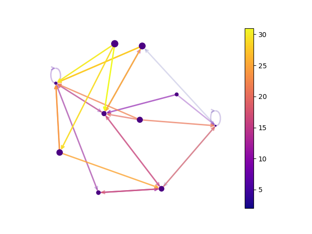
A directed network diagram is useful as the headline figure: it makes prominent connections and reciprocals intuitive. A heatmap is its essential companion: it provides a less ambiguous view of every displayed source-target value.
Two short visual references
The MICrONS tutorial uses a connectivity matrix and emphasizes a convention we will retain: rows are presynaptic neurons and columns are postsynaptic neurons. Its initial example is binary, whereas your cohort matrix remains weighted, so a cell will show a synapse count rather than merely whether a pair is connected.
CAVE Query: Synaptic Connectivity – MICrONs Tutorial
Read the MICrONS Explorer tutorial’s first connectivity-matrix example. It is from a different dataset, but its pivot-table-to-heatmap workflow is directly applicable to the long-form edge table you created.
In the subsection “Plot connectivity as binarized heatmap,” read the matrix construction and first heatmap. Notice that the authors specify both source and target populations before plotting. Their matrix is deliberately binarized; retain the structural convention, but not that loss of weight information, in your own figure.
For the network diagram, NetworkX gives you the right primitives: a directed graph, weighted edges, a reproducible layout seed, and explicit rendering control. The selected video segment demonstrates edge-list construction and compares layouts. Treat layouts as graphical choices, not network findings.
NetworkX Crash Course - Graph Theory in Python
Watch the relevant portion of NeuralNine’s “NetworkX Crash Course - Graph Theory in Python” for the practical mechanics of drawing a graph from an edge list and choosing a layout.
Watch edge list construction to connect the idea of an edge list to a graph object. Then watch layout comparison. For this capstone, use a directed DiGraph and a fixed-seed spring layout; the video’s layout comparison is useful precisely because it shows that one graph can be arranged in several valid visual ways.
Make the edge-selection rule explicit
A cohort can have many nonzero pairs. Drawing every edge tends to produce a “hairball”: technically complete but visually uninformative. Instead, display the top non-autapse directed edges, including all edges tied at the cutoff.
This is a display filter, not a new scientific filter. Your complete cohort_connectivity_edges.csv remains the canonical result.
For a small cohort, begin with . If that produces fewer than roughly 8 visible edges, use all non-autapse edges. If it produces more than about 25 because of ties, retain them but expect the network diagram to become less readable; the heatmap will be especially valuable.
Run the following setup cell. It reloads the files exported in the previous lesson, pins the existing project provenance, and makes readable but still traceable labels. If your validation table has a meaningful annotation column such as cell_type, type, name, or annotation, that label is used alongside the final six digits of each root ID.
from pathlib import Path
import json

import matplotlib.pyplot as plt
import matplotlib as mpl
import networkx as nx
import pandas as pd
import seaborn as sns

output_dir = Path("data/derived")

edge_table = pd.read_csv(
    output_dir / "cohort_connectivity_edges.csv",
    dtype={
        "source_root_id": "string",
        "target_root_id": "string",
    },
)

summary = pd.read_csv(
    output_dir / "cohort_connectivity_node_summary.csv",
    dtype={"root_id": "string"},
)

validation = pd.read_csv(
    output_dir / "cohort_validation.csv",
    dtype={"root_id": "string"},
)

provenance = json.loads(
    (output_dir / "cohort_connectivity_provenance.json").read_text()
)

DATASET = provenance["dataset"]
MATERIALIZATION = provenance["materialization_version"]

assert not edge_table.duplicated(
    ["source_root_id", "target_root_id"]
).any(), "Expected one aggregated row per directed pair."

assert (edge_table["synapse_count"] > 0).all()

# Use an available human-readable annotation if one exists.
primary = validation.loc[
    (validation["decision"] == "included")
    & (validation["analysis_role"] == "primary")
].copy()

label_col = next(
    (
        col for col in ["cell_type", "type", "name", "annotation"]
        if col in primary.columns
    ),
    None,
)

annotation_by_id = (
    primary.drop_duplicates("root_id")
    .set_index("root_id")[label_col]
    .to_dict()
    if label_col is not None
    else {}
)

def display_label(root_id):
    root_id = str(root_id)
    short_id = root_id[-6:]
    annotation = annotation_by_id.get(root_id)

    if pd.notna(annotation) and str(annotation).strip():
        return f"{annotation}\n{short_id}"

    return f"neuron\n{short_id}"

print(f"Dataset: {DATASET}")
print(f"Materialization version: {MATERIALIZATION}")
print(f"Label column used: {label_col or 'none; abbreviated root IDs only'}")
Now apply the display rule. Autapses remain in the canonical edge table, but we exclude them from this particular diagram because self-loops often obscure interactions between distinct cohort members. This convention must be documented in the figure metadata.
TOP_K = 15

candidate_edges = (
    edge_table.loc[~edge_table["is_autapse"]]
    .copy()
    .sort_values(
        ["synapse_count", "source_root_id", "target_root_id"],
        ascending=[False, True, True],
        kind="stable",
    )
    .reset_index(drop=True)
)

if candidate_edges.empty:
    raise ValueError(
        "No non-autapse cohort edges are available for a strongest-connection plot."
    )

n_requested = min(TOP_K, len(candidate_edges))
cutoff = int(candidate_edges.iloc[n_requested - 1]["synapse_count"])

# Include all directed pairs tied at the requested rank boundary.
shown_edges = (
    candidate_edges.loc[
        candidate_edges["synapse_count"] >= cutoff
    ]
    .copy()
    .reset_index(drop=True)
)

shown_edges.insert(0, "display_rank", range(1, len(shown_edges) + 1))
shown_edges["source_label"] = shown_edges["source_root_id"].map(display_label)
shown_edges["target_label"] = shown_edges["target_root_id"].map(display_label)

print(
    f"Requested top {n_requested} directed non-autapse edges; "
    f"cutoff = {cutoff} synapses."
)
print(f"Displaying {len(shown_edges)} edges after including cutoff ties.")

display(
    shown_edges[
        [
            "display_rank",
            "source_label",
            "target_label",
            "synapse_count",
            "source_root_id",
            "target_root_id",
        ]
    ]
)
The displayed table is an important audit artifact in its own right. A figure is easier to interpret when a reader can immediately inspect the ranked pairs behind it.
Build the directed weighted network figure
Create a DiGraph, not an undirected Graph. Each edge receives its observed synapse_count as a weight. The figure uses:
- arrowheads for source-to-target direction;
- edge width and colour for synapse count;
- neutral node styling, so node colour is not accidentally interpreted as a cell class or confidence score;
- curved reciprocal edges, so that connecting to and connecting to do not sit directly on top of one another;
- a fixed layout seed, making reruns visually comparable when the selected graph is unchanged.
# Keep only neurons participating in at least one displayed strong edge.
strong_node_ids = list(
    pd.concat(
        [
            shown_edges["source_root_id"],
            shown_edges["target_root_id"],
        ],
        ignore_index=True,
    ).unique()
)

G = nx.DiGraph()
G.add_nodes_from(strong_node_ids)

for row in shown_edges.itertuples(index=False):
    G.add_edge(
        row.source_root_id,
        row.target_root_id,
        weight=int(row.synapse_count),
    )

# A fixed seed makes this layout reproducible for the same graph.
pos = nx.spring_layout(G, seed=42, weight="weight", k=1.4)

weights = shown_edges["synapse_count"].astype(float)
weight_min = weights.min()
weight_max = weights.max()
weight_span = max(weight_max - weight_min, 1.0)

cmap = plt.colormaps["plasma"]
norm = mpl.colors.Normalize(vmin=weight_min, vmax=weight_max)

def scaled_width(weight):
    return 1.5 + 6.5 * ((weight - weight_min) / weight_span)

fig, ax = plt.subplots(figsize=(10, 8), dpi=180)

nx.draw_networkx_nodes(
    G,
    pos,
    node_size=1600,
    node_color="#d9e5f2",
    edgecolors="#243447",
    linewidths=1.2,
    ax=ax,
)

# Draw one edge at a time so reciprocal pairs curve in opposite directions.
for row in shown_edges.itertuples(index=False):
    curvature = (
        0.18
        if str(row.source_root_id) < str(row.target_root_id)
        else -0.18
    )

    nx.draw_networkx_edges(
        G,
        pos,
        edgelist=[(row.source_root_id, row.target_root_id)],
        width=scaled_width(row.synapse_count),
        edge_color=[cmap(norm(row.synapse_count))],
        arrows=True,
        arrowstyle="-|>",
        arrowsize=20,
        connectionstyle=f"arc3,rad={curvature}",
        min_source_margin=20,
        min_target_margin=20,
        ax=ax,
    )

node_labels = {
    root_id: display_label(root_id)
    for root_id in strong_node_ids
}

nx.draw_networkx_labels(
    G,
    pos,
    labels=node_labels,
    font_size=8,
    font_weight="bold",
    ax=ax,
)

colorbar = fig.colorbar(
    mpl.cm.ScalarMappable(norm=norm, cmap=cmap),
    ax=ax,
    shrink=0.75,
    pad=0.02,
)
colorbar.set_label("Filtered synapse count per directed pair")

fig.suptitle(
    "Strongest directed cohort-internal connections",
    fontsize=14,
    fontweight="bold",
)
ax.set_title(
    f"Top {n_requested} ranked non-autapse pairs, including ties "
    f"at {cutoff} synapses\n"
    f"Dataset: {DATASET}; materialization: {MATERIALIZATION}",
    fontsize=9,
)
ax.axis("off")

fig.text(
    0.5,
    0.02,
    "Arrowheads indicate presynaptic source and postsynaptic target. "
    "Node positions are a layout aid, not anatomical locations.",
    ha="center",
    fontsize=8,
)

fig.tight_layout(rect=(0, 0.05, 1, 0.93))

network_png = output_dir / "cohort_strong_connections_network.png"
network_svg = output_dir / "cohort_strong_connections_network.svg"

fig.savefig(network_png, dpi=300, bbox_inches="tight")
fig.savefig(network_svg, bbox_inches="tight")
plt.show()
Read the result critically before treating it as a final figure:
- Can you identify arrowheads without zooming excessively?
- Are the edge colours and widths visibly ordered?
- Are any reciprocal pairs readable as two separate curved links?
- Does the title state the edge scope and materialization?
- Are labels legible and unique?
If the plot is crowded, first reduce TOP_K to 10. Do not solve crowding by dropping direction or by replacing synapse counts with unlabelled “strength.”
Add a directional heatmap for exact comparison
The network figure is good at communicating the broad pattern. But a force-directed diagram is not ideal for comparing exact values or checking directionality at a glance. A heatmap provides a compact, auditable second view.
In this figure:
- row means presynaptic source;
- column means postsynaptic target;
- a coloured cell contains the exact count for a selected strong edge;
- blank cells mean “not selected for this strongest-edge display,” not “no connection exists.”
# Matrix restricted to nodes and edges shown in the network figure.
strong_matrix = pd.DataFrame(
    0,
    index=strong_node_ids,
    columns=strong_node_ids,
    dtype="int64",
)

for row in shown_edges.itertuples(index=False):
    strong_matrix.loc[
        row.source_root_id,
        row.target_root_id,
    ] = int(row.synapse_count)

# Replace technical IDs with the same labels used in the network diagram.
strong_matrix.index = [
    display_label(root_id) for root_id in strong_matrix.index
]
strong_matrix.columns = [
    display_label(root_id) for root_id in strong_matrix.columns
]

# Mask zero cells because this is a display-filtered matrix.
mask = strong_matrix.eq(0)
annotate_cells = len(strong_matrix) <= 12

fig, ax = plt.subplots(
    figsize=(max(7, len(strong_matrix) * 0.72),
             max(6, len(strong_matrix) * 0.65)),
    dpi=180,
)

sns.heatmap(
    strong_matrix,
    mask=mask,
    cmap="plasma",
    vmin=weight_min,
    vmax=weight_max,
    annot=annotate_cells,
    fmt="d",
    linewidths=0.5,
    linecolor="#eeeeee",
    square=True,
    cbar_kws={"label": "Filtered synapse count"},
    ax=ax,
)

ax.set_title(
    "Selected strongest directed cohort-internal connections\n"
    f"Rows: presynaptic sources; columns: postsynaptic targets; "
    f"cutoff: {cutoff} synapses",
    fontsize=11,
)
ax.set_xlabel("Postsynaptic target")
ax.set_ylabel("Presynaptic source")
ax.tick_params(axis="x", rotation=45)
ax.tick_params(axis="y", rotation=0)

fig.tight_layout()

heatmap_png = output_dir / "cohort_strong_connections_heatmap.png"
heatmap_svg = output_dir / "cohort_strong_connections_heatmap.svg"

fig.savefig(heatmap_png, dpi=300, bbox_inches="tight")
fig.savefig(heatmap_svg, bbox_inches="tight")
plt.show()
The two figures answer slightly different reading tasks:
| Figure | Best for | Main limitation |
|---|---|---|
| Directed network | Seeing major links, direction, reciprocal pairs, and the overall concentrated pattern | Node placement can suggest structure that is purely graphical |
| Directional heatmap | Checking exact source-target weights and asymmetry | Less intuitive as an overview when the cohort is large |
Use the network as the main capstone visual and keep the heatmap beside it in the notebook or appendix. Together they communicate the same data without forcing a reader to infer too much from either representation.
Export the figure inputs and visualization provenance
Exporting the image alone is not enough. Save the exact ranked edge subset and the visual-selection rules, so you or another analyst can reproduce the plot later.
shown_edges.to_csv(
    output_dir / "cohort_strong_connections_edges.csv",
    index=False,
)

visualization_provenance = {
    "dataset": DATASET,
    "materialization_version": MATERIALIZATION,
    "input_edge_table": "data/derived/cohort_connectivity_edges.csv",
    "input_node_summary": "data/derived/cohort_connectivity_node_summary.csv",
    "edge_scope": (
        "Directed cohort-internal edges among the validated primary cohort."
    ),
    "edge_weight": "Filtered synapse count per source-target pair.",
    "selection_rule": (
        f"Rank non-autapse edges by descending synapse_count; "
        f"request top {n_requested}; include all ties at cutoff."
    ),
    "requested_top_k": int(n_requested),
    "displayed_edge_count": int(len(shown_edges)),
    "synapse_count_cutoff": int(cutoff),
    "autapse_handling": (
        "Autapses retained in canonical edge table but excluded from "
        "strongest-connection network and heatmap figures."
    ),
    "network_layout": (
        "NetworkX spring_layout with seed=42 and edge weight supplied "
        "to the layout algorithm; positions are visual only."
    ),
    "network_outputs": [str(network_png), str(network_svg)],
    "heatmap_outputs": [str(heatmap_png), str(heatmap_svg)],
    "selected_edge_output": (
        "data/derived/cohort_strong_connections_edges.csv"
    ),
}

with open(
    output_dir / "cohort_strong_connections_provenance.json",
    "w",
) as f:
    json.dump(visualization_provenance, f, indent=2)

print("Saved visualization outputs:")
for path in [
    network_png,
    network_svg,
    heatmap_png,
    heatmap_svg,
    output_dir / "cohort_strong_connections_edges.csv",
    output_dir / "cohort_strong_connections_provenance.json",
]:
    print(" -", path)
Your figure caption in the final capstone can now be concise and defensible:
Strongest directed cohort-internal connections. Arrowheads indicate presynaptic source and postsynaptic target; edge width and colour indicate filtered synapse count. The figure displays the top 15 non-autapse directed pairs, including ties at the cutoff of synapses, among the validated primary cohort in materialization . Node positions are a layout aid rather than anatomical coordinates.
Replace and with the exported values. If you use cell-type labels, state the annotation source in the caption or immediately adjacent methods note.
Wrap-up
You now have a reproducible visualization set for the cohort’s strongest directed connections:
- a directed weighted network figure for immediate visual communication;
- a heatmap that makes source-target values and directional asymmetry explicit;
- a rank-based edge-selection rule that includes cutoff ties;
- exported figures, displayed-edge data, and visualization provenance;
- an interpretation boundary: synapse count is not the same thing as biological efficacy, certainty, or anatomical distance.
Next, you will evaluate how your findings could change under reconstruction uncertainty, annotation ambiguity, cohort-selection choices, and materialization-version changes.
Can't find a good explanation? Sign up and we'll make it for you
Sign up