
Hello! Welcome to the fifth lesson in our module on Core Financial Charting in Excel.
In our last session, we explored how to use scatter plots to analyze the relationship between two different financial variables, calculating key metrics like beta and R-squared. We focused on understanding how assets move relative to each other.
Today, we're zooming in to visualize the price movement of a single stock in detail. Our goal is to build candlestick charts to visualize stock price movements using Open, High, Low, and Close (OHLC) data. This is one of the most common and powerful charts used by traders and analysts to understand price action and market sentiment within specific time periods.
1. The Anatomy of a Candlestick
Before we build the chart, we need to understand what each candlestick represents. A single "candle" packs in four crucial pieces of information for a given time period (e.g., a day, an hour):
- Open: The price at the beginning of the period.
- High: The highest price reached during the period.
- Low: The lowest price reached during the period.
- Close: The price at the end of the period.
These four values create the shape of the candlestick:
- The thick part is called the body. It represents the range between the open and close prices.
- The thin lines extending above and below the body are the wicks (or shadows). They represent the range between the high/low and the open/close prices.
- The color of the body tells you the direction of the price movement. Conventionally, green (or white/hollow) means the price closed higher than it opened (a "bullish" or up day), and red (or black/filled) means the price closed lower than it opened (a "bearish" or down day).
Candlestick Chart: Stocks & Cryptocurrency Trading Charts, In-Depth Tutorial - Excel & Google Sheets
To see this explained visually, watch the beginning of this tutorial from the 'Learn Google Sheets & Excel Spreadsheets' channel. It does a fantastic job breaking down a single candle before moving on to a full chart.
Please watch from the beginning to 02:36 to understand the four core components (OHLC). Then, watch from 05:21 to 07:05 to understand how the candle's color or fill indicates whether the price increased or decreased during the period.
Test your understanding!
Imagine a single red candlestick for a stock's daily trading. It has a long upper wick, a short body, and almost no lower wick. What does this tell you about the trading day?
Show answer
- Red Body: The stock's price closed lower than it opened.
- Long Upper Wick: During the day, buyers pushed the price significantly higher than the opening price, but sellers then took control and pushed it back down.
- Short Body: The difference between the opening and closing price was relatively small.
- No Lower Wick: The lowest price of the day was the closing price.
In summary, the stock opened, rallied to a high, but then sellers dominated, pushing the price all the way down to close below the open. This pattern often suggests a shift from buying pressure to selling pressure.
2. Preparing Your Data for a Candlestick Chart
To build a candlestick chart, Excel needs the OHLC data organized in a specific way. Getting this wrong is the most common reason these charts fail to build correctly.
Acquiring the Data
In our first module, you learned to import data from CSV files. While that works perfectly, modern versions of Excel offer a powerful function called STOCKHISTORY that can pull this data directly into your worksheet.
How to Make a Candlestick (Stock) Chart in Excel With Live Historical Stock Prices! #tutorial #stock
This video from 'Brandon's Excel Tutorials' shows how to use the STOCKHISTORY function to get live historical data.
Watch the first 2 minutes and 15 seconds of this video. The presenter explains how to use the STOCKHISTORY function. Pay attention to the arguments, especially how you can specify the ticker, date range, frequency (daily, weekly), and which data points (Open, High, Low, Close) to retrieve.
Structuring the Data
This is the most critical step. For an Open-High-Low-Close chart, Excel requires the columns to be in a specific order.
how to make stock graph in excel: step-by-step
This article from bitget.com provides a very clear reference for the data structure required by Excel.
Please read the section 'Data Requirements and Proper Layout' and check the 'Appendix: Quick Reference — Required Column Orders'. Note the exact column order required for an OHLC chart.
As you saw in the resource, the required order for a candlestick chart is:
Date | Open | High | Low | Close
Make sure your data table follows this sequence. If you use the STOCKHISTORY function, you can define this order directly in the formula arguments.
3. Building and Formatting Your Candlestick Chart
With your data correctly prepared, you are ready to create the chart.
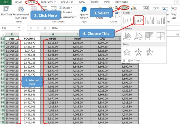
Step 1: Insert the Chart
- Select your entire data range, including the headers.
- Go to the Insert tab on the Excel ribbon.
- In the Charts group, click the icon for Waterfall, Funnel, Stock, Surface, or Radar chart.
- Under the Stock section, choose the second option: Open-High-Low-Close.
Step 2: Essential Formatting for a "Nice" Visualization
Excel's default chart is functional but not very readable. Let's fix the three most common issues. The following video demonstrates these fixes clearly.
How to Make a Candlestick (Stock) Chart in Excel With Live Historical Stock Prices! #tutorial #stock
Let's return to the 'Brandon's Excel Tutorials' video to see how to format the chart for clarity.
Watch from 03:37 to 06:10. The video addresses three key formatting tasks: Adjusting the Vertical Axis (Price): Notice how zooming in on the price range makes the candles more distinct. Fixing Weekend Gaps: This is a crucial step to make the chart continuous. Pay close attention to how the horizontal axis is changed from a Date Axis to a Text Axis. Customizing Candlestick Colors: Learn how to apply the standard green-for-up and red-for-down color scheme.
To summarize the formatting steps:
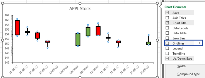
- Remove Weekend Gaps: Right-click the horizontal (date) axis, select Format Axis, and under Axis Type, choose Text axis. This treats each trading day as a separate category and removes the gaps for weekends and holidays when no trading occurs.
- Set Candle Colors: Right-click on one of the candlesticks and select Format Data Series. Here, you can set separate fill colors for up bars (when Close > Open) and down bars (when Close < Open). Use solid fill and choose green for up and red for down.
- Adjust Price Axis: Right-click the vertical (price) axis and choose Format Axis. You can adjust the Bounds (Minimum and Maximum) to better fit the price action. Be cautious with setting manual bounds, as a large price move could go off the chart. It's often best to do this as a final step.
4. Enhancing Your Chart with a Moving Average
A standard candlestick chart shows price, but you can add more analytical depth by overlaying technical indicators. The most common is the Moving Average (MA), which smooths out price data to show the underlying trend. This builds on the concept of trendlines we discussed in the last lesson.
How to Create a Candlestick Chart in Excel
The article from Coefficient.io provides a straightforward guide to adding a moving average directly to your candlestick chart.
Read the section 'Adding Technical Indicators', specifically 'Step 1: Add Moving Averages'. Follow the instructions to add a Moving Average trendline to your chart. You can experiment with different periods (e.g., a 20-day moving average is common for short-term trends).
Adding an MA trendline transforms your chart from a simple price display into a more analytical tool, helping you visually identify trends, which is a key part of creating "nice" and insightful financial visualizations.
Conclusion
Great work! You can now build and customize one of the most essential charts in financial analysis. You've learned not just the "how" but also the "why" behind visualizing OHLC data.
Key Takeaways:
- A candlestick visualizes the Open, High, Low, and Close price for a period, with its body color indicating the price direction.
- Excel requires data to be in the Date | Open | High | Low | Close column order to create a candlestick chart.
- You can use the
STOCKHISTORYfunction to pull live financial data directly into Excel. - Key formatting steps include setting the horizontal axis to a Text Axis to remove gaps and customizing up/down bar colors for clear visual signals.
- Enhancing the chart with a Moving Average adds a layer of trend analysis.
In our next and final lesson for this module, we will learn how to create waterfall charts. These are excellent for illustrating sequential changes in a value, such as breaking down the components of a company's profit and loss statement.
Can't find a good explanation? Sign up and we'll make it for you
Sign up