
Hello! Let's dive into our next lesson.
In our last session, we covered how to use the display property to control whether elements stack vertically (block), flow horizontally (inline), or do a bit of both (inline-block). This gave you control over the fundamental layout and flow of the "boxes" on your page.
Today, we're going to style the appearance of those boxes themselves. As a designer, you know that the background of an element—whether a solid color, a subtle pattern, or a full-bleed photograph—is crucial for establishing visual hierarchy and atmosphere. This lesson will show you how to implement those design choices in code.
Our learning outcome is to apply background properties including background-color, background-image, and background-size. By the end of this lesson, you'll be able to create rich, visually engaging backgrounds for your web elements.
1. Background Color and Gradients
The simplest way to style a background is with a solid color using the background-color property. You can use the same color value formats you're likely familiar with from design tools like Figma, including hex codes, rgb(), and rgba() for transparency.
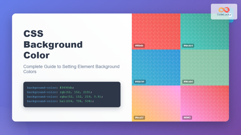
A solid background color also serves an important practical purpose: it acts as a fallback in case a background image fails to load, ensuring your text remains readable.
Beyond solid colors, CSS allows you to create gradients directly in your code, which is a powerful tool for any designer. Let's see how to create a linear-gradient.
CSS Background Images and Responsive Image Properties for Beginners
This video by Dave Gray demonstrates how to apply a linear-gradient as a background. It also shows how you can layer gradients with images, a more advanced technique that might interest you.
Watch the segment from 33:57 to 36:10. Focus on how a linear-gradient is defined with a direction (e.g., to left) and a series of color stops.
2. Adding a Background Image
To place an image in the background of an element, we use the background-image property with a url() function. The value inside url() is the path to your image file.
Navigating file paths in CSS can be tricky at first. It's all about telling the browser where to find the image relative to your CSS file.
Every CSS Background Property Illustrated and Explained
This article from freeCodeCamp provides an excellent, visual guide to understanding file paths in CSS.
Read the section 'The CSS background-image property', focusing on the three illustrated cases for directory paths (same folder, next folder, previous folder). This will clarify how to use . and .. to navigate your project's file structure.
By default, if a background image is smaller than its container, the browser will tile it to fill the space. We can control this with the background-repeat property.
Let's watch how these properties work together.
CSS Background Images and Responsive Image Properties for Beginners
In this next segment, Dave Gray adds a background image to a hero section and then controls its default repeating behavior.
Watch from 19:28 to 21:20. Pay attention to how the url() function is used to specify the image path and how background-repeat: no-repeat; prevents the image from tiling.
3. Sizing and Positioning the Image
Once you have an image in the background, you'll almost always want to control its size and position. This is where your design skills directly translate to CSS properties.
background-size
This property defines the size of the background image. Two of the most useful values are cover and contain:
cover: Scales the image to be as large as possible to completely fill the container, maintaining its aspect ratio. Parts of the image may be cropped if the container's aspect ratio is different. This is similar to a "Fill" option in a design tool.contain: Scales the image to be as large as possible while ensuring the entire image is visible inside the container. This is similar to a "Fit" option.
background-position
This property sets the starting position of the background image. You can use keywords like center, top, right, bottom, left, or specific coordinates.
Let's see these properties in action.
CSS Background Images and Responsive Image Properties for Beginners
This final video segment demonstrates how to use background-size and background-position to achieve a common design pattern: a full-bleed hero image.
First, watch from 23:23 to 24:54 to see the difference between cover and contain. Notice how cover creates a responsive background that adapts as the screen size changes. Then, watch from 31:44 to 32:50 to see how background-position can be used to adjust which part of the image is visible.
The freeCodeCamp article you looked at earlier also has some great animated examples of cover and contain in the section "The CSS background-size property" if you'd like a quick visual refresher.
4. The Shorthand background Property
Writing out each background property individually can be repetitive. CSS provides a background shorthand property that lets you define all of these values in a single line.
.hero-section {
    /* Long-form properties */
    background-color: #333;
    background-image: url('images/hero.jpg');
    background-repeat: no-repeat;
    background-position: center;
    background-size: cover;

    /* Shorthand equivalent */
    background: #333 url('images/hero.jpg') no-repeat center / cover;
}
The order isn't strictly enforced for all values, but a common convention is color image repeat position / size. Note the special / syntax used to separate background-position from background-size.
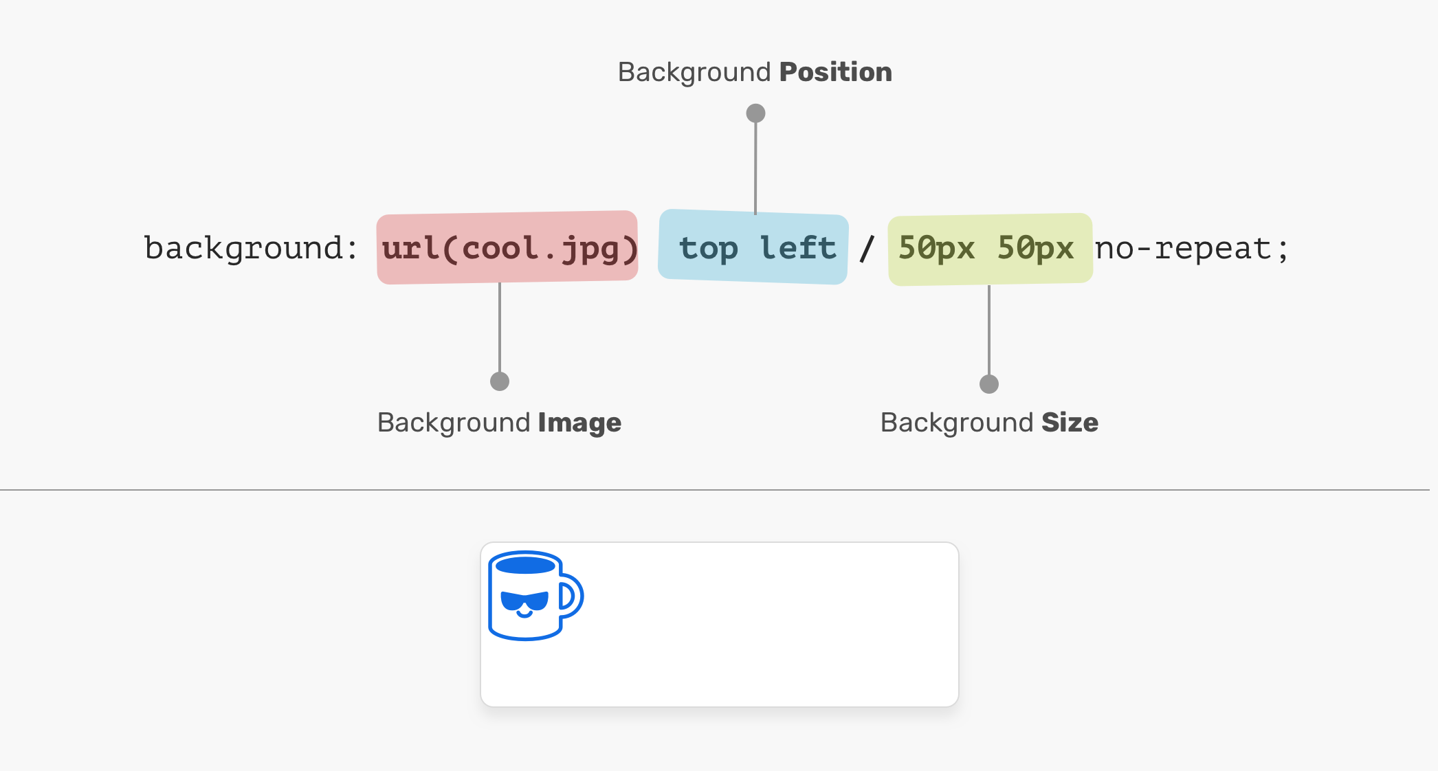
Using the shorthand property is more efficient and is what you will commonly see in professional codebases.
Conclusion
Excellent work! You now have the tools to control the background of any element, a fundamental skill for translating your visual designs into functional web pages.
Key Takeaways:
background-color: Sets a solid color or gradient for the background. It's also a crucial fallback for images.background-image: Places an image in an element's background using theurl()function.background-repeat: Controls if and how a background image tiles (no-repeat,repeat-x,repeat-y).background-size: Manages the image's dimensions.coverfills the element (cropping if needed), whilecontainfits the entire image inside.background-position: Adjusts the placement of the image within the element.background: A shorthand property to set all these values in one declaration.
In our next lesson, we'll tackle a common point of confusion for developers: what happens when multiple CSS rules target the same element? We'll explore CSS specificity and cascade rules to understand how the browser decides which style "wins" and gets applied.
Can't find a good explanation? Sign up and we'll make it for you
Sign up