
Hello! Welcome back to our journey into creating compelling financial data visualizations.
In our last lesson, we built matrix and treemap visuals to compare components of a whole, like analyzing sector weights or company market caps. Those visuals gave us a powerful static snapshot. Today, we'll bring those snapshots to life.
Our goal is to make your reports interactive, allowing you or your audience to explore the data on their own terms. The learning outcome for this lesson is to implement slicers and filters to enable dynamic user-driven exploration of financial data. You'll learn how to add controls that let users instantly change the focus of the entire report—for example, filtering a portfolio dashboard from a 5-year view down to a specific quarter, or comparing sector performance just for large-cap stocks.
1. Slicers: The Interactive Controls on Your Canvas
The most visible way to let users filter a report is with slicers. Think of them as user-friendly controls that live directly on your report page. Instead of digging into a menu, a user can simply click a button, check a box, or drag a slider to filter the data.
This is what a slicer looks like in action. In the image below, a 'Year' slicer is being added to a sales dashboard, which will allow a user to filter all the charts on the page to a specific year.

Slicers come in many forms, each suited for different types of data. A video tutorial is the best way to see them in action.
Power BI Slicers - A Step-by-Step Tutorial for All Types to Improve Data Analysis
The video 'Power BI Slicers - A Step-by-Step Tutorial' by Leila Gharani is an excellent, practical guide. It demonstrates how to create and format the most common slicer types you'll need for financial analysis.
Please watch the video from 00:27 to 07:18. As you watch, pay close attention to the different slicer types and think about how you could use them with financial data: Buttons/List (00:27 - 04:47): Notice how you can create buttons for filtering by category (e.g., 'Sector', 'Stock Exchange', 'Asset Class'). A dropdown is great for saving space when you have many options. Numeric Range Slider (05:06 - 05:45): This is perfect for filtering by quantitative metrics like 'Market Capitalization', 'P/E Ratio', or 'Share Price'. Date/Timeline Slicer (05:45 - 07:18): This is essential for almost any financial report, allowing users to analyze performance over specific time periods.
As you can see, slicers provide a highly visual and intuitive way for people to interact with your data.
Test your understanding!
You are creating a stock screener dashboard. For each of the following filtering requirements, which slicer type would be most appropriate?
- Filter stocks by their Sector (e.g., 'Technology', 'Healthcare', 'Financials').
- Filter for stocks with a Price-to-Earnings (P/E) ratio between 10 and 25.
- Filter the stock performance chart to show data from Q1 2023 to Q4 2023.
Show answer
- A List, Dropdown, or Tile (Button) slicer would be ideal for categorical data like sectors. A dropdown saves space if there are many sectors.
- A Numeric Range slicer is perfect for filtering on a continuous numerical value like a P/E ratio.
- A Date Range or Timeline slicer is the correct choice for selecting a specific period to analyze time-series data.
2. The Filter Pane: Powerful, "Behind-the-Scenes" Filtering
While slicers are visible on the canvas, Power BI has another, more powerful filtering tool: the Filter Pane. This pane, typically on the right side of your screen, allows you to apply filters that are less obvious to the end-user. You can think of these as "developer-set" filters.
The Filter Pane is crucial because it operates at three different levels:
- Visual-level filter: Affects only a single visual. (e.g., filtering one chart to exclude a specific outlier company, without affecting any other chart).
- Page-level filter: Affects all visuals on the current page. (e.g., dedicating an entire page to analyzing the 'Technology' sector).
- Report-level filter: Affects all visuals on all pages of the report. (e.g., filtering the entire report to show data for only one subsidiary of a company).
How to Use Filters and Slicers in Power BI
To understand these levels better, let's review a short guide. This article from Expertrain clearly explains the different filter levels.
Please read the section titled 'Step 1: Understanding Filter Levels.' It provides clear examples for visual-, page-, and report-level filters.
The choice between a slicer and the Filter Pane depends on your goal. Slicers are for user interaction, while the Filter Pane is for setting a firm context for your analysis.
Let's watch a short video that compares the two directly.
Power BI slicers vs the filter pane
This video from Guy in a Cube, 'Power BI slicers vs the filter pane,' offers a great comparison of the two tools and their specific use cases.
Please watch the sections from 00:23 - 00:49 and 03:22 - 04:34. The first part introduces the topic, and the second part focuses specifically on the capabilities of the Filter Pane, including its different levels and the 'advanced filtering' options.
3. Creating a Cohesive, Multi-Page Experience
In a real financial report, you'll likely have multiple pages (e.g., a summary page, a portfolio detail page, a market trends page). A common requirement is for a filter selection on one page to apply to other pages as well. You wouldn't want a user to select '2023' on the first page and then have to select it again on the second.
This is achieved using the Sync Slicers feature.
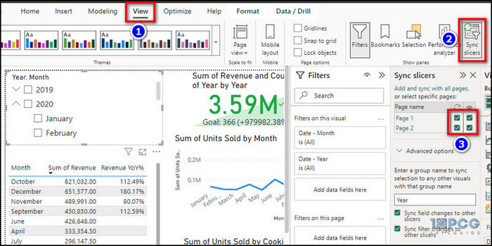
You can use this pane to make a slicer on your summary page control the charts on a detail page, even if the slicer itself isn't visible on that detail page.
Let's return to the first video to see a clear demonstration of this powerful feature.
Power BI Slicers - A Step-by-Step Tutorial for All Types to Improve Data Analysis
Leila Gharani's tutorial provides a very clear walkthrough of the 'Sync Slicers' pane.
Please watch the final tip from 07:18 to 08:42. This section demonstrates exactly how to make a slicer on one page filter the visuals on another page.
4. Slicers vs. Filters: A Quick Guide
So, when should you use each tool? Here’s a summary of best practices:
| Use a Slicer when... | Use the Filter Pane when... |
|---|---|
| The filter is common and should be easily accessible. | The filter should be permanent or "hidden" from the user. |
| Example: Filtering by Year, Region, or Asset Class. | Example: Excluding test data or internal transactions. |
| You want a specific interactive style (buttons, slider). | You need to apply a filter to the entire report consistently. |
| Example: Using buttons for 'Buy'/'Sell'/'Hold' ratings. | Example: A report that should only ever show data for 'India'. |
| You are building a highly interactive dashboard for exploration. | You need more complex logic (e.g., contains, is not blank). |
| Example: A stock screener with multiple on-screen filters. | Example: Filtering for all companies whose name contains 'Ltd'. |
Conclusion
Fantastic work! You've just unlocked one of the most important features of Power BI: interactivity. You are no longer just presenting data; you are creating an analytical tool that others can use to ask and answer their own questions.
Key Takeaways:
- Slicers are on-canvas visuals (like buttons, dropdowns, and sliders) that provide a user-friendly way to filter report data.
- The Filter Pane is a more powerful, "behind-the-scenes" tool for applying filters at the visual, page, or report-wide level.
- Sync Slicers is a crucial feature for creating a unified experience across a multi-page report, ensuring filter selections on one page carry over to others.
- Choosing between slicers and filters depends on whether you want an obvious user control (slicer) or a foundational rule for the data (filter).
In our next lesson, we will dive into DAX (Data Analysis Expressions). Now that you can dynamically filter your data, we'll learn how to create custom calculations on that data. We’ll start by creating simple calculated columns and measures, such as Year-over-Year growth, which will become incredibly powerful when combined with the slicers and filters you learned about today.
Can't find a good explanation? Sign up and we'll make it for you
Sign up