
Hello! Welcome to your next lesson in our journey to build powerful financial visualizations.
In our last session, you learned how to create interactive time-series charts, which are the backbone of analyzing financial data like stock prices and market indices over time. You now know how to pull in dynamic data and allow users to explore it using drill-down, zoom, and custom time slicers.
Today, we'll add another critical layer to our dashboards. While time-series charts show the historical journey, we often need to see the destination or the current status at a single glance. Our learning outcome is to utilize card and gauge visuals to display key performance indicators (KPIs) and summary statistics. These visuals are essential for highlighting the most important numbers on any financial dashboard—the current stock price, portfolio value, or performance against a target.
By the end of this lesson, you'll be able to create compelling, at-a-glance metrics that provide immediate insight and context.
1. Understanding KPIs in Financial Dashboards
Before we build, let's clarify what we're building. A Key Performance Indicator (KPI) is a measurable value that demonstrates how effectively a company (or a portfolio, or a stock) is achieving key objectives. In financial markets, this could be anything from a company's profit margin to a stock's year-to-date return.
To display these critical numbers, Power BI offers several visuals. We will focus on two of the most versatile: the Card and the Gauge.
To start, let's get a brief overview of how KPIs are used in Power BI.
A Step-By-Step Guide to Visualizing KPIs in Power BI
This article from DataCamp, 'A Step-By-Step Guide to Visualizing KPIs in Power BI,' provides a great introduction to the concept.
Please read the first two sections: 'What are Power BI KPIs?' and 'Choosing Your KPIs'. Focus on understanding the purpose of KPIs and the principle that 'less is more'.
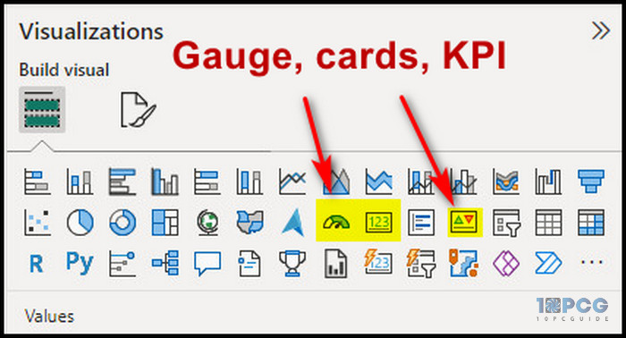
As the article mentions, the goal is to provide a clear, quick measure of performance. The Card and Gauge visuals are excellent tools for this. You can find them in the 'Visualizations' pane.
2. The Modern Card Visual: More Than Just a Number
The Card visual is perfect for displaying a single, important metric. However, the new, updated Card visual in Power BI is far more powerful, allowing you to group multiple metrics and add contextual information within a single visual container. This is fantastic for creating clean, organized, and highly informative dashboards.
Creating a Multi-Metric Card
Let's say you want to display a stock's latest price, trading volume, and 52-week high all in one place. The new Card visual makes this straightforward.
The following video from Maven Analytics is a complete guide to this new visual. We'll start with the basics of setting it up and applying formatting.
NEW Power BI Card Visual Nov 2023 | Full Tutorial from Basic to Advanced (PBIX File Included!)
Watch this segment of 'NEW Power BI Card Visual Nov 2023' to learn how to create and format a card that contains multiple KPIs.
Watch from 01:23 to 06:23. Pay attention to how the presenter: Adds multiple fields (like 'Total Revenue', 'Total Profits') to a single card visual. Uses the Format pane to adjust the Shape, Layout (to add space between cards), and Callout values (font, size, color). Applies styling to the individual cards within the visual using the Card options, including background color and an Accent bar. Adds small icons next to each metric for better visual cues.
Adding Context with Reference Labels
A number on its own has limited value. Is a stock price of $150 good? It's better if we know that yesterday's close was $145, showing a positive trend. The new Card visual's best feature is Reference Labels, which let you add this crucial context directly below your main KPI.
This next segment of the same video demonstrates this powerful feature.
NEW Power BI Card Visual Nov 2023 | Full Tutorial from Basic to Advanced (PBIX File Included!)
Now, let's see how to add reference labels to provide context, like comparing a current value to a previous one or a target.
Watch from 06:23 to 11:39. This is the most important part of the video. Focus on understanding the concept of: Adding a Label: See how a second measure (e.g., 'Previous Month Revenue') is added to provide context to the main KPI. Formatting Labels: You can format the title and value of each reference label independently. Using the Detail option: An additional layer of information (like the gap to a target) can be added. Conditional Formatting: Notice how the color of the 'gap' value changes to red if it's negative. This is a critical technique for financial dashboards to instantly flag underperformance.
Test your understanding!
You are creating a card for a specific stock, 'NIFTYBEES'. The main callout value is its Last Traded Price (LTP). What are three meaningful metrics you could add as reference labels to give this LTP more context for an investor?
Show answer
Here are a few excellent choices for reference labels:
- Previous Day's Close: To immediately see if the stock is up or down for the day.
- 52-Week High / 52-Week Low: To show where the current price stands within its annual range.
- Day's Change (%): To quantify the daily movement as a percentage, which is often more meaningful than the absolute dollar change.
- A Moving Average (e.g., 50-day MA): To compare the current price against its recent trend.
3. The Gauge Visual: Tracking Progress to a Goal
While cards are great for displaying numbers, Gauge visuals are specifically designed to show progress towards a target. This is perfect for scenarios like:
- Tracking a portfolio's current value against a year-end goal.
- Visualizing a company's quarterly revenue against its forecast.
- Showing how close a stock price is to its all-time high.
Building and Configuring a Gauge
The gauge visual has four main data fields: Value, Minimum value, Maximum value, and Target value. You can either drag measures into these fields or set them manually in the Format pane.
This video from Fernan | Power BI provides a great walk-through.
How to use GAUGES to visualise KPI and GOAL PROGRESS // Beginners Guide to Power BI in 2022
This first part of 'How to use GAUGES to visualise KPI and GOAL PROGRESS' explains the basic setup of a gauge visual.
Watch the first four minutes (00:00 to 03:54). Focus on how the Value, Maximum value, and Target value fields work together to create the visual. Note that you can drag fields here or set them manually.
Making the Gauge Dynamic with Conditional Formatting
A static gauge is useful, but a dynamic one is even better. We can use DAX to create measures that control the gauge's colors, making it automatically turn green when a target is met and red or amber when it's not.
Let's watch how to implement this. The example uses sales data, but the principle is identical for any financial metric.
How to use GAUGES to visualise KPI and GOAL PROGRESS // Beginners Guide to Power BI in 2022
This final segment of the video shows how to use a DAX measure with a SWITCH function to dynamically color the gauge based on performance.
Watch from 04:06 to 11:46. This is a key technique for creating professional dashboards. DAX for Comparison (04:06 - 08:11): Observe how he creates a 'Total Sales Previous Year' measure to use as a dynamic target. DAX for Color (08:11 - 11:46): Pay close attention to the SWITCH measure. The logic is simple: IF Total Sales is greater than Previous Year Sales, THEN the color is 'Green', OTHERWISE it's 'Orange'. Applying Conditional Formatting: See how he applies this DAX measure to both the Fill color of the gauge and the Font color of the callout value. This creates a consistent and clear visual signal.
This technique of using a DAX SWITCH statement to control colors is one of the most valuable skills in Power BI dashboard design. It can be applied to almost any visual, not just gauges.
Conclusion
In this lesson, you've learned how to present the most critical numbers—the KPIs and summary statistics—in a clear and compelling way. You've moved beyond just showing a number to providing rich context that tells a story.
Key Takeaways:
- Card Visuals are for displaying key metrics. The modern card visual is exceptionally powerful, allowing you to combine multiple numbers, add icons, and provide context with Reference Labels.
- Gauge Visuals are ideal for showing a value relative to a target and visualizing progress.
- Conditional Formatting with DAX is a crucial skill. Using a
SWITCHfunction to create a color measure allows you to dynamically change the appearance of your visuals to flag good or bad performance automatically.
In our next lesson, we will explore visuals designed for comparing components of a whole. We'll learn how to design matrix and treemap visuals for sector performance and market capitalization comparisons, allowing you to answer questions like "Which industry sector is driving the market today?" or "What are the largest companies in this index?".
Can't find a good explanation? Sign up and we'll make it for you
Sign up