
Hello! Welcome back to our course on creating financial data visualizations.
In our last lesson, we took a significant step by learning DAX, Power BI's formula language. You created your first measures, including a powerful Year-over-Year growth calculation. This allows you to embed custom analytics directly into your reports.
Today, we're going to learn how to present that extra layer of analysis in a sleek and professional way. Our goal is to create custom tooltip pages to provide deeper contextual information on demand. Instead of the default tooltip that just lists values, you'll design a mini-report that appears when a user hovers over a data point, offering rich visuals and insights without cluttering your main dashboard. This is a key technique for creating the "nice," high-impact financial visualizations you're aiming for.
Let's imagine you have a chart of major market indices. When you hover over a specific index, wouldn't it be great to see a pop-up showing its sector breakdown and recent performance trend? That's exactly what a custom tooltip page allows you to do.
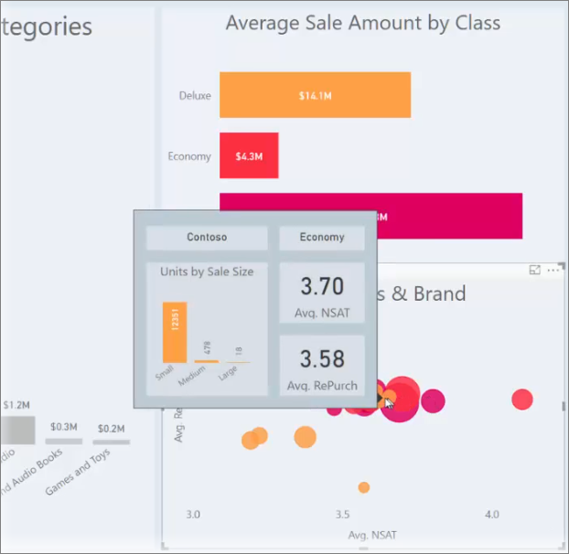
1. Default Tooltips vs. Custom Tooltip Pages
By default, when you hover over a data point in a Power BI visual, a small black box appears showing the values that make up that point. This is the default tooltip. You can add more data to it by dragging fields into the "Tooltips" well in the Visualizations pane, but you're limited to a simple list of values.
A custom tooltip page is different. It's a completely separate report page that you design specifically to act as a tooltip. This page can contain any combination of visuals: charts, KPIs, gauges, text, and even images. This unlocks a new level of interactivity and information density for your financial reports.
2. How to Create a Custom Tooltip Page
The process involves three main stages:
- Create and configure a new report page to act as a tooltip.
- Design and build the visuals you want to display inside the tooltip.
- Connect the tooltip page to a visual on your main report.
Let's walk through this process with a detailed video guide.
How to create Tooltip Pages in Power BI - Easy Tutorial
The video 'How to create Tooltip Pages in Power BI' by Chandoo provides a fantastic, easy-to-follow walkthrough of the entire process from start to finish. It covers all the fundamental steps you need to get started.
Please watch from 01:25 to 04:38. Pay close attention to these key actions: Setting up the page (01:25): How to add a new page and, crucially, change its Type to Tooltip in the Canvas settings. Adding visuals (02:11): Observe how a simple pie chart is added to the small tooltip canvas. Linking the tooltip (02:31): Watch how the main visual is configured to use your new 'Report page' as its tooltip. Extra tips (03:19): Note the ideas for adding background colors and multiple visuals, and for removing titles to create a cleaner look.
3. A Financial Application: Stock Performance Tooltip
Let's apply this to a financial scenario. Imagine you have a line chart on your main report showing the closing price of a stock over time. You want the tooltip to provide deeper context for any given day.
Step 1: Create the Tooltip Page
- Add a new page and name it something descriptive, like
TT_Stock_Detail. - Go to
Format your report page>Canvas settings. - Change the
Typefrom16:9toTooltip. Power BI will automatically resize the canvas.
Step 2: Build Your Tooltip Visuals
Now you have a mini-canvas to work with. Let's add some insightful financial visuals:
- KPI Cards: Add two
Cardvisuals.- One to show the Volume for that day.
- Another to show the Year-over-Year Growth % for that day's price (using the DAX measure we discussed in the last lesson!).
- Gauge Visual: Add a
Gaugevisual.- Set the
Valueto the stock's closing price for that day. - Set the
Minimum valueto the 52-week low and theMaximum valueto the 52-week high. This instantly shows where the current price stands in its yearly range.
- Set the
Step 3: Link the Tooltip Page
- Go back to your main report page with the stock price line chart.
- Select the line chart visual.
- Go to the
Format visualpane >General>Tooltips. - Expand the options. Change the
TypetoReport page. - In the
Pagedropdown, select yourTT_Stock_Detailpage.
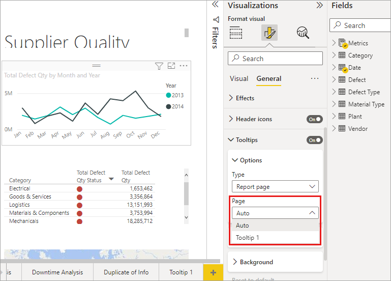
Now, when you hover over any point on the line chart, your custom tooltip with the KPIs and gauge will appear, dynamically filtered to that specific day.
Test your understanding!
You have a treemap visual on your dashboard showing the market capitalization of various companies in the S&P 500, grouped by sector. You want to create a custom tooltip that appears when you hover over a specific company's rectangle. The tooltip should show the company's daily stock price trend for the last 30 days and its Price-to-Earnings (P/E) ratio.
What two visuals would be most appropriate to add to your tooltip page to display this information?
Show answer
- A Line Chart to show the daily stock price trend over the last 30 days.
- A Card visual to display the single P/E ratio value.
4. Advanced Design and Best Practices
To make your tooltips even more professional, there are a few extra tips you can use. The next video provides some great ideas for design and organization.
How to Design Custom Report Tooltips in Power BI Desktop (PBIX File Included!)
The video 'How to Design Custom Report Tooltips in Power BI Desktop' from Maven Analytics showcases some excellent pro tips for making your tooltips look polished and professional.
Watch these three short clips: Custom Canvas Size (00:45 - 01:34): See how you can go beyond the default tooltip size and specify a custom height and width for more control over your design. Designing with Multiple Visuals (01:34 - 04:50): This is a great example of combining multiple visuals (KPIs and a trend chart) into a single, information-rich tooltip. Don't worry about replicating every formatting step, just focus on the concept of combining visuals. Hiding the Tooltip Page (05:38 - 06:03): This is a crucial best practice. Learn how to hide your tooltip page so it doesn't appear as a regular page in your final report.
For a handy text-based guide that you can refer back to, the article "How to create interactive tooltips in Power BI" from Chandoo.org covers these same steps clearly.
How to create interactive tooltips in Power BI (step by step)
This article is a step-by-step text and image guide that covers the same core process. It's useful as a quick reference if you prefer reading or want to review the steps after watching the videos.
Quickly read through 'Step 2: Add a new page and make it “tooltip” page', 'Step 3: Build your tooltip page', and 'Step 4: Link tooltip page to main visual' to solidify your understanding of the core workflow.
Conclusion
You've just added a powerful and elegant feature to your Power BI toolkit. Custom tooltips allow you to add significant depth and context to your financial visualizations, telling a richer story without overwhelming your audience with information.
Key Takeaways:
- Custom tooltip pages replace the default list of values with a rich, mini-report that appears on hover.
- The process is straightforward: create a new page, set its
Canvas settingstype toTooltip, add your desired visuals, and link it from theFormat visualpane of your main chart. - This is a perfect way to display the DAX measures (like YoY%) and other detailed analytics you've been building.
- For a clean user experience, always remember to right-click and hide your tooltip pages from the report view.
In our next lesson, we will begin Module 5 and start assembling all the pieces we've learned. You'll learn how to build a multi-page financial dashboard, bringing together different charts, slicers, DAX measures, and the custom tooltips you mastered today into a single, cohesive, and interactive report.
Can't find a good explanation? Sign up and we'll make it for you
Sign up