
Hello! Welcome to the first lesson in our new module, "Building High-Converting Landing Pages."
In our last module, you mastered the foundations of SEO, learning how to create content and earn backlinks to drive traffic to your website. But traffic is only the first step. A stream of visitors is useless if none of them convert into customers. This module is all about turning that hard-earned traffic into sign-ups, demos, and paying users.
Today, we'll address the foundational learning outcome for this entire topic: Deconstruct the essential components of a high-converting SaaS landing page (headline, hero shot, social proof, CTA). Before you can build your own high-performing pages, you need to understand the architectural principles behind the best ones. Think of this as studying the blueprints of a skyscraper before you start mixing concrete.
The Anatomy of a High-Converting SaaS Landing Page
A great landing page isn't just a random collection of information; it's a carefully structured persuasive argument that guides a visitor from curiosity to action. Each section has a specific job to do.
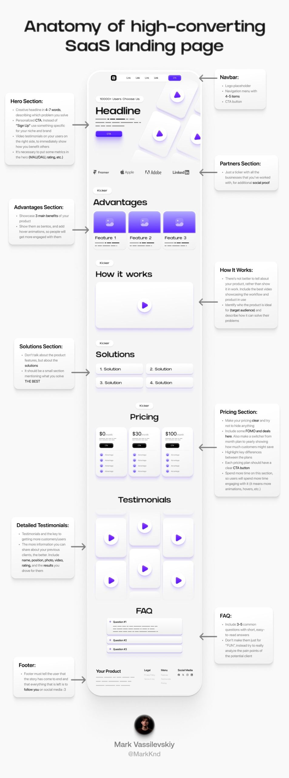
A highly effective way to think about this structure is as a narrative flow. One proven structure follows this sequence:
- Hero: Grab attention and state your value.
- Social Proof: Build initial trust.
- Problem: Agitate the pain point you solve.
- Solution: Introduce your product as the answer.
- Results & Testimonials: Prove your solution works.
- Final CTA: Make a clear, final ask.
Today, we'll focus on the non-negotiable, high-impact elements from this flow: the Headline, Hero Shot, Social Proof, and Call to Action (CTA).
1. The Critical "Above the Fold" Zone: Your First 5 Seconds
"Above the fold" refers to everything a visitor sees on your page without scrolling. You have mere seconds to convince them they're in the right place. This area is dominated by three crucial elements.
7 CRUCIAL Things Every SaaS Landing Page Should Have (with examples)
Rob Walling, a veteran SaaS founder, provides a masterclass in the foundational 'above the fold' elements. Watch this first section to understand the critical trio of headline, sub-headline, and CTA.
Watch from the beginning until 04:21. Pay close attention to his distinction between a headline that says what a product is versus one that explains what problem it solves.
As you just saw, the three essential components above the fold are:
-
The Headline (H1): This is the single most important piece of copy on your page. It must answer two questions instantly: What problem does this solve? and Who is it for? Avoid vague, jargon-filled headlines like "Innovation. Redefined." Instead, focus on a clear, benefit-driven statement. For example, instead of "An App for Product Marketers," use "Spend 10x Less Time on Product Management."
-
The Sub-headline (H2): This is a supporting sentence or two that expands on the headline. It provides a little more context, explains how you deliver the benefit mentioned in the headline, or highlights a key differentiator.
-
The Primary Call to Action (CTA): This is the button that asks the user to take the single most important action (e.g., "Start Free Trial," "Book a Demo," "Sign Up for Free"). It must be visually prominent and use clear, action-oriented language.
2. The Hero Shot: Showing, Not Just Telling
The "hero shot" is the main visual element that complements your headline. A visitor should be able to look at your hero shot and instantly get a feel for what your product does. Static screenshots are a starting point, but modern, high-converting pages often do much better.
9 AMAZING SaaS Websites You Can Copy
Payton Clark Smith's video showcases some of the best SaaS websites and emphasizes one key element: animated demos. Watch this section to see why showing your product in action is so powerful.
Watch from the start to 01:31 to understand the four key components he identifies, with a focus on animated demos. Then, watch his analysis of Slack from 01:31 to 02:29. Finally, watch from 05:30 to 06:31 where he discusses how implementing these changes (especially animated demos) tripled the conversion rate for his own SaaS.
As highlighted in the video, your hero shot can take several forms, each with a different level of impact:
- Static Screenshot: Simple and better than nothing, but can be uninspiring.
- Product Mockup: A stylized screenshot inside a laptop or phone frame. More visually appealing.
- Animated GIF/Video: This is the gold standard for many modern SaaS sites. A short, looping video that shows the core workflow or "magic moment" of your product is incredibly effective. It answers the "how does it work?" question without requiring the user to read anything.
- Interactive Demo: The most advanced option, where a user can click around in a simulated version of your product directly on the landing page.
For your future SaaS projects, prioritizing the creation of a clean, animated hero shot can have a significant impact on your conversion rates.
3. Social Proof: Building Trust and Reducing Risk
Once you've captured a visitor's attention, you need to build their trust. People are inherently skeptical of new products. Social proof is the evidence that other people—ideally people similar to your visitor—are already using and getting value from your product.
There are many forms of social proof, and they can be arranged in a hierarchy of impact.
7 CRUCIAL Things Every SaaS Landing Page Should Have (with examples)
Let's return to Rob Walling's video, where he gives a comprehensive breakdown of the different types of social proof, from the simple to the complex.
Watch from 06:14 to 10:30. Notice how he presents the different types of social proof (logos, social embeds, text testimonials, video testimonials, case studies) as a ladder of increasing complexity and persuasiveness.
To summarize and expand on the video's points, here are the key types of social proof to include:
- Customer Logos: The simplest form. Display the logos of companies that use your product. This is especially powerful in B2B if you have recognizable brands.
- Badges and Ratings: Featuring star ratings from review sites like G2 or Capterra, or security badges, can quickly convey quality and trustworthiness.
- Testimonials/Quotes: A direct quote from a happy customer. A great testimonial is specific, focuses on a result, and includes the person's full name, title, company, and photo for authenticity.
- Social Media Embeds: Screenshots or live embeds of posts from Twitter/X or LinkedIn where users are praising your product. This feels raw and authentic.
- Case Studies: A detailed story of how a specific customer solved a problem and achieved measurable results with your product. This is the most powerful form of social proof but also the most effort-intensive to create.
For a new SaaS, start by aiming for logos and simple text testimonials. As you grow, you can work your way up to case studies and video testimonials.
4. The Call to Action (CTA): The Engine of Conversion
We've already mentioned the primary CTA above the fold, but your landing page should have multiple CTAs. The goal is to ensure that whenever a visitor feels convinced, a button to take the next step is right there.
Here are the key principles for effective CTAs:
- Be Consistent: Use the same primary CTA throughout the page (e.g., "Start Free Trial").
- Use Benefit-Oriented Language: Instead of a generic "Submit," use language that describes what the user will get, like "Get Your Free Demo" or "Create My Account."
- Reduce Risk: Add microcopy near the button to handle objections, such as "No credit card required" or "Free 14-day trial."
- Make It Stand Out: The CTA button should be the most visually prominent, high-contrast element on the page.
Test your understanding!
Let's deconstruct a real-world example. Go to the landing page for Loops.so, an email marketing platform.
Spend a few minutes on their homepage and identify the following:
- What is the Headline?
- What kind of Hero Shot are they using?
- What is the primary Call to Action?
- Identify at least two different types of Social Proof on the page.
Show answer
- Headline: "The modern email platform for SaaS" - It's clear, concise, and immediately identifies the target audience (SaaS companies).
- Hero Shot: They use a clean, animated GIF that cycles through key features of their interface, showing the product in action.
- Call to Action: The primary CTA is "Start for free". It's simple, benefit-driven, and repeated throughout the page.
- Social Proof:
- Customer Logos: They have a prominent section showing logos of well-known tech companies like Replicate, Vercel, and Runway.
- Testimonials/Quotes: They feature a "Wall of Love" with embedded tweets (a combination of social media embeds and quotes) from founders and developers, complete with names, photos, and Twitter handles for authenticity.
Conclusion
You now have a solid framework for analyzing and understanding any SaaS landing page. By deconstructing them into their core components, you can see the persuasive logic at work. No matter how complex a page looks, it almost always relies on these fundamental building blocks.
Key Takeaways:
- A landing page is a structured argument, not just a brochure.
- The "above the fold" section is your most valuable real estate and must have a clear Headline, supporting sub-headline, and a prominent Call to Action.
- The Hero Shot should show your product in action, preferably with an animation or video, to quickly communicate value.
- Social Proof in its various forms (logos, testimonials, ratings) is essential for building trust and overcoming skepticism.
- The CTA is the final step, and it should be clear, consistent, and benefit-oriented.
Preview of the Next Lesson:
Understanding the components is the first step. The next is filling them with words that sell. In our next lesson, we will focus on writing compelling landing page copy using an AI-assisted framework like AIDA or PAS. You'll learn how to use AI tools to generate persuasive copy for each of the sections we've deconstructed today.