
Hello! Welcome back to your second lesson on the psychology of decision-making.
In our first session, we established the foundational concept of two distinct thinking processes: the fast, intuitive System 1 and the slow, analytical System 2. We defined their core attributes and saw how they work together through the "bat and ball" riddle.
Today, we'll build directly on that foundation. Our goal is to identify the characteristics of System 1 and System 2 thinking in everyday user interactions. We will move from the abstract definitions to concrete examples you'd encounter in the digital world. For you as a Product Design Lead, being able to spot which system a user is engaging is a crucial skill for creating experiences that feel effortless and intuitive.
1. Refreshing the Characteristics
Let's start with a quick visual recap of the two systems we discussed.
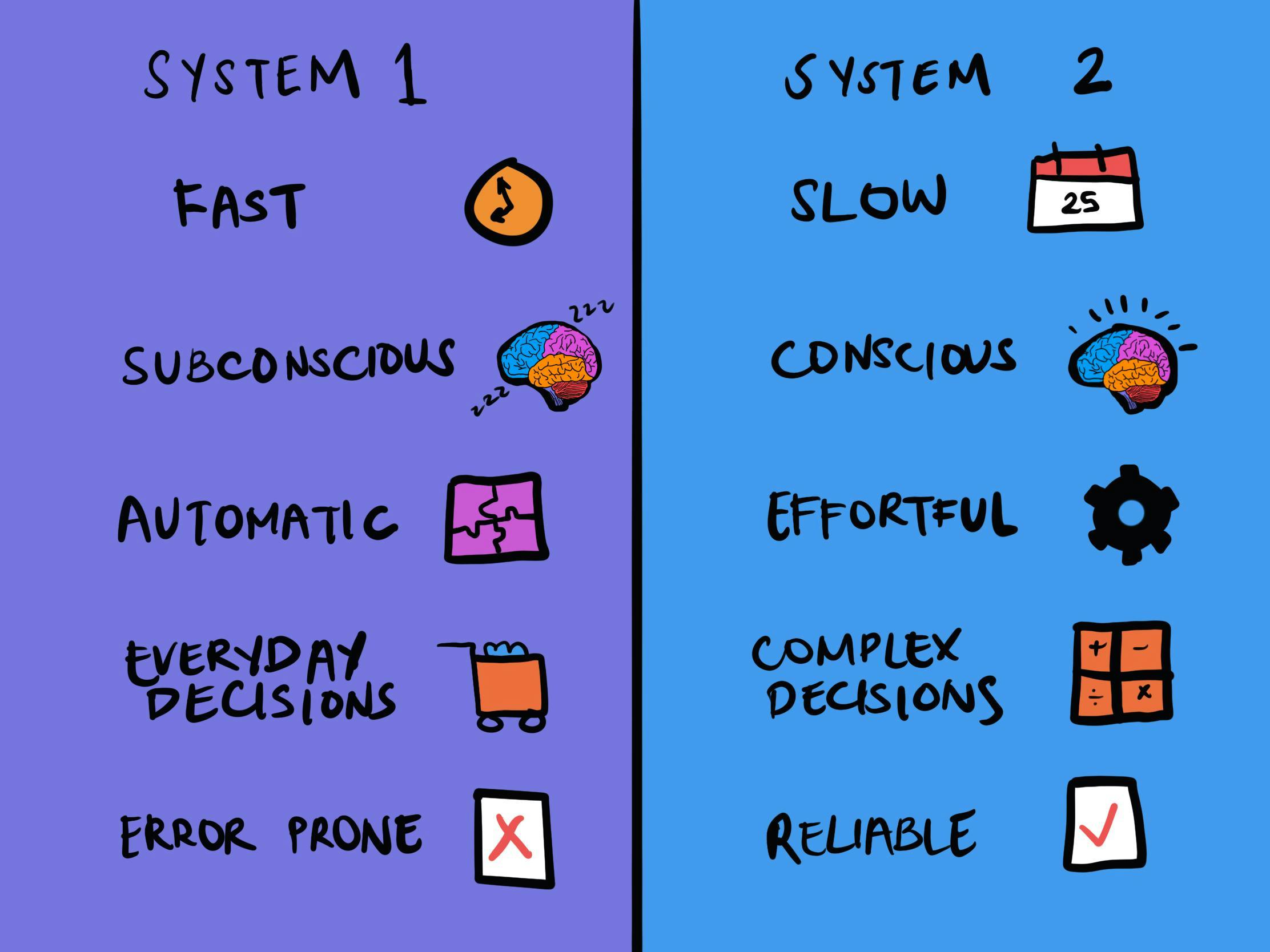
While this chart is a great summary, it's helpful to think of the two systems as "characters" with distinct personalities. System 1 is the impulsive storyteller, while System 2 is the powerful but lazy analyst.
To explore these personalities, let's watch a short video that provides some useful metaphors.
System 1 & System 2: Why Do We Make Irrational Decisions (Cognitive Biases In A Nutshell)
This video from IQrius, titled 'System 1 & System 2: Why Do We Make Irrational Decisions,' offers a concise explanation of the characteristics of each system.
About two and a half minutes in, watch System 1 traits, paying attention to how it's described as a 'storyteller' that jumps to conclusions. Then continue directly to System 2 traits, where System 2 is characterised as a 'lazy' but logical problem-solver.
The key takeaway here is that System 1 is always on, creating stories and making quick judgments based on whatever information is available. System 2, on the other hand, prefers to conserve energy and will only step in when it absolutely has to. This dynamic has significant consequences for how we interact with the world—and with digital products.
2. Seeing the Systems in Action (and Conflict)
One of the best ways to understand the distinct roles of System 1 and System 2 is to see what happens when they conflict. Psychologists use simple but clever experiments to create this conflict.
The article "Applying System 1 & 2 Thinking for Better UX" by Austin Acevedo provides excellent descriptions of two classic tests.
Applying System 1 & 2 Thinking for Better UX
This article directly connects dual-process theory to user experience. We'll start by looking at two experiments that brilliantly illustrate the interplay between the two systems.
Please read the sections titled "The Stroop Test" and "The Cognitive Reflection Test," which appear in sequence roughly midway through the article. In the section titled "The Stroop Test," read the Stroop experiment. Then, in the immediately following section titled "The Cognitive Reflection Test," read the cognitive reflection test. Try the tests yourself as you read. Notice the feeling of internal conflict or the pull of an intuitive-but-wrong answer. This is the feeling of your System 2 overriding your System 1.
What do these tests show us?
- The Stroop Test (naming the ink color) demonstrates that your System 1's automatic skill of reading is so powerful that it interferes with the task. You have to actively engage your effortful System 2 to ignore the word and name the color, which slows you down.
- The Cognitive Reflection Test (the bat and ball problem again) shows System 1's tendency to substitute a hard question ("How much does the ball cost?") with an easier one ("How do I split $1.10?"). The answer $0.10 is an intuitive guess from System 1. Arriving at the correct answer, $0.05, requires System 2 to engage, do the math, and check the logic.
These "cognitive illusions" are important because they reveal that even when we know the right way to think about something, our automatic System 1 can still pull us toward an error. As Daniel Kahneman explains, this is a fundamental challenge in decision-making.
3. Identifying System 1 & 2 in User Interfaces
Now, let's apply this understanding to the field you know best: user experience design. When a user interacts with an app or website, their brain is constantly switching between these two modes.
A well-designed product allows users to stay in the fast, effortless System 1 for most tasks, making the experience feel smooth and intuitive. However, for more complex or high-stakes actions, the design must support the slow, deliberate thinking of System 2.
The same article we just read has an excellent section on this.
Applying System 1 & 2 Thinking for Better UX
Let's continue with the article 'Applying System 1 & 2 Thinking for Better UX' to see how these concepts translate into design principles.
Please read the section 'How do I apply it?', which follows the Cognitive Reflection Test. applying dual process. Focus on the distinction between when you want to keep users in System 1 and when System 2 thinking is 'unavoidable, and often desirable.'
To make this even more concrete, let's categorize some common user interactions.
| System 1 Tasks (Automatic & Intuitive) | System 2 Tasks (Effortful & Deliberate) |
|---|---|
| Recognizing a brand logo (e.g., the Twitter bird) | Writing a thoughtful product review |
| Clicking a standard "Continue" or "Add to Cart" button | Comparing specifications on a product comparison page |
| Scrolling through a social media feed | Configuring privacy settings |
| Navigating a familiar app using standard icons (home, search, profile) | Filling out a multi-page form (e.g., for insurance or a loan) |
| Tapping a "like" button | Deciding between different subscription tiers and their features |
| Entering your name and address into a standard form field | Troubleshooting an error or unexpected behavior in the interface |
A classic example of a design optimized for System 1 is the Google search homepage.
Designing for Decision Making: The Psychology of Choice
This brief excerpt from the article 'Designing for Decision Making' provides a perfect example of a System 1-centric design.
Read the final paragraph of the 'Theoretical Frameworks' section, which discusses leveraging System 1 processing for everyday tasks: Google search design. Notice how the simplicity of Google's design facilitates a quick, automatic response.
The design is so minimal and focused that your System 1 knows exactly what to do without any conscious thought. You don't have to decide where to type; you just do it.
4. Your Turn: Deconstructing an Interface
Now it's your turn to be the analyst. Think about an application you use frequently or one you've worked on, perhaps at Perlego or Strategyzer.
- Choose a specific user flow. For example:
- Searching for a book and adding it to your library on Perlego.
- Creating a new business model canvas in a Strategyzer tool.
- Ordering food through a delivery app.
- Map the user's journey. Break it down into small steps.
- Identify the thinking mode. For each step, ask yourself: Is the user likely operating on the automatic, pattern-matching of System 1, or are they required to engage the deliberate, analytical System 2?
For example, in a food delivery app:
- Opening the app and seeing familiar restaurants (System 1).
- Tapping on a cuisine category like "Pizza" (System 1).
- Deciding between two new, unfamiliar pizza places by reading reviews and comparing prices (System 2).
- Customizing the pizza toppings (can be System 1 if it's your usual order, or System 2 if you're carefully considering options).
- Proceeding to checkout and using a saved address and payment method (System 1).
Take a few minutes to try this with an app of your choice. This exercise is the bridge between understanding the theory and applying it to your design practice.
Conclusion
In this lesson, we moved from defining the two systems to identifying their characteristics in the real world of user interactions.
Key Takeaways:
- System 1 operates on intuition and learned patterns, making it ideal for familiar, low-stakes tasks. Its goal is efficiency.
- System 2 handles complex, novel, or high-stakes situations that require focused analysis. Its goal is accuracy.
- In UX design, the goal is often to design for System 1 to create a feeling of ease and flow. This is achieved by using familiar patterns, clear visual hierarchy, and respecting user mental models.
- However, when a task is inherently complex or important (like making a financial decision or configuring critical settings), a good design must support and guide the user's System 2 thinking, not try to eliminate it.
In our next lesson, we will delve deeper into a concept we've touched on today: cognitive load. We will explore how the amount of mental effort required by an interface directly influences whether a user can rely on the easy-going System 1 or is forced to call in the effortful System 2.
Can't find a good explanation? Sign up and we'll make it for you
Sign up