
Hello! Welcome to the first lesson in our course on deflation.
Introduction
This lesson kicks off our empirical exploration of deflation. Our goal today is to build a foundational tool that we'll use throughout the course. You will learn how to programmatically access a major economic database, process time-series data, and visualize key economic phenomena.
Specifically, we will tackle the following learning outcome: "Write a Python script to download post-WWII US CPI data, then programmatically identify and plot periods of deflation and disinflation."
To get started, let's clarify our key terms with a real-world example.
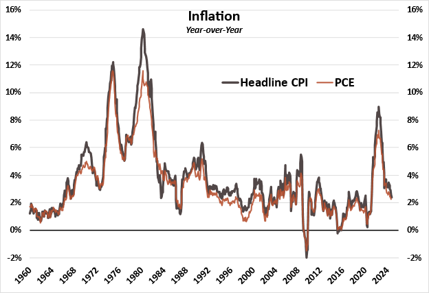
This graph from 6 Meridian shows the US inflation rate. Notice the period around 2009 where the rate dips below zero—that's deflation. The long downward trend from the early 1980s is a classic example of disinflation (inflation is positive but falling). By the end of this lesson, you will have created a similar plot from scratch.
This lesson should take you approximately 60 minutes to complete.
1. Setting Up Your Economic Data Lab
To analyze economic data, we need a reliable source and a way to access it. We'll use the Federal Reserve Economic Data (FRED) database, a comprehensive repository maintained by the St. Louis Fed. We can interact with it directly from Python using an API.
Your first step is to get a free API key.
- Request an API Key: Go to the [Unknown resource ID: https://fredaccount.stlouisfed.org/apikeys] and request an API key. You'll need to create an account if you don't have one. It's an instant process.
- Choose a Library: There are several Python libraries to interface with the API. We will use
fredapi, which is a popular and well-documented wrapper around the FRED API. - Install and Set Up: Install the library using pip and prepare your script.
For a guided walkthrough of this setup process, please watch the beginning of the following video. It covers installing the library and initializing the connection with your new API key.
Focus on the section from 0:00 to 5:20. This will guide you through importing libraries, installing fredapi, and creating the Fred object using your API key. You can store your key as a string in your script for now.
Here is a summary of the essential code to get you started:
import pandas as pd
import matplotlib.pyplot as plt
from fredapi import Fred

# Use your 32-character API key
fred_key = 'YOUR_API_KEY_HERE'

# Create a Fred object
fred = Fred(api_key=fred_key)

# Set a plot style for consistency
plt.style.use('seaborn-v0_8-whitegrid')
2. Finding and Downloading US CPI Data
With your setup complete, you can now query the database. Our target is the Consumer Price Index (CPI), which measures the average change over time in the prices paid by urban consumers for a market basket of consumer goods and services.
The FRED database contains thousands of data series. The fredapi library has a handy search() function to find the specific series we need.
Let's search for the main US CPI series. A good search term is "Consumer Price Index for All Urban Consumers". The most common series is seasonally adjusted.
# Search for the CPI series
cpi_search = fred.search('Consumer Price Index for All Urban Consumers', filter=('frequency', 'Monthly'))

# Display the top results
print(cpi_search.head())
You'll see a DataFrame of results. The most popular and relevant series for our purpose is CPIAUCSL ("Consumer Price Index for All Urban Consumers: All Items in U.S. City Average, Seasonally Adjusted").
Now, let's download the data for this series. We'll use the get_series() method.
# Download the post-WWII data for the chosen series ID
cpi_level = fred.get_series('CPIAUCSL', observation_start='1947-01-01')

# Plot the raw price level index
cpi_level.plot(title='US CPI Level (Index 1982-84=100)',
               ylabel='Index',
               figsize=(12, 8))
plt.show()
You've now downloaded and plotted the raw price level. This is an index, not the inflation rate. Our next step is to transform this index into a rate of change.
3. Calculating Inflation, Deflation, and Disinflation
Inflation is the percentage change in the price level from one period to the next, typically expressed as a year-over-year rate.
You could calculate this manually in pandas using cpi_level.pct_change(12) * 100. However, the FRED API offers a more direct and powerful way to request pre-computed transformations. This is efficient and less error-prone.
To get the year-over-year percentage change, we can specify units='pc1' when calling get_series().
For a clear explanation of how to use parameters like units and frequency, watch this short segment.
Watch from 4:55 to 6:11. The presenter demonstrates how to request data in different units, specifically "percent change from a year ago" (pc1), which is exactly what we need for our inflation rate.
Let's apply this to get our inflation series directly:
# Download the year-over-year percentage change in CPI
inflation_rate = fred.get_series('CPIAUCSL', observation_start='1947-01-01', units='pc1')

# Drop missing values that result from the 12-month lookback
inflation_rate.dropna(inplace=True)
Now that we have the inflation rate, we can programmatically define and identify our target periods.
Identifying Deflation
Deflation is straightforward: it's any period where the inflation rate is negative.
# Identify deflationary periods (inflation < 0)
is_deflation = inflation_rate < 0
This is_deflation Series now contains True for every month experiencing deflation.
Identifying Disinflation
Disinflation is more nuanced. It describes a period where the inflation rate is positive but decreasing. For our purposes, we can define it as any month where inflation is above zero, but lower than the previous month.
# Calculate the change in inflation from the previous month
inflation_change = inflation_rate.diff()

# Identify disinflationary periods (inflation > 0 and falling)
is_disinflation = (inflation_rate > 0) & (inflation_change < 0)
This is_disinflation Series now flags months that fit our definition.
4. Plotting and Visualizing the Results
The final step is to create a clear visualization. We will plot the inflation rate and then use the boolean Series we just created to highlight the periods of deflation. Highlighting every single month of disinflation would make the plot unreadable, so we'll focus on visualizing deflation.
matplotlib's fill_between function is perfect for this. It can shade areas of the plot based on a condition.
# Create the plot
fig, ax = plt.subplots(figsize=(14, 8))

# Plot the inflation rate
ax.plot(inflation_rate.index, inflation_rate, color='black', linewidth=1.5, label='US CPI Inflation (YoY %)')

# Add a horizontal line at 0% for reference
ax.axhline(0, color='grey', linestyle='--', linewidth=1)

# Shade the deflationary periods
ax.fill_between(inflation_rate.index,
                inflation_rate,
                0,
                where=is_deflation,
                color='red',
                alpha=0.3,
                interpolate=True,
                label='Deflation')

# Set titles and labels
ax.set_title('US Inflation, Disinflation, and Deflation (Post-WWII)', fontsize=16)
ax.set_xlabel('Year', fontsize=12)
ax.set_ylabel('Year-over-Year Percentage Change', fontsize=12)
ax.legend()

plt.show()
Self-Correction & Analysis:
Examine your plot. You should see distinct red-shaded areas. The most prominent one should be around 2009, during the Global Financial Crisis. You may also see smaller, briefer periods of deflation. Compare your final plot to the one in the introduction. Do they tell a similar story?
You can also inspect the disinflationary periods you identified programmatically by printing the dates:
# Find the start of major disinflationary periods (e.g., a run of 6+ months)
# This is a more advanced step, but gives you a sense of the data
disinflation_periods = is_disinflation.astype(int).groupby(is_disinflation.ne(is_disinflation.shift()).cumsum()).cumsum()
major_disinflation_starts = disinflation_periods[disinflation_periods == 6].index

print("Start of major disinflationary periods (6+ months):")
print(major_disinflation_starts)
You should see dates corresponding to well-known periods, such as the early 1980s under Fed Chair Paul Volcker.
Conclusion
Congratulations on completing your first lesson! You have successfully built a practical tool for economic analysis.
Key Takeaways:
- You can access vast amounts of economic data directly in Python using the FRED API and the
fredapilibrary. - It's crucial to distinguish between a price level (like the raw CPI index) and its rate of change (the inflation rate).
- The FRED API allows for on-the-fly data transformations (e.g.,
units='pc1') which simplifies analysis. - You can use boolean masking in pandas to programmatically identify economic conditions like deflation (rate < 0) and disinflation (rate > 0 and falling).
matplotlibcan be used to create insightful visualizations that highlight these identified periods.
Preview of the Next Lesson:
You've just used the CPI to identify deflation. But how reliable is this measurement? In our next lesson, we will critically evaluate the construction and limitations of common price indices like the CPI and GDP deflator, and explore how measurement biases can affect our identification of deflation. This will add a crucial layer of critical thinking to our empirical framework.
Can't find a good explanation? Sign up and we'll make it for you
Sign up