
Hello! Welcome back to our course on deflation.
In our last lesson, we explored the powerful theoretical arguments for why deflation can be so damaging, focusing on deferred consumption, wage rigidity, and Irving Fisher's debt-deflation spiral. We noted that these theories were forged in the crucible of one specific event: the Great Depression.
Lesson Introduction
What this lesson covers: Today, we will move from theory to history. Our goal is to construct a clear timeline of the Great Depression from 1929 to 1939. We will do this by charting the "big three" macroeconomic indicators: the price level (to identify deflation), economic output (GDP), and unemployment. This will allow us to precisely isolate the deflationary period and observe its correlation with the economic collapse.
Why it's important for your goals: Understanding the timeline and the sheer magnitude of the data is a prerequisite for analyzing the "cons" of deflation. The Great Depression is the primary historical exhibit for the dangers of a deflationary spiral. By mastering this timeline, you'll have the empirical foundation to critically evaluate the causes of the crisis and compare it to the later case of Japan.
Estimated time to complete: 60 minutes.
Recap from last lesson: We established that the combination of high pre-existing debt and a sudden, sharp fall in prices can create a vicious cycle—the debt-deflation spiral—where attempts to pay down debt make the real burden of debt even heavier. Now, let's look at the data from the period when this theory was born.
1. Setting the Stage: From "Roaring Twenties" to the Brink
The Great Depression did not begin with the stock market crash of October 1929. The US economy, after a decade of rapid growth known as the "Roaring Twenties," was already showing signs of weakness.
Activity: Read an Overview (10 minutes)
To understand the context, please read the first section of the following article from EH.net, which details the economic climate of the 1920s and the initial signs of trouble that preceded the famous crash.
An Overview of the Great Depression (The 1920s and the Economy Stumbles)
As you read, focus on these key points:
- The 1920s were a period of strong growth, innovation in consumer credit, and increasing confidence in the Federal Reserve's ability to manage the economy.
- The Federal Reserve, concerned about a perceived stock market bubble, began a contractionary monetary policy in early 1928.
- The official start of the recession, as dated by the NBER, was August 1929, two months before the stock market crash. Industrial production had already begun to fall.
This context is crucial: the crash was a dramatic symptom and an accelerant, but not the sole cause of the downturn.
To get a sense of the scale of the impending disaster, let's watch a very brief summary of the key statistics.
Activity: Watch a Statistical Summary (1 minute)
This gives us the headline figures for the collapse that would unfold over the next four years: a 28% peak unemployment rate, a 46% drop in industrial production, and a 32% fall in wholesale prices. Let's now build the timeline of how the economy got there.
2. Charting the Collapse: 1929-1933
The period from the 1929 crash to Franklin D. Roosevelt's inauguration in March 1933 marks the most severe phase of the Depression. During these 40 months, the economy spiraled downwards, driven by waves of banking panics and collapsing prices.
The Core Data
The single best resource for charting this period is a table of macroeconomic statistics compiled for a case study at Reed College. It provides annual data for our three key indicators.
Activity: Analyze the Macroeconomic Data (15 minutes)
Please study Table 1 in the resource below. This is the central activity for this lesson.
Great Depression Case - Economics Department (Table 1: Major Macroeconomic Statistics (1925-1941))
As you examine the table, trace the path of each of our key indicators from 1929 to 1933:
-
Price Level (Deflation): Look at the "GNP deflator" and the "Inflation rate" columns.
- Notice the mild deflation in 1929 (-0.39%) and 1930 (-2.57%).
- Then, observe the catastrophic collapse in prices: -9.13% in 1931 and -10.27% in 1932. This is the heart of the deflationary crisis.
-
Economic Output (GDP): Look at the "Per-capita real GNP" and its "Growth Rate".
- The economy contracts by a staggering -10.83% in 1930, -8.46% in 1931, and -15.40% in 1932.
- In total, from its 1929 peak to its 1933 trough, real output per person fell by over a third.
-
Unemployment: Look at the "Unemployment Rate" column.
- It starts at a healthy 3.2% in 1929.
- It then explodes: 8.7% (1930) → 15.9% (1931) → 23.9% (1932) → 24.9% (1933). One in four people in the labor force was out of work.
Visualizing the Crisis
Tables are precise, but graphs can provide a more intuitive feel for the dynamics. Let's visualize the data for prices and unemployment.

This bar chart starkly illustrates the annual price changes. The deep red bars from 1931-1933 represent the severe deflationary period, contrasting sharply with the inflationary periods before and after.
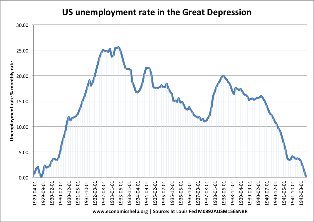
This line graph shows the monthly US unemployment rate. It provides a more granular view than the annual data, revealing the relentless climb to the peak of over 25% in early 1933.
The Narrative of the Collapse
The data tells a story of economic implosion. This was not a smooth decline but a series of shocks, primarily driven by banking panics that destroyed the money supply and crushed confidence.
Activity: Watch a Narrative Explanation (5 minutes)
This video provides an excellent narrative overlay for the data we've just examined. Pay close attention to the description of the price collapse and its comparison to previous downturns.
The video highlights that prices fell by an average of 7% per year between 1930 and 1933, and the wholesale price index fell by 33% in total. This confirms the severity of the deflation shown in the Reed College data table.
3. Isolating the Deflationary Period and its Correlates
Based on our analysis, we can now precisely define the timeline and its key features.
- The Onset (1929-1930): The recession begins in August 1929. The stock market crashes in October. The economy contracts sharply in 1930, and mild deflation sets in.
- The Great Contraction (1930-1933): This is the core of the crisis. As described in the EH.net article, a series of banking panics began in late 1930 and intensified through 1932. This is the period where all three indicators flash bright red:
- Deflation: Intensifies dramatically, with prices falling at roughly 10% per year.
- GDP: Collapses, with double-digit negative growth.
- Unemployment: Surges from under 10% to 25%.
The data makes the correlation undeniable. The most severe period of economic collapse in US history coincided perfectly with its most severe bout of deflation.
Let's summarize the devastation with a simple "before and after" snapshot using the data from the Reed College table.
| Indicator | 1929 (Peak) | 1933 (Trough) | Change |
|---|---|---|---|
| Unemployment Rate | 3.2% | 24.9% | +21.7 p.p. |
| Per-capita real GNP | $1,671 | $1,126 | -32.6% |
| GNP Deflator (Price Level) | 50.6 | 39.3 | -22.3% |
4. The Long Road Back: 1933-1939
The learning outcome extends to 1939, covering the period of recovery under the New Deal. The economy hit its absolute bottom in March 1933.
Activity: Trace the Recovery in the Data (10 minutes)
Return to the Reed College data table and trace the indicators from 1933 to 1939.
Great Depression Case - Economics Department (Table 1: Major Macroeconomic Statistics (1925-1941))
You should observe the following:
- A Turnaround: Starting in 1934, the economy experiences a remarkable recovery. Real GNP growth is strong, hitting 13.15% in 1936.
- A Return to Inflation: The price level begins to rise again in 1934, and inflation returns, peaking at 4.22% in 1937. The severe deflationary period is over.
- Stubbornly High Unemployment: Despite the strong growth, unemployment falls slowly. It was still 14.3% in 1937.
- The "Recession within a Depression" (1937-38): Notice the sharp reversal in 1938. Real GNP falls by 5.84%, unemployment jumps back to 19.0%, and the economy slips back into mild deflation (-1.35%). This event highlights the fragility of the recovery.
By 1939, the economy was growing again, but unemployment remained at a staggering 17.2%. It would take the massive fiscal stimulus of World War II to finally bring the economy back to full employment.
Conclusion
Today we have constructed a data-driven timeline of the Great Depression, focusing on the interplay between prices, output, and employment.
Key Takeaways:
- The Great Depression can be divided into two main phases: the catastrophic collapse from 1929 to 1933, and the long, uneven recovery from 1933 to the start of WWII.
- The most acute phase of the crisis (1930-1933) was defined by severe deflation, with the price level falling by over 20%.
- This period of intense deflation was perfectly correlated with a collapse in real GDP (down by a third) and a surge in unemployment to an unprecedented 25%.
- The recovery phase, beginning in 1933, was characterized by a return to inflation and strong GDP growth, but unemployment remained stubbornly high. A secondary recession in 1937-38 demonstrated the economy's continued fragility.
Preview of the Next Lesson:
We have now established what happened and when. We've seen the strong correlation between deflation and economic collapse. In our next lesson, we will delve into the why. We will analyze the primary channels through which deflation exacerbated the crisis, returning to Irving Fisher's debt-deflation theory to explain how falling prices turned a severe recession into the Great Depression.
Can't find a good explanation? Sign up and we'll make it for you
Sign up