
Hello. In the previous lesson, you used SQL window functions to calculate returns, trailing volatility, and cross-sectional ranks without losing the date-by-symbol structure of market data. Those calculations are now inputs to exploratory analysis: plots that help you see whether the data behaves in a way your later models and risk estimates can reasonably handle.
This lesson builds a compact visual diagnostic workflow for adjusted-price data: return-distribution plots, cross-asset and temporal dependence plots, and rolling-volatility charts. The aim is not to “prove” a model from a chart. It is to identify facts worth carrying into research decisions: fat tails, unstable correlations, unusual observations, and volatility clustering. These are also useful baseline checks when comparing real and synthetic NIFTY 50 panels.
Begin with returns, not price levels
A price chart is useful for context, but price levels are usually a poor object for distributional analysis. Prices have trends, differ in scale across assets, and are constrained to remain positive. Returns put movements on a comparable scale.
For a price , the one-period log return is:
Log returns are particularly convenient because they aggregate over time by addition. Use the adjusted close series already cleaned and aligned in the earlier lessons.
Assume prices is a wide DataFrame with:
- a sorted
DatetimeIndex; - one column per instrument;
- adjusted close prices;
- missing values retained where data is unavailable rather than replaced with invented prices.
import numpy as np
import pandas as pd
import matplotlib.pyplot as plt
import seaborn as sns

from scipy import stats
from statsmodels.graphics.tsaplots import plot_acf

sns.set_theme(style="whitegrid", context="notebook")

# Basic structural checks
assert prices.index.is_monotonic_increasing
assert prices.index.is_unique

# Each column becomes its own return series.
# A missing price produces a missing return rather than a fabricated zero return.
log_returns = np.log(prices / prices.shift(1))
Do not forward-fill prices merely to make a return panel rectangular. A forward-filled price creates a zero return, which can artificially lower estimated volatility and alter correlations. For a particular pairwise analysis, align the relevant return series explicitly and drop only the pair’s missing rows.
A productive exploratory notebook normally answers four questions:
- Distribution: Are returns symmetric, thin-tailed, and plausibly normal-looking?
- Cross-asset dependence: Which assets tend to move together?
- Temporal dependence: Does today’s return, or today’s magnitude of movement, resemble recent observations?
- Regimes: Are calm and turbulent periods visibly clustered in time?
Return distributions: center, asymmetry, and tails
Choose one liquid asset first. The following code creates three complementary diagnostics:
- a histogram, which shows the bulk and rough tail shape;
- a normal Q-Q plot, which compares empirical quantiles with a fitted normal reference;
- a box plot, which makes unusually large observations visible.
symbol = "RELIANCE.NS"  # Replace with a column available in your data
r = log_returns[symbol].dropna()

mu = r.mean()
sigma = r.std(ddof=1)

print(
    pd.Series(
        {
            "mean": mu,
            "daily standard deviation": sigma,
            "skewness": stats.skew(r, bias=False),
            "excess kurtosis": stats.kurtosis(r, fisher=True, bias=False),
            "observations": len(r),
        }
    )
)

fig, axes = plt.subplots(1, 3, figsize=(16, 4))

# Histogram with a fitted normal density for visual comparison
sns.histplot(r, bins=60, stat="density", color="steelblue", alpha=0.65, ax=axes[0])
x = np.linspace(r.min(), r.max(), 300)
axes[0].plot(x, stats.norm.pdf(x, loc=mu, scale=sigma),
             color="darkred", lw=2, label="Fitted normal")
axes[0].set(
    title=f"{symbol}: log-return distribution",
    xlabel="Daily log return",
    ylabel="Density"
)
axes[0].legend()

# Normal Q-Q plot
stats.probplot(r, dist="norm", plot=axes[1])
axes[1].set_title(f"{symbol}: normal Q-Q plot")

# Box plot
sns.boxplot(x=r, color="lightsteelblue", ax=axes[2])
axes[2].set(
    title=f"{symbol}: box plot",
    xlabel="Daily log return"
)

fig.tight_layout()
plt.show()
A normal Q-Q plot is often more informative than a histogram because it directs attention to the quantiles that matter. If returns were well described by a normal distribution, points would lie approximately on the reference line throughout the plot.
In financial data, a common pattern is:
- reasonable alignment near the center;
- systematic departures at one or both tails;
- some observations much farther from the center than a fitted normal distribution would suggest.
That pattern indicates heavy tails. It does not mean that every normal-based method is unusable, but it is a warning that tail-sensitive quantities, such as stress losses and extreme risk estimates, deserve care.
The printed excess kurtosis is a useful numerical companion. With the definition used above, a normal distribution has excess kurtosis of approximately zero. A positive estimate suggests heavier tails than the normal benchmark in this sample. Skewness records directional asymmetry: negative skew indicates a relatively longer or heavier left tail, while positive skew indicates the opposite. Neither statistic should be treated as a complete diagnosis on its own.
Python for Finance: Are stock returns normally distributed?
Watch “Python for Finance: Are stock returns normally distributed?” by QuantPy for a practical walkthrough of histogram, Q-Q, and box-plot diagnostics. It reinforces why a visually bell-shaped center is not sufficient evidence for a normal return model.
Watch distribution diagnostics. Focus on the distinction between the center of the histogram and the tails in the Q-Q plot. Treat the examples as exploratory evidence, not as a substitute for checking the precise sample, return definition, and time period in your own data.
Read the plots conservatively
Three practical cautions matter:
- Bin count changes a histogram. If the apparent tail shape changes dramatically when you change
bins=60tobins=30, rely more on the Q-Q plot and the raw extreme observations. - A fitted normal curve uses your sample mean and volatility. It is a visual benchmark, not a forecast.
- Outliers require investigation. A large return may be a legitimate market event, a corporate-action error, a stale price, or a data-alignment problem. The audit workflow from Module 1 comes before deleting it.
Dependence has two forms: across assets and across time
A portfolio’s risk is not determined by each asset’s volatility alone. It also depends on how assets move together. The most common first summary is the Pearson sample correlation:
This measures linear association. A high positive value means that, within the chosen sample, assets tended to have returns with the same sign and relative direction. It does not establish causality, a stable economic relationship, or independence when the value is near zero.
Cross-asset correlation: scatter plots and heatmaps
For a pair of assets, inspect both the numeric correlation and the scatter plot.
pair = log_returns[["RELIANCE.NS", "HDFCBANK.NS"]].dropna()

rho = pair["RELIANCE.NS"].corr(pair["HDFCBANK.NS"])
print(f"Sample correlation: {rho:.3f}")

fig, ax = plt.subplots(figsize=(6, 5))

sns.regplot(
    data=pair,
    x="RELIANCE.NS",
    y="HDFCBANK.NS",
    scatter_kws={"alpha": 0.35, "s": 18},
    line_kws={"color": "darkred"},
    ax=ax
)

ax.set(
    title=f"Same-day log returns, correlation = {rho:.2f}",
    xlabel="RELIANCE.NS log return",
    ylabel="HDFCBANK.NS log return"
)

plt.show()
The fitted line summarizes linear association, while the cloud shows features correlation can hide: isolated extreme days, asymmetric co-movements, or groups of observations with different dispersion.
For many assets, use a heatmap. Fix the color scale to the full interval from to ; otherwise, separate charts can look visually different even when their correlation values are similar.
universe = [
    "RELIANCE.NS",
    "HDFCBANK.NS",
    "ICICIBANK.NS",
    "INFY.NS",
    "TCS.NS",
    "WIPRO.NS",
]

available = [s for s in universe if s in log_returns.columns]

corr = log_returns[available].corr(min_periods=100)

fig, ax = plt.subplots(figsize=(8, 6))

sns.heatmap(
    corr,
    cmap="vlag",
    center=0,
    vmin=-1,
    vmax=1,
    square=True,
    linewidths=0.5,
    annot=True,
    fmt=".2f",
    cbar_kws={"label": "Pearson correlation"},
    ax=ax
)

ax.set_title("Sample correlation of daily log returns")
plt.tight_layout()
plt.show()

The heatmap is symmetric, so the upper and lower triangles repeat the same information. In the displayed NIFTY example, the strongest visible relationship is between HDFCBANK.NS and KOTAKBANK.NS, at approximately . That is economically plausible for two bank stocks, but the plot alone cannot tell you whether the relationship is persistent, caused by a shared market factor, or concentrated in a stress period.
Data Handling & Visualization: Python for Quant Finance ...
Read the correlation and rolling-statistics discussion in this quantitative-finance visualization guide. It gives a useful interpretation of what a scatter plot and a correlation matrix can, and cannot, establish; its illustrated data are simulated, so use it for method rather than empirical claims about any named stock.
In the subsection “Scatter Plots and Correlations,” read the scatter and heatmap discussion. Focus on the distinction between correlation and independence, and on why a matrix becomes useful for several assets. Then, in “Rolling Statistics,” read the rolling-estimate discussion, noting why a full-sample number can conceal stress-period behavior.
Do not confuse correlation with a permanent diversification benefit
A full-sample correlation is an average over the selected period. It may conceal important variation. A 60-day rolling correlation lets you inspect that variation directly.
asset_a = "RELIANCE.NS"
asset_b = "HDFCBANK.NS"
window = 60

rolling_corr = (
    log_returns[asset_a]
    .rolling(window=window, min_periods=window)
    .corr(log_returns[asset_b])
)

fig, ax = plt.subplots(figsize=(11, 4))

ax.plot(rolling_corr, color="navy", lw=1.5)
ax.axhline(0, color="black", lw=1)
ax.set(
    title=f"{window}-trading-day rolling correlation",
    xlabel="Date",
    ylabel="Correlation"
)

plt.tight_layout()
plt.show()
The first dates have missing values because a 60-observation estimate is not yet available. Do not replace them with zero. A zero would claim “no relationship” when the correct interpretation is “insufficient history.”
Temporal dependence: autocorrelation
Dependence can also occur within one asset’s own history. The lag- autocorrelation measures the correlation between and :
An autocorrelation function, or ACF, plot displays this estimate for many lags. Plot raw returns first, then absolute returns. A raw-return ACF asks whether direction persists or reverses; an absolute-return ACF asks whether the magnitude of movement clusters.
fig, axes = plt.subplots(1, 2, figsize=(13, 4))

plot_acf(r, lags=40, zero=False, alpha=0.05, ax=axes[0])
axes[0].set_title(f"{symbol}: ACF of log returns")

plot_acf(r.abs(), lags=40, zero=False, alpha=0.05, ax=axes[1])
axes[1].set_title(f"{symbol}: ACF of absolute log returns")

fig.tight_layout()
plt.show()
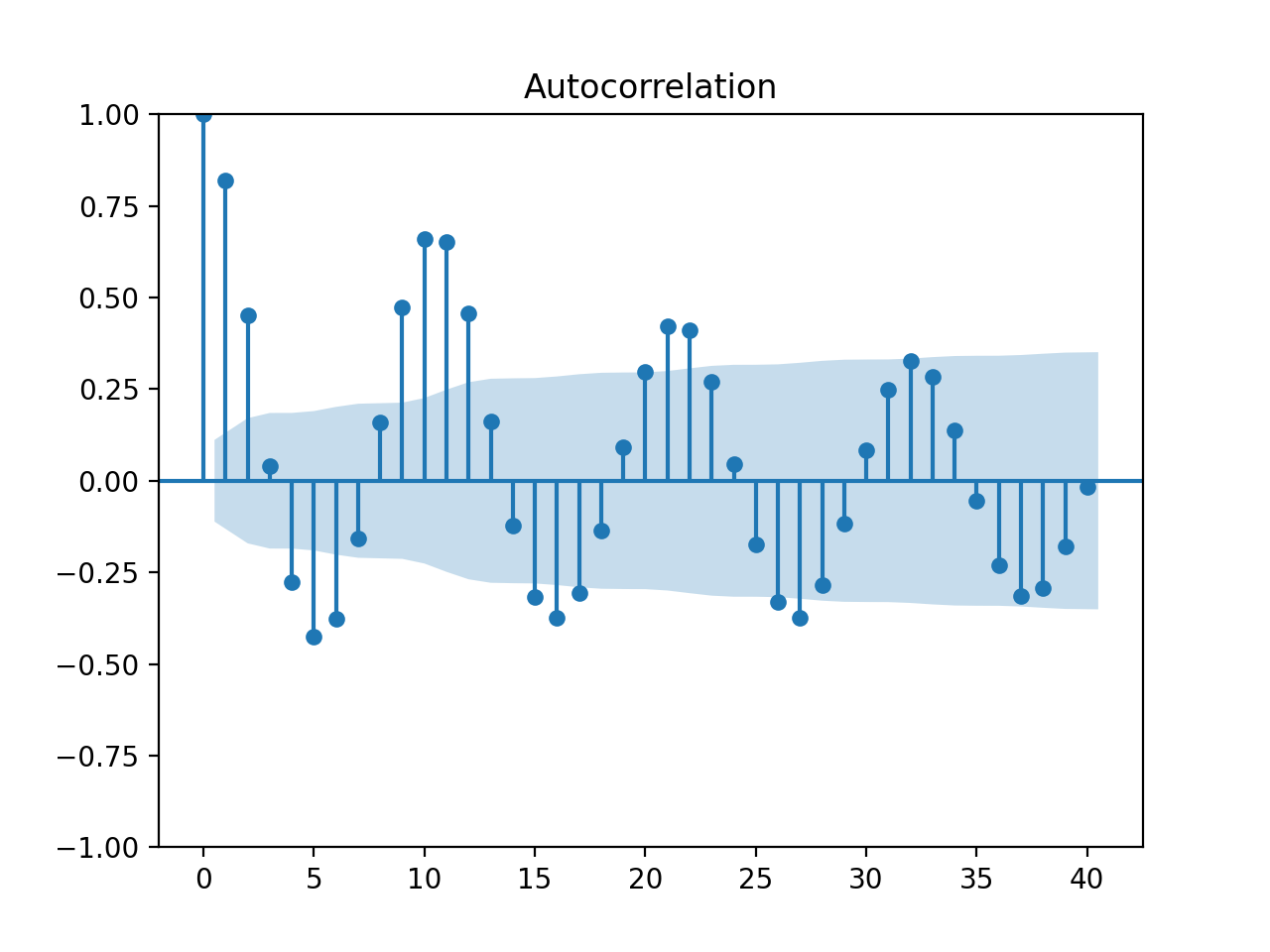
Lag zero is always , because a series is perfectly correlated with itself, so it is usually excluded from interpretation. Bars outside the approximate confidence band can indicate that a lag deserves investigation. Do not scan 40 lags and interpret one isolated bar as a trading opportunity: many lags create many chances for random-looking excursions.
For daily equity returns, the raw-return ACF is often weak. In contrast, the ACF of absolute or squared returns often displays positive short-lag dependence. That pattern is known as volatility clustering: quiet days tend to be followed by relatively quiet days, while large-movement days tend to be followed by large-movement days. It motivates the volatility models you will study later, but at this stage it is simply a visible empirical feature to document.
Volatility regimes: make changing risk visible
A single annualized volatility number can be useful for a summary table, but it averages calm and turbulent periods together. A rolling estimate makes the changing risk environment visible.
For a window of daily log returns, rolling sample volatility is:
A conventional annualized version is:
The factor is an approximate number of trading sessions in a year. It makes daily estimates easier to compare with annually quoted risk figures, but it relies on a square-root-of-time convention and should not be mistaken for a precise prediction of annual risk.
window = 60

rolling_vol_ann = (
    log_returns[symbol]
    .rolling(window=window, min_periods=window)
    .std(ddof=1)
    * np.sqrt(252)
)

fig, axes = plt.subplots(
    2, 1, figsize=(12, 7), sharex=True,
    gridspec_kw={"height_ratios": [2, 1]}
)

# Indexed price helps relate volatility episodes to market moves
indexed_price = 100 * prices[symbol] / prices[symbol].dropna().iloc[0]

axes[0].plot(indexed_price, color="black", lw=1.2)
axes[0].set(
    title=f"{symbol}: indexed adjusted price and rolling volatility",
    ylabel="Indexed price"
)

axes[1].plot(100 * rolling_vol_ann, color="firebrick", lw=1.4)
axes[1].set(
    ylabel="Annualized volatility (%)",
    xlabel="Date"
)

fig.tight_layout()
plt.show()
Python for Finance: Historical Volatility & Risk-Return Ratios
Watch “Python for Finance: Historical Volatility & Risk-Return Ratios” by QuantPy for a short implementation-focused view of rolling historical volatility. The essential idea is that a moving standard deviation reveals risk changes that a full-sample value hides.
Watch rolling volatility. Focus on the choice of rolling-window length and on the value of placing a volatility plot near a price plot for contextual interpretation.
A volatility regime is a descriptive label for a period with a relatively persistent level of volatility. A rolling chart may show:
- a low, stable band associated with relatively calm trading;
- a rising transition period;
- sharp spikes around market-wide or asset-specific events;
- a high-volatility cluster that persists after the initial shock.
Do not label a period “high volatility” solely because one daily return is large. A regime refers to a sustained pattern in a rolling estimate. Conversely, do not infer that a high-volatility period must continue; the plot describes information observed through each date.
The exact window is a research choice:
| Window | Main use | Trade-off |
|---|---|---|
| 20 trading days | Responsive monthly-style diagnostic | Noisy estimate |
| 60 trading days | Balanced medium-term view | Responds more slowly to sudden changes |
| 252 trading days | Long-run annual perspective | Can hide short stress episodes |
For a first pass, create both 20-day and 60-day charts. If they tell contradictory stories, that is useful information: it suggests volatility has changed recently.
The phrase realized volatility is sometimes used loosely for a rolling standard deviation of returns. More precisely, high-frequency realized-volatility estimators are often based on sums of squared intraday returns. With daily adjusted-close data, call the quantity above rolling historical volatility or clearly state that it is a daily-return proxy.
A compact research output
For each asset or small universe, aim to produce an EDA record containing:
- a histogram and normal Q-Q plot of daily log returns;
- sample skewness and excess kurtosis;
- a correlation heatmap for a clearly stated universe and date range;
- one pairwise rolling-correlation plot;
- ACF plots for returns and absolute returns;
- 20-day and 60-day annualized rolling-volatility plots.
For every chart, write a one- or two-sentence interpretation that distinguishes observation from claim. For example:
The 60-day rolling volatility is elevated during several clustered intervals, so a constant-volatility assumption is unlikely to describe the entire sample equally well.
This is stronger and more defensible than claiming that volatility “will remain high.” It also provides a clean visual baseline for your synthetic-data work: a generated return panel should not only resemble real data in a histogram, but should be checked for cross-asset dependence and volatility clustering as well.
Key takeaways
Exploratory financial visualization is a structured diagnostic process rather than presentation decoration.
- Analyze adjusted returns, not raw price levels, when studying distributional behavior.
- Combine histograms, Q-Q plots, box plots, and numerical moments to inspect asymmetry and heavy tails.
- Use scatter plots and correlation heatmaps for cross-asset linear dependence, while remembering that correlation is neither causation nor a guarantee of stable diversification.
- Use ACF plots to distinguish weak return-direction dependence from potentially stronger volatility clustering in absolute or squared returns.
- Plot rolling annualized volatility alongside indexed prices to identify calm, stressed, and transitional periods.
- Treat window size, return frequency, asset universe, and date range as explicit research choices.
Next, you will move from visual evidence to formal time-series diagnostics: rolling summaries, autocorrelation evidence, and stationarity tests will help assess whether a series has statistical properties that remain sufficiently stable for a chosen model.
Can't find a good explanation? Sign up and we'll make it for you
Sign up