
Welcome back. In the previous lesson, you learned to classify an ideal response by locating its passband: low frequencies, high frequencies, a middle band, or everything except a middle band. You also distinguished an ideal vertical boundary from the smooth, cutoff behavior of a physical passive filter.
This lesson turns that recognition skill into a drawing skill. By the end, you should be able to produce four clean, fully labeled ideal magnitude-response diagrams: low-pass, high-pass, bandpass, and bandreject. The aim is not artistic precision; it is to make the intended signal-selection behavior unambiguous.
Choose the axes before drawing the response
A magnitude-response diagram plots how much of an input sinusoid appears at the output as frequency changes. The standard quantities are
for a linear magnitude ratio, or
for magnitude in decibels.
For the ideal diagrams in this course, the most transparent choice is:
- Horizontal axis: frequency , in hertz .
- Vertical axis: normalized magnitude , in or simply “dimensionless.”
- Passband level: .
- Stopband level: .
A passband gain of unity means that, ideally, the output amplitude equals the input amplitude. If a problem specifies some other passband gain , draw the plateau at instead of .
Read the “Some Key Points and Terms” section of An Introduction to Filters from All About Circuits. It connects the ratio V_\text{out}/V_\text{in}, decibels, and frequency-axis conventions used in practical response plots.
In the section “Some Key Points and Terms,” read from the sentence beginning response curve conventions. Focus on the fact that frequency may be written as f in Hz or \omega in rad/s, and that practical magnitude plots commonly use dB vertically and a logarithmic frequency scale horizontally.
For hand-drawn ideal response diagrams, a linear frequency axis is usually easiest because it allows you to show DC clearly at . Later, when you sketch Bode plots for RC and RL filters, you will normally use a logarithmic frequency axis.
There are two legitimate horizontal-axis conventions:
| Axis label | Meaning | Unit |
|---|---|---|
| ordinary frequency | ||
| angular frequency |
Use one, not both, on the same axis. This lesson will use and .
The supplied reference image shows the four standard response shapes and labels important regions. Its rounded curves and marked levels resemble practical filters; your ideal sketches will replace those rounded transitions with vertical steps.
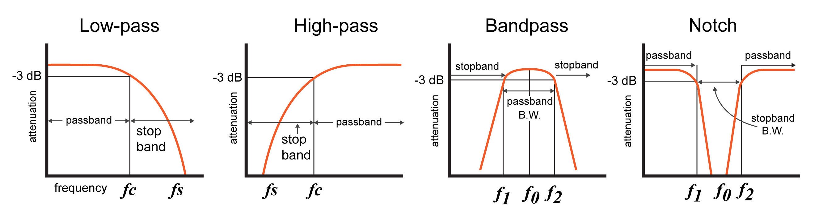
The ideal-drawing convention
An ideal filter is a visual model with an abrupt transition:
- Draw a horizontal line at wherever the signal is passed.
- Draw a horizontal line at wherever the signal is rejected.
- Join these levels with a vertical line at each cutoff frequency.
- Label the horizontal ranges “passband” and “stopband.”
- Place the cutoff label directly below its position on the frequency axis.
At a literal vertical discontinuity, the magnitude at the single exact cutoff frequency is a mathematical convention rather than a physically important value. Therefore, for ideal sketches, treat , , and as boundaries between regions.
This differs from a real first-order RC or RL response:
at cutoff, which is
Do not draw a rounded point on an ideal step response. You will do that when constructing real Bode-magnitude sketches in later modules.
A useful labeling rule is:
| Filter class | Cutoff labels needed |
|---|---|
| Low-pass | one cutoff, |
| High-pass | one cutoff, |
| Bandpass | lower cutoff , upper cutoff |
| Bandreject | lower cutoff , upper cutoff |
For the two-cutoff filters, always preserve the ordering
Draw the one-cutoff responses
Low-pass filter
Start with axes labeled and . Mark at the left end of the frequency axis and on the vertical axis. Choose a point to the right of DC and label it .
Draw the response at from up to . At , draw a vertical drop to , then continue at zero for frequencies above .
Your final labels should state:
The visual message is: the left side is passed. That is why it is low-pass.
When labeling the graph, put “passband” above or within the unity-level region and “stopband” near the zero-level region. A compact title such as Ideal low-pass magnitude response is also good practice.
High-pass filter
Use the same axes and the same unity normalization. Mark one cutoff, , on the horizontal axis.
This time, start at near DC and continue that line until . At , draw a vertical rise to , then continue at unity toward higher frequency.
The regions are:
The left side includes DC, so an ideal high-pass filter rejects DC. The right side is passed, which gives the filter its name.
A reliable memory cue is to read the unity-level portion of your own diagram: if the line lies left of the cutoff, it is low-pass; if it lies right, it is high-pass.
Draw the two-cutoff responses
With two cutoff frequencies, first place and on the frequency axis, leaving a visible interval between them. Label that interval before drawing the response. This prevents the common error of producing a low-pass or high-pass sketch with an extra, meaningless tick mark.
Bandpass filter
For a bandpass response, the central interval is passed. Draw:
- below .
- A vertical rise at .
- from to .
- A vertical drop at .
- above .
Label the regions as
The important visual feature is a central unity plateau. In a real series RLC bandpass circuit, that plateau becomes a rounded resonant peak, but the same two cutoff frequencies bound the passed band.
Bandreject filter
A bandreject response is the exact complement in shape: the middle interval is rejected. Draw:
- below .
- A vertical drop at .
- from to .
- A vertical rise at .
- above .
The labels are
A narrow bandreject filter is often called a notch filter. For this ideal drawing, “narrow” does not alter the labeling method; it only means that the separation between and is small compared with the surrounding frequency range.
A compact drafting checklist
Use this checklist every time you are asked to “draw the ideal magnitude response.”
| Item | What must appear on the diagram |
|---|---|
| Vertical axis | $ |
| Horizontal axis | , with DC or at the left |
| Response shape | Flat levels at and , with vertical transitions |
| Cutoffs | , or and , marked below the axis |
| Regions | Every passband and stopband explicitly named |
| Filter identity | A title or clear annotation: low-pass, high-pass, bandpass, or bandreject |
If the vertical axis is in decibels instead, the labeling changes as follows:
| Linear-magnitude sketch | dB-magnitude sketch |
|---|---|
| Passband at $ | H |
| Stopband at $ | H |
| Vertical axis unit: or dimensionless | Vertical axis unit: |
For an ideal dB sketch, it is conventional to show the stopband heading downward or to label it “ideal attenuation,” rather than attempting to place at a finite point on the page.
Frequent drawing errors
The diagrams are simple, but their labels carry technical meaning. Watch for these errors:
-
Using “attenuation” as the vertical label while plotting increasing gain upward.
Prefer or “magnitude gain (dB)” unless the sign convention for attenuation is made explicit. -
Omitting units.
Write or , and write or magnitude . -
Putting on an ideal response.
The condition belongs to a real, smooth response. In an ideal plot, the cutoff is the vertical pass/stop boundary. -
Calling the entire span from to the passband of a bandpass filter.
Only the interval between the two cutoffs is passed. -
Showing only one passband on a bandreject response.
A bandreject filter passes both the low-frequency and high-frequency outer regions. -
Treating a stopband frequency as another cutoff without a stated specification.
In a basic ideal response, the cutoff itself separates the passband and stopband. A separate stopband-frequency label is used only when a design specification defines a required attenuation at that frequency.
Key takeaways
A complete ideal magnitude-response sketch has three layers of information: the axes and units, the step-shaped magnitude response, and the named frequency regions and cutoff boundaries.
- Low-pass: unity at low frequency, zero above .
- High-pass: zero at low frequency, unity above .
- Bandpass: unity only between and .
- Bandreject: zero only between and .
For all four diagrams, use a horizontal frequency axis, a vertical magnitude axis, and explicit passband/stopband labels. Keep the ideal step response separate from the real cutoff curves you will encounter shortly.
Next, the course begins first-order low-pass filters by deriving the series RC low-pass transfer function using impedance division.
Can't find a good explanation? Sign up and we'll make it for you
Sign up