Hello! Welcome to your next lesson in the module on Emerging Architectures and Research Frontiers.
In our previous lesson, we explored gradient-based attribution methods like Saliency Maps and Integrated Gradients. We learned how they use the model's internal gradients to highlight which input features (e.g., pixels) were important for a specific prediction. However, their reliance on gradients ties them intrinsically to the model's architecture, making them inapplicable to models where gradients are inaccessible or nonsensical.
Today, we address this limitation by tackling the learning outcome: Apply SHAP for model-agnostic explanations. We will dive into SHAP (SHapley Additive exPlanations), a powerful and unified approach to model interpretability rooted in cooperative game theory. Unlike the methods we saw last time, SHAP can be applied to virtually any machine learning model, from a simple linear regression to a complex neural network.
Our goals for this lesson are to:
- Understand the core theoretical concept of Shapley values.
- Learn how to use the
shapPython library to generate explanations. - Interpret the rich visualizations SHAP provides for both individual predictions (local) and overall model behavior (global).
Let's get started.
1. The Fair Game: What are Shapley Values?
Imagine you have a machine learning model that predicts the price of a house. For a specific house, it predicts $500,000. The average house price across all your data is $300,000. How did the features of this specific house—its size, location, age, etc.—contribute to the $200,000 difference? Did the large size add $150,000, the prime location add $100,000, and its old age subtract $50,000?
This is precisely the question Shapley values answer. They provide a principled way to "fairly" distribute the difference between a specific prediction and the average prediction (the baseline) among the input features. The idea comes from game theory, where it's used to fairly distribute the "payout" of a game among its players.

To build a solid intuition for how these values are calculated, let's watch an excellent video that breaks down the concept.
Shapley Values : Data Science Concepts
The video 'Shapley Values : Data Science Concepts' from ritvikmath uses a simple ice cream shop analogy to explain the core logic behind Shapley values. It's one of the clearest explanations available.
Please watch the following segments: The Setup (00:25 - 03:37): Understand the core question: how to attribute the difference between a specific prediction and the average prediction to individual features. The Calculation (06:50 - 13:24): This is the most important part. Pay close attention to the process of using random permutations and 'Frankenstein' samples to calculate the contribution of a single feature. The intuition is more important than memorizing the steps. Putting it Together (13:24 - 14:55): See how the process is repeated for all features and can be aggregated to understand the entire model.
As the video explained, the process involves simulating every possible ordering (permutation) of features "entering" the model and measuring the change in prediction as each one is added. The SHAP value for a feature is its average marginal contribution across all these permutations.
The Properties of SHAP
This game-theoretic foundation gives SHAP several desirable properties, but the most important one is Local Accuracy (also called the Efficiency property). It guarantees that for any single prediction, the sum of the SHAP values for all features will exactly equal the difference between the model's prediction for that instance and the base value (the average prediction).
This makes each explanation a complete, closed accounting system, which is a very powerful guarantee.
2. Applying SHAP in Python
While the theoretical calculation is computationally expensive (NP-hard, in fact), the shap Python library provides highly optimized and clever approximations that make it practical. Let's see how to use it.
There are different "explainers" in the shap library, optimized for different model types. For example:
shap.TreeExplainer: A fast implementation for tree-based models like XGBoost, LightGBM, and Random Forests.shap.DeepExplainer: A fast approximation for deep learning models that leverages the model's structure.shap.KernelExplainer: A model-agnostic version that can work with any function, but is slower.shap.Explainer: A convenient wrapper that often automatically selects the best explainer for your model.
The general workflow is:
- Train your machine learning model.
- Create an
explainerobject by passing your model and a sample of your training data (to establish the baseline). - Use the explainer to calculate
shap_valuesfor the instances you want to explain. - Use
shap's plotting functions to visualize the results.
This next video will walk you through a complete, practical example.
SHAP with Python (Code and Explanations)
The video 'SHAP with Python' from A Data Odyssey provides a clear, code-along tutorial for applying SHAP to an XGBoost model. It covers the most important plots you'll use in practice.
Watch the segments covering the SHAP implementation and visualizations. We'll break down each plot type right after. Calculating SHAP Values (06:46 - 08:12): See how the shap.Explainer is used. Local Explanations (08:12 - 09:47): Focus on the waterfall and force plots for explaining a single prediction. Global Explanations (10:55 - 15:16): Pay attention to the bar plot (mean absolute SHAP), beeswarm plot, and dependence plot for understanding the whole model.
Now, let's consolidate our understanding of those plots.
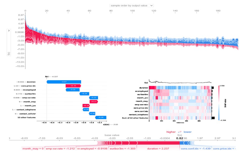
2.1 Local Explanations: Explaining One Prediction
How do we explain the model's decision for a single data point?
-
Waterfall Plot: This is the most direct visualization of the additive nature of SHAP. It starts from the base value and shows how each feature's SHAP value (red for positive, blue for negative) "pushes" the prediction to its final value, .
-
Force Plot: This is a more compact version of the waterfall plot. It's often used to visualize many explanations at once. Red features push the prediction higher, blue features push it lower. The size of the feature's block is proportional to the magnitude of its SHAP value.
2.2 Global Explanations: Understanding the Entire Model
By aggregating the SHAP values from many (or all) data points, we can understand the model's behavior as a whole.
-
SHAP Feature Importance (Bar Plot): This plot shows the average absolute SHAP value for each feature. It tells us which features have the largest impact on the model's predictions, on average. It's a more robust alternative to the classic feature importance measures (like Gini impurity) found in tree-based models.
-
SHAP Summary Plot (Beeswarm Plot): This is arguably the most information-dense and useful SHAP plot. Each point is the SHAP value for a feature for a single instance.
- Feature Importance: Features are ordered vertically by their importance (same as the bar plot).
- Magnitude: The horizontal position shows the magnitude and direction of the SHAP value.
- Original Value: The color shows whether the original value for that feature was high (red) or low (blue).
- Distribution: The density of points shows the distribution of SHAP values for that feature.
For example, a beeswarm plot might show that for the
shell weightfeature, high values (red points) have positive SHAP values, meaning high shell weight consistently pushes the prediction higher. -
Dependence Plot: This is a scatter plot of a feature's value (on the x-axis) against its SHAP value (on the y-axis). It helps you see the relationship between a feature's value and its impact on the prediction. It can reveal non-linearities and, by coloring the points by a second feature, can also reveal interaction effects.
Test your understanding!
You are analyzing a beeswarm plot for a model that predicts customer churn (where a positive SHAP value contributes to a higher probability of churn). You see the following for a feature called monthly_charges:
- The points on the far right (high positive SHAP values) are mostly red.
- The points on the left (negative or near-zero SHAP values) are mostly blue.
What can you infer about how monthly_charges affects the model's churn prediction?
Show answer
The colors in a beeswarm plot represent the feature's original value (red = high, blue = low).
- Since high positive SHAP values (predicting churn) correspond to red points (high
monthly_charges), it implies that higher monthly charges are a strong driver of churn according to the model. - Since negative or neutral SHAP values (predicting retention) correspond to blue points (low
monthly_charges), it implies that customers with lower monthly charges are predicted to be less likely to churn.
In short, the model has learned that the higher the monthly bill, the more likely the customer is to leave.
3. Considerations and Best Practices
SHAP is a powerful tool, but it's important to be aware of its nuances.
- Model-Agnostic vs. Model-Specific: While
KernelExplaineris truly model-agnostic, it's slow. When possible, using model-specific explainers likeTreeExplaineris much more efficient. Your CS background will appreciate the trade-off: the specific explainers gain speed by exploiting the internal structure of the model to avoid re-evaluating it for every single coalition. - Correlated Features: The default SHAP implementations assume features are independent. When features are highly correlated, this can lead to crediting impact to unrealistic data combinations (e.g., a house with 10 bedrooms but only 500 sq. ft.). Be cautious when interpreting SHAP values for highly correlated features.
- The Output Space Matters: For classification models, you can explain the model's output in terms of log-odds or probabilities. Explaining the log-odds output is often more mathematically pure and directly reflects the model's additive structure (especially for models like logistic regression). Explaining probabilities can be more intuitive but can show interaction effects that are just artifacts of the logit transformation.
18 SHAP – Interpretable Machine Learning
For a deeper dive into the theory and the different estimation methods, the 'Interpretable Machine Learning' book by Christoph Molnar is an essential resource. It also provides a balanced view of the strengths and weaknesses.
Please read the following sections: SHAP theory: Skim this to reinforce the desirable properties (Local Accuracy, Missingness, Consistency). Strengths: Understand why SHAP is so popular. Limitations: This is crucial. Pay attention to the points about KernelSHAP's speed and the issue of feature dependence.
Conclusion
In this lesson, we moved from the model-specific world of gradient-based methods to the flexible, model-agnostic framework of SHAP. You now have a powerful tool for peering inside any black-box model and demanding an explanation for its behavior.
Key Takeaways:
- SHAP explains a model's prediction by computing Shapley values, which fairly distribute the prediction's deviation from the baseline among the input features.
- The core property of SHAP is Local Accuracy: the sum of a prediction's SHAP values equals the prediction minus the base value.
- Local explanations like waterfall and force plots help dissect individual predictions.
- Global explanations like feature importance (bar) plots, summary (beeswarm) plots, and dependence plots aggregate local explanations to reveal overall model behavior.
- The
shaplibrary provides efficient implementations and a rich suite of visualizations to apply these concepts in practice.
Preview of the Next Lesson:
Now that we have two powerful sets of tools for understanding how models think (gradient-based methods and SHAP), we can ask a more adversarial question: Can we use this understanding to fool them? In the next lesson, we will explore this by learning how to generate adversarial examples to test model robustness.