
Welcome back. Last time, you added RSI as a momentum layer: it can show persistent strength, weakness, or a possible momentum mismatch, but it cannot by itself predict a reversal. Bollinger Bands add a different layer: volatility. They show whether price movement is currently compressed or unusually dispersed around a moving average.
By the end of this lesson, you will be able to configure a practical Bollinger Bands setup in TradingView and interpret three things separately:
- Volatility state: are conditions contracting or expanding?
- Price position: is price near, inside, or outside the bands?
- Market context: does that position support continuation, possible exhaustion, or simply uncertainty?
The discipline throughout is the same as with RSI: a band touch is information, not an instruction.
An adaptive envelope around price
Bollinger Bands were developed by John Bollinger to make changing volatility visible directly on a price chart. Unlike a fixed-price channel, the distance between the bands adjusts as recent price movement becomes calmer or more volatile.
The conventional configuration uses:
- a 20-period simple moving average as the middle band;
- an upper band two standard deviations above that average;
- a lower band two standard deviations below it.
For closing prices , the default calculation can be represented as:
Here, is the middle band, the upper band, the lower band, and is the recent standard deviation of the selected price source.
The useful intuition is straightforward:
- When recent closes remain relatively close to their average, standard deviation falls and the bands contract.
- When recent closes move farther from their average, standard deviation rises and the bands expand.
Because the calculation is based on bars, “20” means 20 daily bars on a daily chart, 20 four-hour bars on a four-hour chart, and so on. It is not inherently a 20-day setting.
One statistical caution is important. The use of two standard deviations does not mean that exactly 95% of future prices should remain inside the bands. Financial prices are not a stable normal distribution, and the bands use a short, rolling sample. Treat them as an adaptive visual measure of recent dispersion—not a probability guarantee.
Learn Every Bollinger Indicator on TradingView: Tutorial
Watch TradingView’s “Learn Every Bollinger Indicator on TradingView: Tutorial” for a visual explanation of the three lines and the separate BandWidth tool. It is especially useful for seeing how the same indicator can show price position and volatility without predicting direction.
Watch band construction to see the middle average and standard-deviation envelope. Then skip to BandWidth, focusing on the distinction between bands narrowing and widening. Treat a squeeze as a condition of low volatility, not a forecast of whether price will rise or fall.
Configure a stable baseline in TradingView
For this course, use a single baseline before experimenting. A stable configuration makes cross-asset observation meaningful and prevents endless parameter tuning.
Bollinger Bands (BB) — TradingView
Read TradingView’s Bollinger Bands guide for the indicator’s construction, volatility interpretation, “walking the bands,” and its settings panel.
In the “Definition” section, read the construction. In “The basics,” focus on the volatility link. Then read the “Walking the Bands” discussion, beginning with the uptrend example. Finally, in “Inputs,” read the configuration options, noting the meanings of Length, Basis MA Type, Source, StdDev, Offset, and Timeframe.
On a liquid instrument’s daily chart, add TradingView’s built-in Bollinger Bands indicator. Use these settings initially:
| Setting | Baseline value | Why |
|---|---|---|
| Length | Widely used intermediate lookback | |
| Basis MA Type | SMA | Conventional Bollinger Band construction |
| Source | Close | Consistent with the typical setup |
| StdDev | Conventional band distance | |
| Offset | Keeps bands aligned with the current bars | |
| Timeframe | Chart | Prevents accidental mixed-timeframe readings |
Keep the middle band visible. It is a 20-period SMA, so it can act as a short-to-medium-term reference line, but it should not replace the 50- and 200-period averages you used for broader trend context.
Avoid changing the length or standard-deviation multiplier just because an alternative setting looks better on a past move. That is a small form of overfitting. First use across several assets and timeframes; later, if you change a parameter, state the reason in advance and test it consistently.
Read the bands through three distinct questions
Bollinger Bands become much more useful when each visual feature has one job.
1. Are the bands contracting or expanding?
A contraction, often called a squeeze, occurs when the upper and lower bands move close together. It tells you that recent volatility is low relative to the recent past.
A volatility expansion occurs when the bands spread apart. It tells you that price has recently begun moving more widely around its average.
Neither answers the directional question on its own.
| Observation | What it supports | What it does not establish |
|---|---|---|
| Bands unusually narrow | Volatility is compressed; a larger move becomes more plausible | The direction or timing of that move |
| Bands begin widening after consolidation | Volatility has increased | That the first breakout will persist |
| Bands stay wide after a sharp move | Volatility remains elevated | That the move is still a good entry |
| Bands flatten and narrow after expansion | Price movement has calmed | That a reversal has occurred |
The crucial distinction is between setup and signal. A squeeze is a setup for attention. A close beyond a meaningful range boundary, with appropriate volume and structure, may later become evidence for a directional hypothesis. The squeeze alone is not a trade thesis.
Band width is relative. A narrow band on BTCUSD can still represent a much larger percentage move than a wide-looking band on a large UK consumer-staples share. Compare an instrument’s current width with its own recent history, not with the raw width of another asset.
2. Where is price relative to the bands?
The bands create a relative definition of high and low:
- Near the upper band, price is high relative to its recent 20-bar average and volatility.
- Near the lower band, price is low relative to that same recent reference.
- Near the middle band, price is close to the recent average.
This is not the same as saying a share is fundamentally expensive or cheap. Nor is it the same as RSI’s momentum reading. A price can be near the upper band while RSI is moderately high, extremely high, or even declining; each combination needs market-structure context.
TradingView also offers Bollinger Bands %B, which expresses position numerically. Conceptually:
With the usual interpretation:
| %B value | Closing-price position |
|---|---|
| At the lower band | |
| At the middle band | |
| At the upper band | |
| Above | Above the upper band |
| Below | Below the lower band |
You do not need to add %B to your standard chart yet. Reading the bands visually is sufficient at this stage. The numerical view can become useful later when building alerts or Pine Script rules.
3. What is the market doing around that position?
The exact same upper-band touch can mean very different things.
| Market context | Upper-band interaction | More reasonable interpretation |
|---|---|---|
| Strong uptrend: higher highs, higher lows, rising trend references | Several closes near or above upper band | Persistent demand; possible trend continuation |
| Strong downtrend | Brief rally reaches upper band and fails near resistance | A rally within a bearish structure, not necessarily a bullish reversal |
| Horizontal range near established resistance | Touch or brief move above upper band followed by rejection | A possible mean-reversion candidate, requiring confirmation |
| Newly expanding bands after a tight range | Close outside the band and range | A possible breakout; assess follow-through, volume, and invalidation |
This is why Bollinger Bands cannot replace the work you already did with swing highs/lows, support and resistance, moving averages, Supertrend, RSI, and volume.
A band touch is an event, not a reversal call
The indicator’s creator states the principle particularly clearly: a tag of a band is a tag, not a buy or sell signal.
Bollinger Bands Explained. Rules to use Bollinger Bands successfully
Read John Bollinger’s own rules as a corrective to the common mistake of treating the outer bands as automatic reversal levels.
In “BOLLINGER BANDS RULES,” begin with rules 1 and 2. Then focus on the tag warning. Read the next rule beginning continuation and defaults, but treat these as disciplined observations to test, not universal guarantees.
A strong trend can walk the bands:
- In an uptrend, price may repeatedly close near or above the upper band.
- In a downtrend, price may repeatedly close near or below the lower band.
This behaviour often reflects directional strength. Shorting simply because price touched the upper band means fighting demonstrated demand; buying simply because price touched the lower band means fighting demonstrated selling pressure.
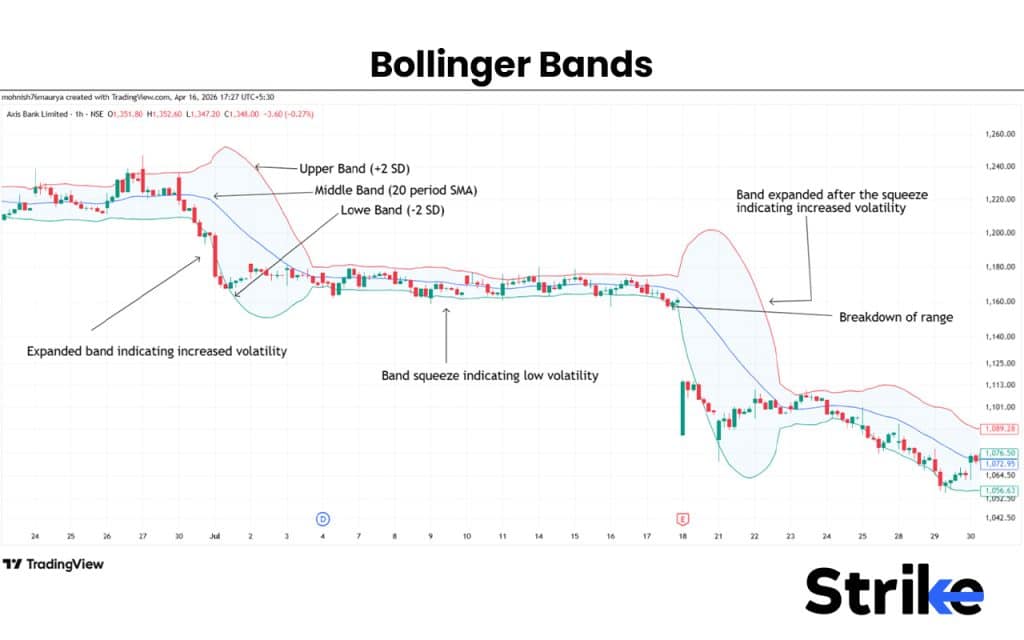
The Axis Bank chart illustrates a useful sequence: wide bands accompany a volatile decline, bands compress during the subsequent quiet range, and expansion resumes when price breaks lower. The important observation is not “tight bands predict a bearish move.” It is that the contraction highlighted a market moving from active volatility into compression; the eventual direction had to be supplied by the range break and subsequent price action.
When mean reversion is more plausible
In a clear sideways range, outer-band interaction can identify an area worth monitoring for a move back toward the middle band. The contextual evidence might be:
- Price reaches a previously tested support or resistance zone.
- It tags or briefly exceeds the relevant outer band.
- A candle rejects that excursion and closes back inside the bands.
- Price structure does not show a sustained breakout.
- You can define a nearby invalidation point beyond the range edge.
Even this is a candidate, not an order instruction. A range can become a trend at any time, especially around earnings, macroeconomic releases, or cryptocurrency-specific news.
A compact Bollinger Bands inspection routine
Spend about 12 minutes with three daily charts: one liquid US share or ETF, one UK-listed share, and BTCUSD or a liquid exchange-traded commodity product. Keep your existing market-structure markings, volume, trend references, RSI, and Bollinger Bands visible.
For each chart, record one observation in a note with this structure:
| Field | What to record |
|---|---|
| Instrument and timeframe | For example, daily chart |
| Market structure | Uptrend, downtrend, range, or transition |
| Band state | Contracting, expanding, or neither clearly |
| Price position | Upper half, lower half, near middle, or outside a band |
| Other evidence | Volume, RSI regime, trend-reference slope, nearby support/resistance |
| Interpretation | Continuation strength, possible range rejection, watchlist squeeze, or no clear conclusion |
Use the following process:
- Find one period where bands were visibly narrow compared with the preceding several months. Mark the local support and resistance range; do not guess the eventual breakout direction before inspecting it.
- Move forward through the chart and note whether volatility expanded. Then assess whether price actually held beyond the range or quickly returned inside it.
- Find one instance of price touching an outer band repeatedly. Classify the surrounding market structure. If price was walking the upper band in a rising trend, label it trend strength, not “overbought.”
- Find one outer-band touch in a range. Check whether a rejection candle and the range boundary gave a more credible mean-reversion context.
- Compare RSI with the bands, but do not make them vote on the same question. RSI describes momentum; Bollinger Bands describe recent volatility and relative price location.
A useful conclusion such as “volatility is compressed, but direction is unclear” is far better than forcing a bullish or bearish opinion.
Key takeaways
Bollinger Bands place an adaptive volatility envelope around a moving average. With the default setup, the middle band is a 20-period SMA and the outer bands are set two standard deviations from it.
- Narrow bands indicate volatility contraction; they are a reason to watch for a later move, not a directional forecast.
- Widening bands indicate volatility expansion; they describe increased movement but do not guarantee continuation or reversal.
- The upper and lower bands define relative high and low positions, not fundamental value or automatic overbought/oversold signals.
- In strong trends, price can walk the upper or lower band. Repeated outer-band touches may show strength rather than imminent reversal.
- In established ranges, an outer-band touch becomes more relevant when it coincides with genuine support or resistance and confirmed rejection.
- Use bands alongside structure, volume, trend tools, and RSI. Each tool should contribute a different kind of evidence.
Next, you will consolidate these components into a coherent TradingView chart template, giving market structure, volume, trend, momentum, and volatility tools explicit non-redundant roles.
Can't find a good explanation? Sign up and we'll make it for you
Sign up