
Hello! Welcome back to our course on creating financial data visualizations.
In our last lesson, you learned how to create the fundamental building blocks of any report: bar charts, line charts, and tables. You now know how to get your data onto the canvas in a visual format. However, a default chart is rarely a finished one. To tell a compelling story, especially in finance, your visualizations need to be clear, professional, and easy to interpret.
Today, we'll focus on turning those basic visuals into polished, insightful graphics. Our learning outcome is to format visualizations using colors, labels, and themes to maintain a consistent style. We will dive deep into the Format pane (the paintbrush icon) to take full control over the appearance of your reports. By the end of this lesson, you'll be able to transform a simple chart into a professional-grade visual that effectively communicates financial insights.
1. The Anatomy of Visual Formatting
Every visual you create in Power BI can be customized in dozens of ways. The central hub for all these options is the Format visual tab in the Visualizations pane.
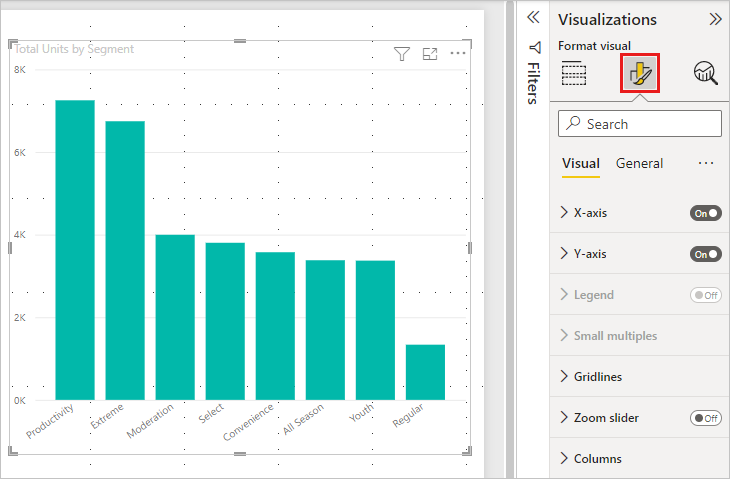
The options you see in this pane are contextual; they change depending on the type of visual you've selected. A pie chart won't have an X-axis to format, but a line chart will.
To get a foundational understanding of these options, let's start with a quick read from Microsoft's official documentation.
Get Started Formatting Report Visualizations - Power BI
This guide from Microsoft Learn, 'Get Started Formatting Report Visualizations,' provides an excellent overview of the formatting pane and its key capabilities.
Please read the following sections to get familiar with the basic formatting controls: 'Get started formatting report visualizations', 'Change colors in a visual', 'Change axis properties', and 'Add and format data labels'. This will give you a solid map of the tools we'll be using.
Now, let's see these principles in action. The following video demonstrates how to format a typical bar or column chart, covering some of the most common and important adjustments you'll make.
Visualizations in Power BI - Full Tutorial
This segment from the 'Visualizations in Power BI - Full Tutorial' by Simon Sez IT provides a practical walkthrough of formatting a clustered column chart.
Watch from 40:48 to 51:40. Pay close attention to how the presenter formats the axes, data colors, and data labels. Notice the 'Display units' option on the Y-axis, which is extremely useful for formatting large financial numbers (e.g., showing '$1.5M' instead of '$1,500,000').
Test your understanding!
Imagine you've created a line chart showing a company's stock price over five years. The chart is functional but hard to read. List three specific formatting changes you could make in the Format visual pane to improve its clarity.
Show answer
Here are a few possible improvements:
- Format the Y-Axis: Change the 'Display units' to Thousands or Millions to make the price labels cleaner. You could also add a title like "Share Price (USD)" for context.
- Add Data Labels: Turn on data labels, but perhaps only for key points (like the start and end values) or use a rule to show only the highest and lowest points to avoid clutter.
- Adjust the Title: Change the default title to something more descriptive, like "XYZ Corp. Share Price Trend (2018-2023)".
- Change Data Color: Choose a color for the line that has good contrast with the background and aligns with your report's overall color scheme.
2. Highlighting Key Data with Conditional Formatting
One of the most powerful formatting features for financial analysis is conditional formatting. It allows you to automatically apply formatting—like background colors, font colors, or icons—based on the data's value. This is the same concept as in Excel and is perfect for drawing attention to key figures.
For instance, you could format a table of stock returns so that:
- Positive returns are shaded green.
- Negative returns are shaded red.
- The highest-performing stocks have a darker shade of green.
This immediately tells a visual story that numbers alone cannot.
Visualizations in Power BI - Full Tutorial
Let's return to the Simon Sez IT tutorial. This section provides an excellent demonstration of applying conditional formatting to a matrix visual, which is highly relevant for financial statements.
Watch from 25:52 to 37:43. The video covers three types of conditional formatting: color scales (like a heatmap), data bars, and icon sets (like traffic lights). Think about how you could apply these to a profit and loss statement or a portfolio performance table.
3. Creating a Consistent Look with Themes
Manually formatting every single visual in a multi-page report is not only time-consuming but also prone to inconsistency. A professional report should have a unified look and feel. This is where themes come in.
A Power BI theme is a predefined collection of colors, fonts, and other formatting properties that you can apply to your entire report with a single click. This ensures that every visual you create automatically adheres to your desired style.
The Complete Guide to Power BI Themes + 12 Examples
To understand the importance of themes, let's read the introduction of 'The Complete Guide to Power BI Themes' from Numerro.
Read the sections 'What are Power BI Themes?', 'How to Customize Power BI Themes', and 'Tips For Using Color in your Power BI Reports'. This will explain the 'why' behind using themes and give you some excellent best practices for using color in financial visualizations.
Now, let's see how easy it is to apply and work with themes.
Visualizations in Power BI - Full Tutorial
This clip from the Simon Sez IT video shows you how to find and apply themes from the 'View' tab in Power BI.
Watch from 01:25:48 to 01:27:00. This short segment demonstrates how quickly a theme can change the entire look of a report.
Using a consistent theme is a hallmark of high-quality report design. It elevates your work from a collection of charts to a cohesive, professional dashboard.
4. Polishing Your Report: Principles of Good Design
Great formatting goes beyond just picking colors. It involves thinking about layout, spacing, and subtle effects that make your report look clean, modern, and trustworthy. The goal is to make the data easy to consume, not to distract with flashy effects.

Let's explore a few design tricks that can elevate your reports. The key is often subtlety.
5 DESIGN TRICKS that Make EVERY Power BI Report Look GREAT!
The video '5 DESIGN TRICKS that Make EVERY Power BI Report Look GREAT!' from How to Power BI offers some fantastic tips for polishing your reports. We'll watch a segment on using shadows and rounded corners.
Watch from 08:20 to 11:36. This clip explains how to use rounded corners and subtle shadows to give your visuals a modern, app-like feel and make them 'pop' from the background. These small details can make a big difference in the final product.
Conclusion
You've now taken a significant step beyond simply creating charts. You've learned how to control their appearance to enhance clarity, highlight key information, and build a professional, consistent brand for your analysis.
Key Takeaways:
- The Format pane is your command center for styling every aspect of a visual, from colors and fonts to axes and titles.
- Conditional formatting is a powerful tool for automatically highlighting trends and outliers in your financial data.
- Themes are crucial for maintaining a consistent and professional design across your entire report, saving you time and effort.
- Effective formatting also includes design principles like layout, spacing, and subtle effects like shadows to create a polished final product.
In our next lesson, we will begin a new module, "Building Interactive Financial Visuals in Power BI." You've learned to build and format visuals; now it's time to make them dynamic. We'll start with the most critical chart for financial analysis: the interactive time-series chart, where you'll learn to visualize stock price movements and market indices in a way that allows users to explore the data themselves.
Can't find a good explanation? Sign up and we'll make it for you
Sign up